Barbie Suitcase Gift Card Holder for National Convention


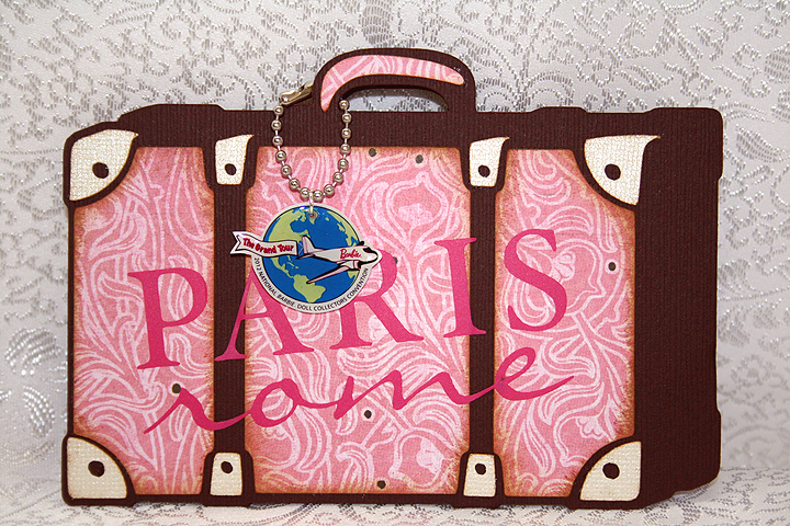
I had a lot of fun with this project.  I was asked to make ten gift card holders that were to be handed out at the 2012 National Barbie Doll Collectors Convention this week in Garden Grove, CA.  They were originally going to hold gift cards, but then it was decided that they would contain raffle tickets.  I guess there are some fabulous prizes in the Raffle Room.  The theme of this year’s convention is The Grand Tour.

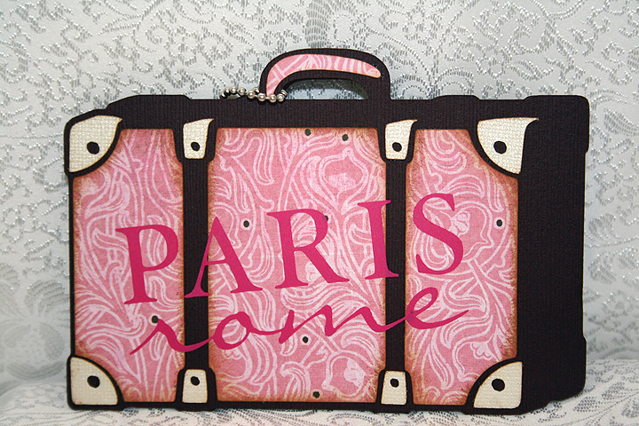
My first thought was to make the card shaped like a suitcase, as a rectangular shape would work well with a gift card.  I searched through suitcase cuts on mycutsearch.com and decided to use the one on the Summer Celebrations cartridge, since it looked sort of vintage.

I welded two shapes together at the bottom in Cricut Design Studio.  I cut the base of the card from chocolate Bazzill cardstock.  All the solid cardstock is Bazzill and the prints are from Basic Grey.  I chose a pink print for the front of the suitcase, using a neutral color for the hardware.  Since Paris and Rome are on the itinerary of the Convention, I cut those words from pink vinyl using the Word Collage cartridge.  Here is a picture of the vinyl lettering.

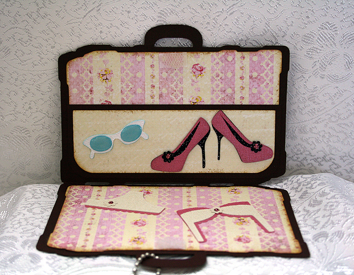
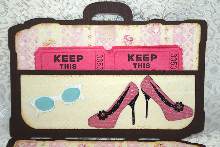
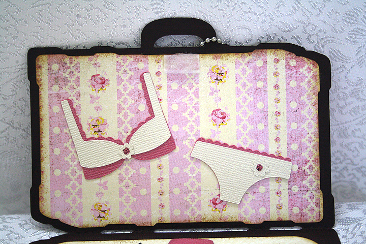
I chose a vintage stripe print for the lining of the suitcase.  I used a rectangle from George & Basic Shapes to create the pocket on the inside, using a punch to round the bottom corners.  Velcro at the top holds the suitcase together when closed.

The shoes, sunglasses and bra and panties are all cut from Forever Young.  I used a black glitter cardstock from Core’dinations for the shoes.  I applied Glossy Accents to the lenses on the sunglasses.

For the small flower embellishments on the shoes and bra and panties, I used the negative cuts from a Martha Stewart punch called Flower Shower.  It makes the tiniest of flowers.  I added Stickles to the centers of the flowers.

Now comes the most fun part — making the charms.  This was my first time using Ink Jet Shrinky Dinks to make charms.  I followed a great tutorial from the talented Nadia to make my charms.  Here are her step-by-step instructions.
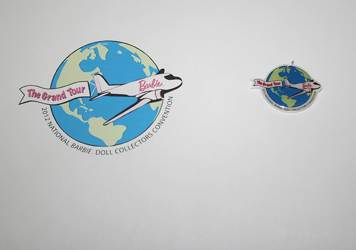
I did not use my Imagine to make the charms as I used a jpg of the Convention logo.  I printed the design on the Shrinky Dink material using my ink jet printer.  So instead of having a Cricut to do my cutting, I hand cut around the charms.  I am not the greatest when it comes to cutting around objects — I got a little wobbly in places.  But the great thing about the Shrinky Dinks is that you don’t really see my wonky cuts.  Here is a photo showing the size of the print I started out with and what it looked like after shrinking.  I also lightened the jpg in Photoshop before printing, as the colors get intense with baking.

Following Nadia’s instructions, after the Shrinky Dinks baked and were flat, I applied some Ultra Thick Embossing Enamel (UTEE) to them.  I then popped them back in the oven and waited for the UTEE to melt.

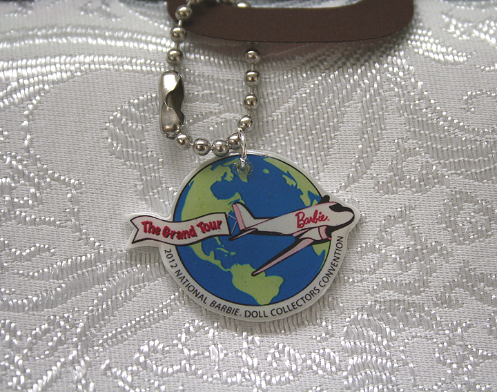
I was so happy with the way they turned out — even my hubby thought they were neat.  The circle part of the charm is not quite an inch across — and look how well you can read the tiny lettering.

I attached jump rings in the holes and hung the charms from key chains that I shortened to fit on the suitcases.

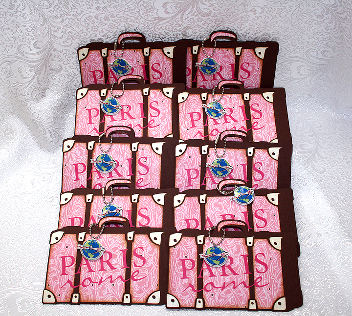
Here are all ten suitcases.

  • Cricut Cartridges – Forever Young, George & Basic Shapes, Summer Celebrations, Word Collage
  • Bazzil cardstock
  • Basic Grey designer paper
  • Vinyl
  • Martha Stewart Flower Shower punch
  • Stickles
  • Glossy Accents by Ranger
  • Ink Jet Shrinky Dinks
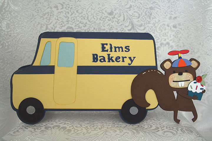
Elms Bakery Truck Birthday Card


I made this card for the Bakery Challenge at Bitten by the Bug 2.  This is a theme challenge and you have to create a project using something you would find in a bakery.

My inspiration will definitely give away my age, but the bakery theme brought back childhood memories of when the Helms Bakery trucks used to come to neighborhoods in So. California in the 1950’s.  I remember my mom putting the blue Helms placard in the corner of the picture window in our living room.  That told the driver to stop at our house.  The Helms motto was “Daily at Your Door.”

The truck was just like having a bakery parked in front of your house.  The driver would pull out drawers filled with baked goodies — so yummy.  The Helms truck delivered the bread that my brothers and I grew up on.

For my bakery truck, since it delivers to whimsical woodland creatures, I changed the name to Elms Bakery.  I created a shaped card using the milk truck from the Cricut cartridge, Pop-Up Neighborhood.  I tried to keep the colors true to the original Helms trucks.  My cardstock is a mix of both Bazzill and Core’dinations.

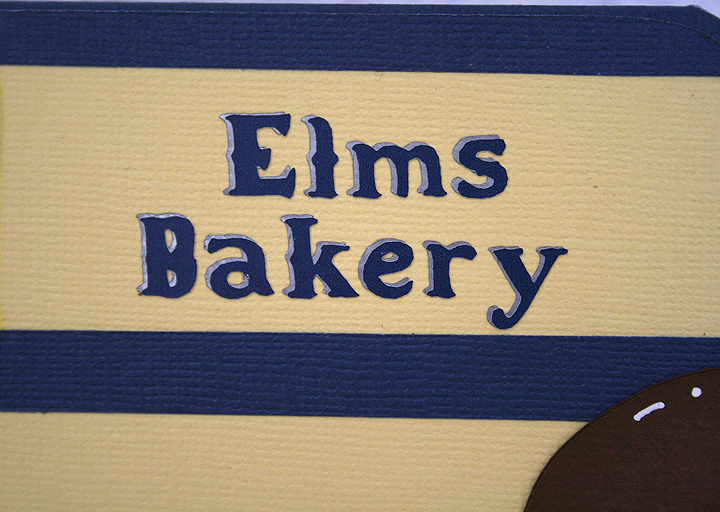
For the base of the card, I welded the squirrel from the Birthday Bash cartridge to the truck in Design Studio.  I made the card so it will just squeeze into a #10 envelope.  The lettering on the side of the truck is done in vinyl and the font is from Noah’s ABC Animals cartridge.  I cut the lettering twice, in two colors, so it looks like it has a shadow layer.

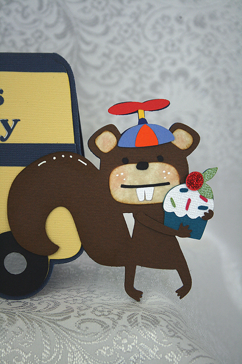
For the squirrel, I decided to put a beanie cap on his little head.  I used Baby Steps cartridge to cut the cap portion. To make the propeller on top, I used a number “8” and deleted the inside cuts in Design Studio.  Then I took the sizing handles and squished the “8” close together.  The little post that the propeller attaches to is a small rectangle from George & Basic Shapes.

I cut the cupcake from Birthday Bash and placed it in the squirrels arms.  I used red Stickles on the cherry.

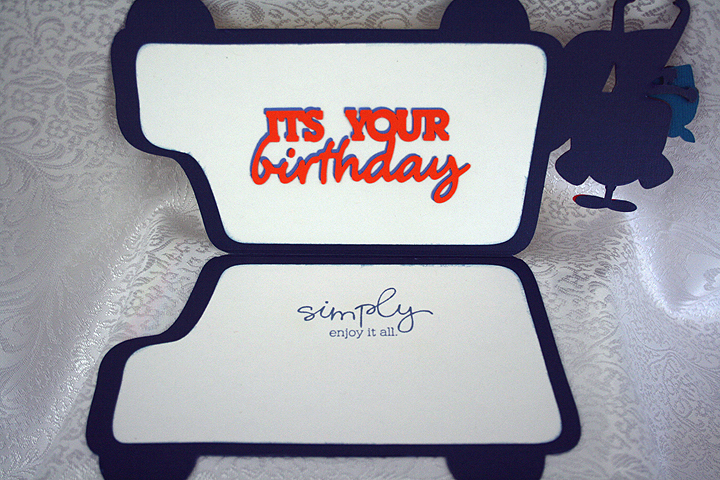
I decided to make this a birthday card, so I cut a sentiment from Birthday Bash to put inside.  I also stamped another sentiment on the opposite side.

  • Cricut Cartridges:  Baby Steps, Birthday Bash, George & Basic Shapes, Noah’s ABC Animals, Pop-Up Neighborhood
  • Cardstock:  Bazzill, Core’dinations
  • Vinyl
  • Stickles

Tiptoe Through the Tulips Layout — Tulip Field in the Netherlands

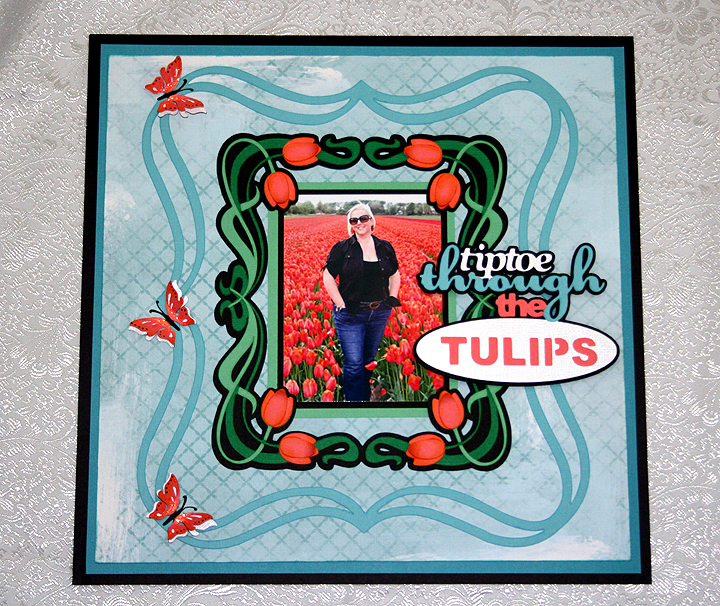
I was inspired to make this layout after my dear daughter, Erin, posted a picture of herself standing in a tulip field in the Netherlands.  Erin and her hubby, Brett, were in the Netherlands the first week of May looking for a place to live as they will be moving there at the end of June.  They are currently living in Taiwan — have been there about 2 1/2 years.

Erin has been to the Netherlands several times before, but she has never been in the country when the tulips are blooming.  She thought they would be too late to see any this trip, but on their way to the airport in Amsterdam to leave, they found this field still in bloom.  Brett snapped the picture and Erin posted it on Facebook.  Once I saw the picture I knew I wanted to do something special with it.

Bitten by the Bug 2 has a frame challenge that began on May 7, right around the time I first saw the picture, so I designed my layout around that challenge.  We were to use a Cricut frame on any project.  The challenge ends today, so once again I am getting my project in just under the wire.

I have to first say that on this layout I finally used my Cricut Imagine.  It has been sitting in the box for some time.  I read some of the problems people were having with their Imagines and it took me quite a while to get up the courage to fire it up.  I discovered that the cartridge that came with my Imagine (Imagine More) was defective.  Luckily I had another cartridge I could use to get the machine running.  I called Provo Craft customer service and they are sending me a new cartridge.

I did manage to get it printing and cutting.  I am having some issues with the machine not cutting each time though.  Sometimes it just spits the mat out after printing.  I will play around with it some more and hopefully it behaves.

For this layout I printed the background paper on the Imagine.  I used a pattern from the Yummy cartridge and filled an 11″ square with the design.  I love that I can now print my own paper!

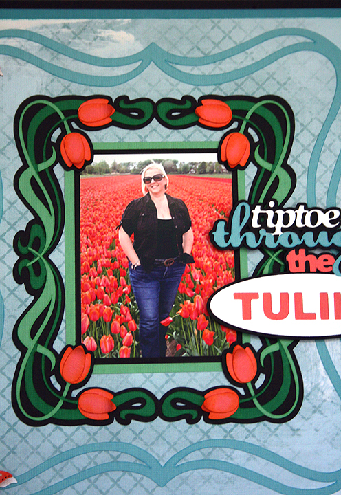
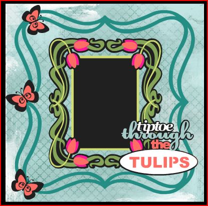
The solid color cardstock is mostly from Core’dinations, with a little Stampin Up thrown in the mixture.  For my swirly frame, I used the Cricut cartridge Fancy Frames.  I made the tulip frame in Design Studio by welding four corner shapes together from the Art Nouveau cartridge.  I welded just the shadow layer (black layer) only.  I cut the other layers separately so the tendrils would overlap on the center sides.  I also cut some extra tulip petals so I could layer them on the flowers and inked all the flower petals with some Tim Holtz Distress ink.  Here is a close-up of the frame.

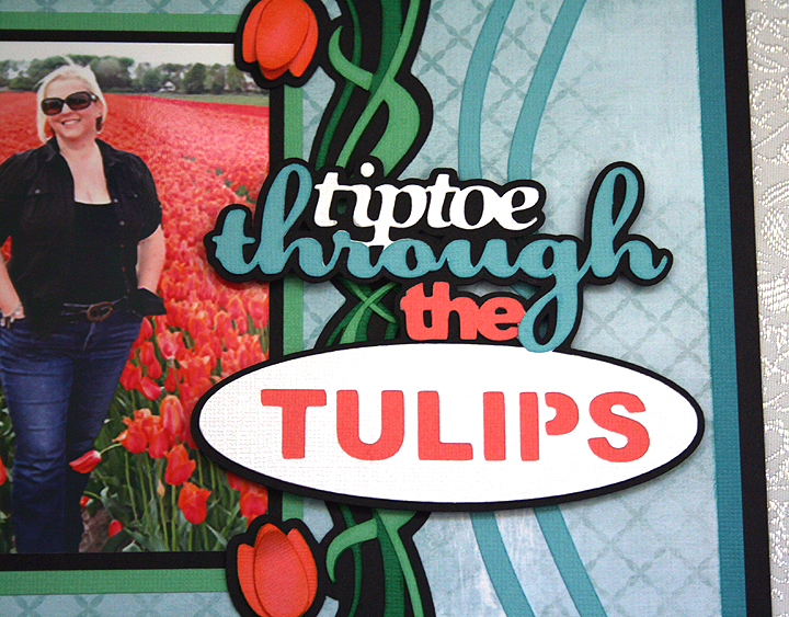
The title is cut from the Bloom Cricut Lite cartridge.  Erin posted on Facebook shortly after she arrived in the Netherlands that she was hoping to tiptoe through some tulips, so this was a perfect choice for the title.  I used pop-dots under the title.

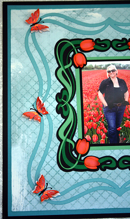
And, finally, to balance out the left side of the layout I added three butterflies from the Indie Art cartridge.  I cut three different layers, and on the last layer I only glued down the inside portion of the wings so I could bend them up.  I added some Stickles to the wings.

I have been playing around some in Cricut Craft Room and have to say that I am impressed by what it can do.  As with the Imagine, I have read some problems people have encountered with CCR, so I haven’t tried cutting with it yet.  I just didn’t have time to try it with this project, but I want to share what my project looked like laid out in CCR.  It is a great design aid because you can color your layers and see exactly what your project will look like.  For my background paper, I tried several different patterns before I decided on this one.  With the click of a button I could see what a different pattern would look like with my layout.  I think the final project looks pretty much like what I laid out in CCR.  I made a few changes as I started working on the layout, but this was my blueprint for my project.

  • Cricut cartridges:  Art Nouveau, Bloom, Fancy Frames, Indie Art
  • Cardstock:  Core’dinations, Stampin Up
  • Tim Holtz Distress Ink
  • Stickles

Prom Princess Scrapbook Layout

Wow, it has been so long since I posted something on our blog.  A couple of weeks ago, Bitten by the Bug 2, posted their Princess (the Word) Challenge and I decided I wanted to participate.  Of course, I waited until the last minute to finish my project.  Time is running so short, in fact, that I am going to post pictures right now so I can link my project to their blog and then come back and post the details.   I am hoping I can come back and add comments without creating a disaster — we’ll see how that works out 🙂

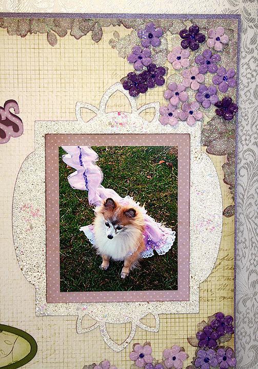
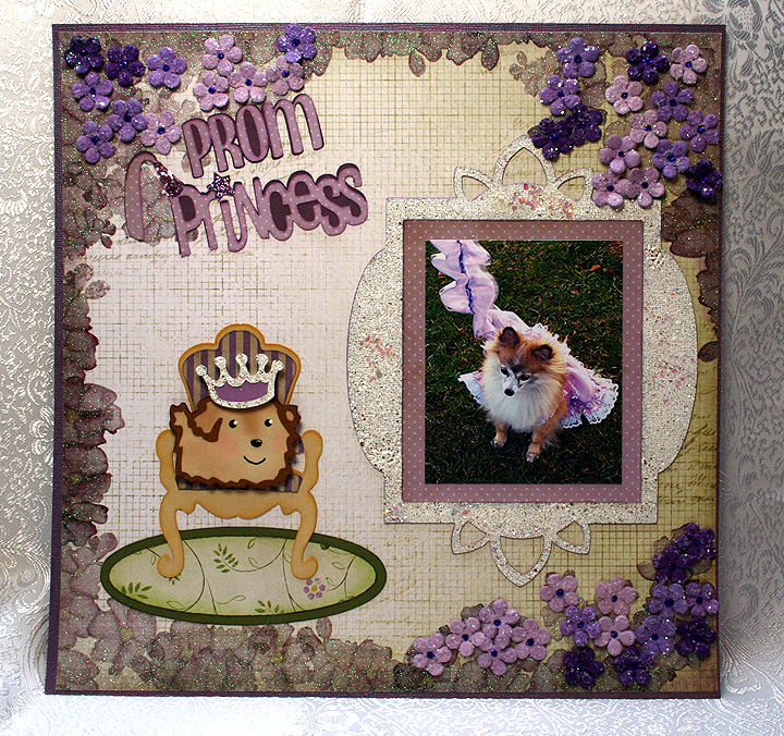
OK, now I will see if I can add some details.   The picture in this layout is of our dog and it was taken in 2006, shortly after we adopted her from a rescue group.  Fifi was in foster care for about a year before we got her, so we decided to keep the name she came with — even though it was not high on my hubby’s list of dog names.

Fifi also came with a few issues, the most worrisome was that she nipped.  We talked with our veterinarian about the problem and she recommended a dog trainer–Fifi likes to refer to her as her personal trainer.  Anyway, the trainer seemed to do the trick as Fifi has not nipped since getting individual and group training.

At the end of the year, the trainer had a party for the dogs.  She does this each year and always chooses a different theme.  For 2006 the theme was Prom.  The dogs all came dressed up, but once they walked for judging they got to get undressed and get down to some serious partying — which included running in the dog park and lots of doggy treats.

This was the first  (and so far only) time that Fifi has dressed up — and I wanted to make her something special to wear.  I altered a dog pattern to make her frilly dress.  I also made a matching cover for her leash.  I was surprised that Fifi did not mind wearing the dress.  After walking for the judges, Fifi was chosen as a Prom Princess and her award was a new chew toy.

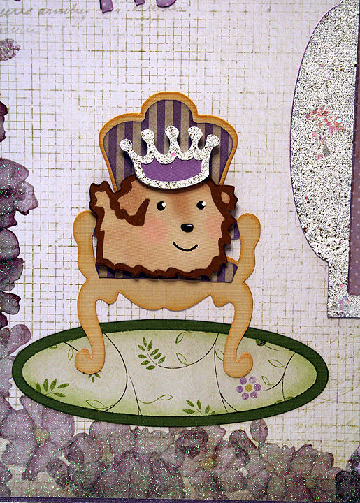
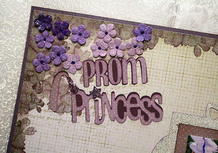
 I used a paper stack from Die Cuts With a View called The Chateau Lavender.  I laid out my design in Cricut Design Studio and I used the Once Upon a Princess cartridge for the title “Princess” cut and Don Juan for “Prom”.  The frame was cut from Elegant Edges, the throne from Formal Occasion and the dog and crown from Paper Pups.

 I did some heat embossing on the frame using some Stampendous products that I recently bought.  The embossing powder I used all over the frame is called Fran-tage Shabby White Opaque.  It is chunky and has lots of gold glitter in it.  I also added some Stampendous Shaved Ice on top of the powder before I heated it — the Shaved Ice adds chunks of bling.  My only problem was trying to keep it from blowing all over.  I heated the frame from underneath, as Stampendous recommends.
 I cut a throw rug to go underneath the throne using George and Basic Shapes.  For the white on the crown, I heat embossed it using the same Stampendous products that I used on the frame.  I did some chalking on the pup.

I used Stampendous Fran-Tage Lavender Crushed Glass Glitter on the princess hat in the title and used Stickles on the star that dots the “i”.  The last step was the small flowers, which are Recollections brand from Michaels that I recently got on clearance.  I used Stickles in the center of the flowers.

  • DCWV The Chateau Lavender
  • Cricut Cartridges:  Don Juan, Elegant Edges, Formal Occasion, Once Upon a Princess, Paper Pups
  • Stampendous Fran-tage Shabby White Opaque Embossing Powder, Lavender Crushed Glass Glitter, Shaved Ice
  • Recollections flowers
  • Stickles


1st Banner for Cricut Expression 2 Design Challenge


On Monday, September 26 at 12:01 a.m. EST, Provo Craft is going to launch their newest machine — the Cricut Expression 2 on HSN.  They posted a challenge to design and make a banner and they are going to give away five new Expression 2’s to some very lucky winners.  You were able to make two banners to enter, so this is the first banner I made.

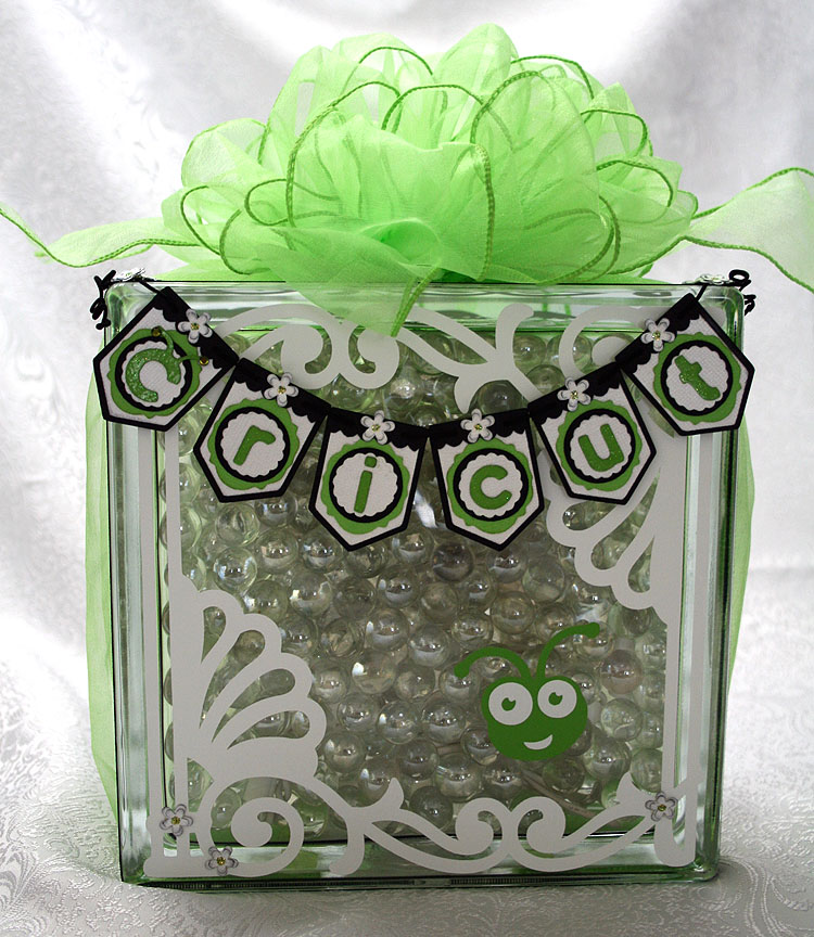
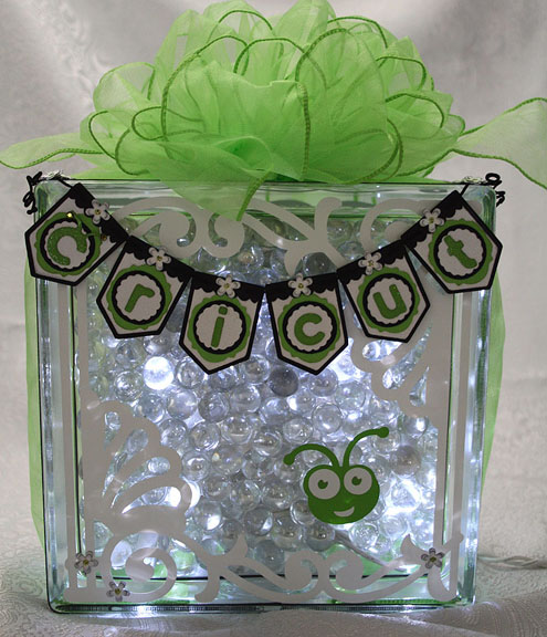
I knew the competition was going to be tough because there are so many talented Cricut users, so I tried to think a little “outside the box.”  For some reason, hanging a mini banner on a glass block was my first idea.   I originally planned on using etching cream to frost the glass, but because I was using a small string of LED lights I ended up putting glass marbles inside to help hold the lights in place.

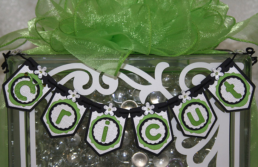
The banner is made using Bazzill and Core’dinations cardstock.  I used the Birthday Bash cartridge for my banner base.  The green frame was cut from Lacy Labels, the scalloped circles from Mini Monograms, the regular circles from George and Basic Shapes, and the black valances were cut from Straight from the Nest.  The Cricut lettering is from Cricut Everyday and I cut it out of a glitter cardstock from DCWV.  I used two Swarovski crystals on the antennae.  I added some small flowers punched from a Martha Stewart Punch Around the Page combo called Flower Shower and used lime green Stickles for the centers.

The pieces on the glass were cut from vinyl — the white fancy scroll frame is from Ornamental Iron 2 and the Bug head is from Cricut Everyday.  I was impressed with how well the Cricut cut the vinyl.  Here is a picture of the block all lit up.

FrontLit4

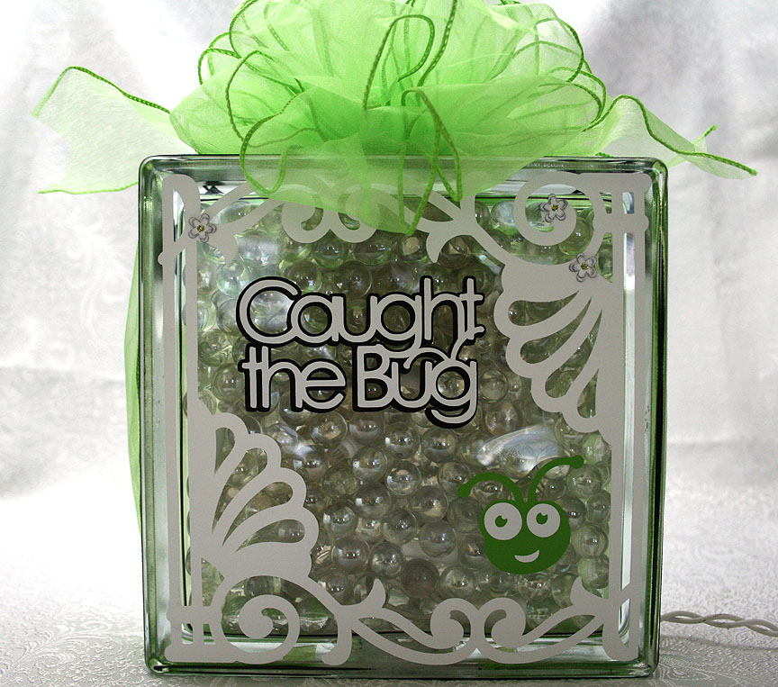
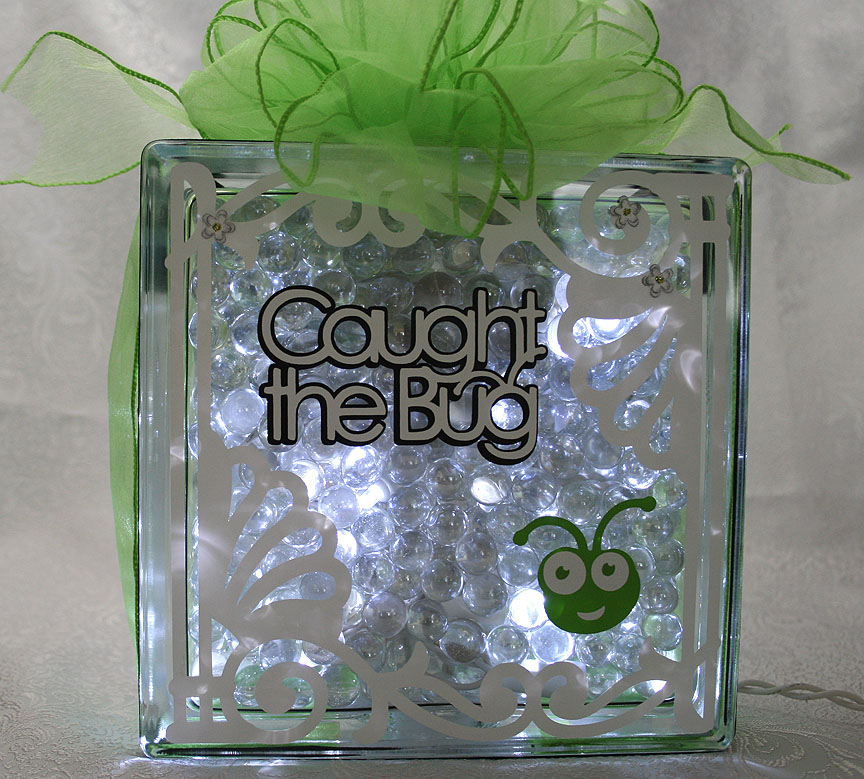
I decided to decorate the back of the block too and I used the same frame that I put on the front, cut from Ornamental Iron 2.  I recently bought this cartridge and I am lovin’ it!  It has some beautiful designs on it and I think they look great cut out of vinyl.

The phrase and Bug head on the back are both cut from Cricut Everyday.  And here is a picture of the back of the block with the lights on.

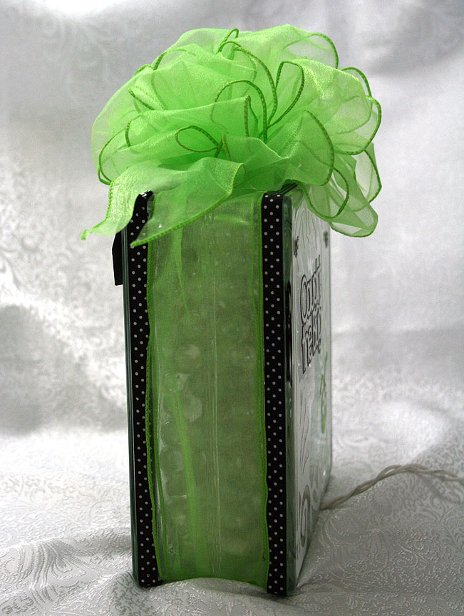
To hang the banner on the glass block, I glued some black & white dotted ribbon around the edges using Terrifically Tacky Tape.  I strung the banner together using DMC’s Memory Thread.  I sewed and glued the ends of the Memory Thread on the banner.  To cover up my stitches, I punched some more flowers and glued them on top.  I also scattered a few flowers on the front and back of the block.  I tied some wide Cricut green organza ribbon around the entire block and made a big bow using my Bowdabra.

The last picture is of the side of the block.

  • Cricut cartridges used:  Birthday Bash, Cricut Everyday, George and Basic Shapes, Lacy Labels, Mini Monograms, Ornamental Iron 2 and Straight from the Nest
  • Cardstock:  Bazzill, Core’dinations, DCWV
  • Cricut vinyl
  • DMC Memory Thread
  • Terrifically Tacky Tape
  • Martha Stewart Flower Shower punch
  • Lime green Stickles
  • Swarovski crystals

Flowers Made With New EK Success Dimensional Punch


Boy, it has been a long time since I posted anything on our poor ol’ blog.  I have been busy with the embroidery business, which is such a blessing after being so slow last year. 

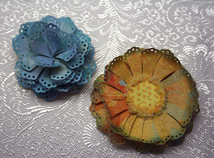
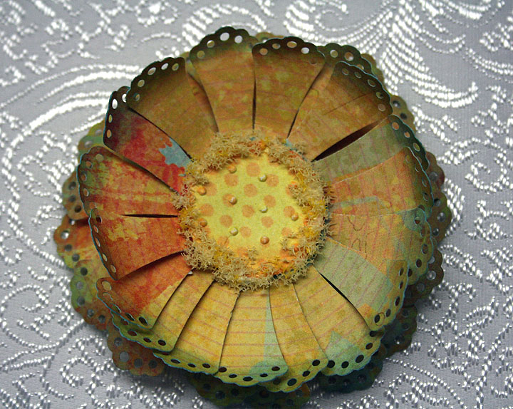
I want to share a couple of flowers I made with one of the new EK Success Dimensional Punches.  EK released four new punches for making flowers and I was able to find them at Joann’s.  The new punches are:  Doily Petals, Gerber Daisy, Dahlia, and Carnation.  The one I used to make these two flowers is the Doily Petals punch.  These are the first two flowers I made — I haven’t had a chance to try the other punches yet.  But after making these flowers, I am looking forward to playing with the other punches.

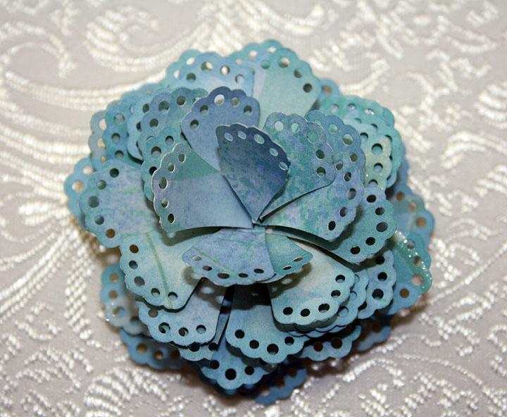
Before trying to make a flower, I watched a couple of videos showing how to use these new punches.  The video I watched on a blog called Tinker Planet really helped.  She showed making a flower using the directions given on the back of the punch package and then showed her method.  I made the blue flower using her method. 

I cut two strips from a scrap of 12″ K & Company paper for my petals.  I put tape at the bottom of each strip using my ATG gun, just as shown in the video.  I wrapped my two strips around a chopstick.  But instead of gluing a pearl or gem in the center of the flower, I cut another strip of petals and used just six petals from this strip.  I wrapped them tightly around a very small paint brush and then glued them in the center of my previous two strips, to hide the hole in the middle. 

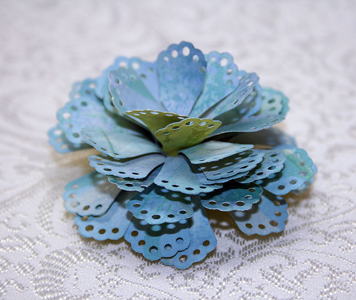
As in the video, I pulled all my petals down — just like peeling a banana.  Here is a picture showing the side view of the flower.


The second flower is my creation.  When I was looking at the strips of petals after punching them, I was reminded of a Spellbinders flower die that I have.  The only difference is that it is a round die — so the petals are all nicely in a circle.  I wondered how I could get the petals on the strip into a circle. 

I thought maybe I could score the strip and then fold it, like making a rosette, and get it into a circle.  I put the strip on my Martha Stewart score board and started scoring a line on each petal.  I scored right next to where the petal joined the bottom strip, scoring  just once on each petal — but always scoring on the same side of each petal. 

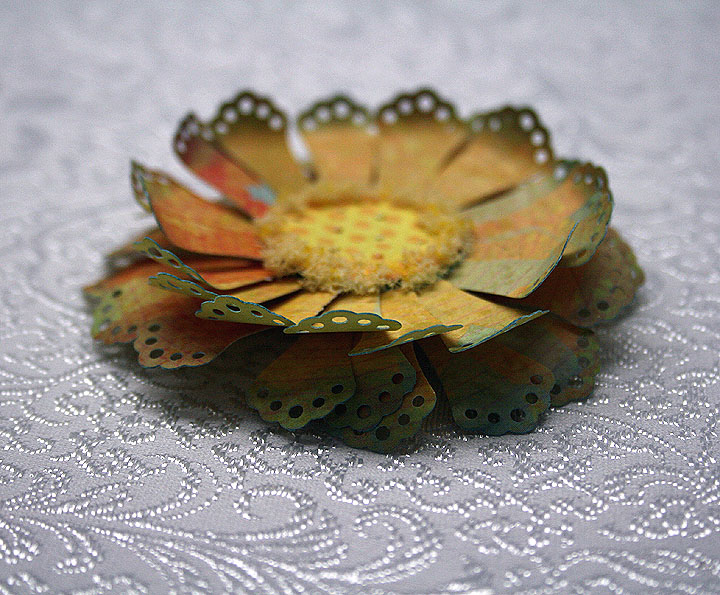
Then I folded along each score line and folded the petal until it was almost touching the next petal.  When I got to the end of the 12″ strip, I joined the ends.  Then I punched out a 1″ circle and glued my rosette onto it.  I made two layers and glued them together.  Then I took a third circle and put in the center of the flower and added some Flower Soft around the edges. 

This flower is also cut from a scrap of K & Company paper.  I guess it looks OK — it reminds me of a sunflower.  And here is a side view so you can see the layers and dimension.
  • EK Success Doily Petals Dimensional Punch
  • K & Company paper
  • Flower Soft

Ice Cream Shop Card for Cricut Circle Weekly Challenge


Weekly Challenge #33 over at the Cricut Circle Blog is called the Sweet Summertime Challenge.  You have to incorporate the shape of your favorite summertime treat and use a stamp somewhere on your project.

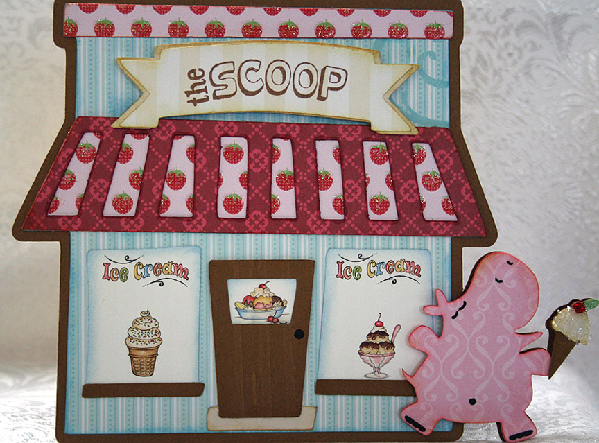
My summertime treat is easy — it’s the same treat I love all year long — ice cream!!  That being said, I knew right away what my card was going to have on it.  But I decided that I would not only include an ice cream cone but also the ice cream shop.

The lastest exclusive cartridge for Cricut Circle members is Pop-Up Neighborhood.  I was looking through the handbook and really liked some of the buildings.  While I didn’t use the pop-up feature on this card, I did take the bakery and turned it into an ice cream shop.

In Design Studio, I laid out two of the bakery shadow shapes and welded them together at the top.   I remembered the cute little hippo from Birthday Bash, who is blissfully running with her ice cream cone, and knew I wanted her on my card too.  So I laid out the hippo shape onto my base and welded that also.

I cut the shapes from the Sweet Stack by Die Cuts With A View.  The solid color cardstock is from Bazzill.  I used just the two cartridges — Birthday Bash and Pop-Up Neighborhood.   Oops, I just remembered a third cartridge that I used — the Lite cartridge Twinkle Toes.  I cut the banner for the shop name from it.

For the windows on my ice cream shop, I used graphics from Provo Craft — from their pccrafter.com site.  I thought they were perfect with my design.  I used a stamp to do the name of the shop.  I found a clear stamp in a set that I bought from K & Company that said “The Scoop” and when I saw it I knew that would be the name.

I used the Cuttlebug on the front door, the Distressed Stripes folder, and also on the ice cream cone, the Mesh Texture folder.  I needed something with a small pattern because the ice cream cone on the front of the card is quite small and this folder was great.  It gives the look of a waffle cone.  I used coarse glitter on the ice cream itself and red Stickles for the cherry on top.

Front3

This is a happy and fun creation and when I look at my card I can’t help but think of a book Erin had as a child.  It was called Yummers! and featured Miss Emily (a pig) and Eugene (a turtle).  When I look at the pink hippo, she just looks like she is running along thinking, yummers!!

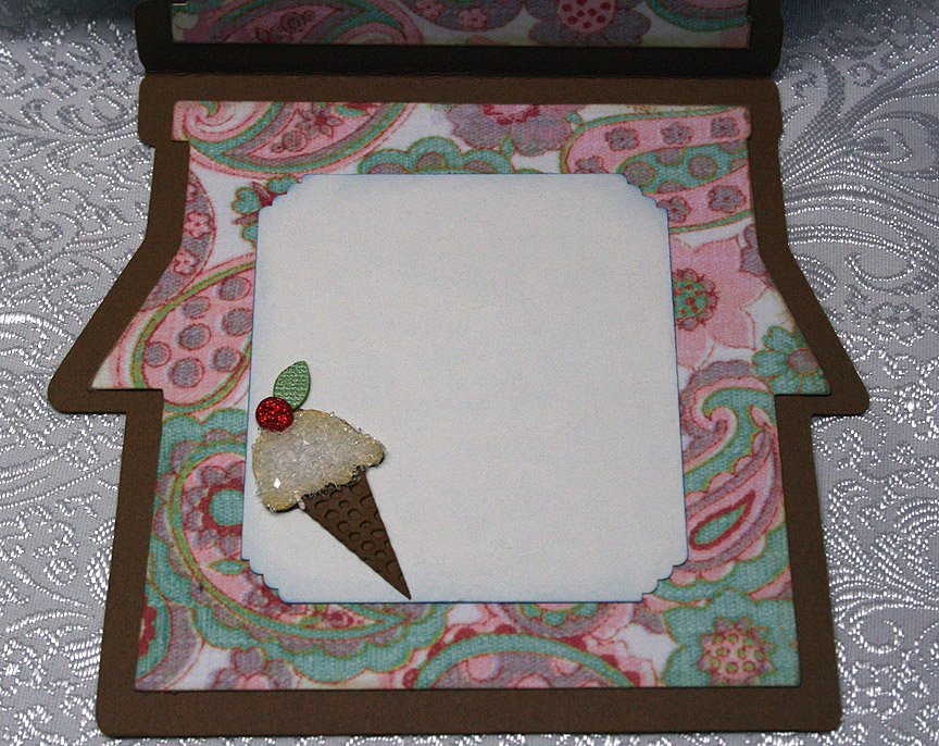
The patterned paper on the inside of the card is from daisyd’s.  I made another ice cream cone, this time a little larger, to adhere to a corner.

  • Cricut Design Studio
  • Cricut cartridges:  Birthday Bash, Pop-Up Neighborhood, Twinkle Toes
  • Cuttlebug folders:  Distressed Stripes and Mesh Texture
  • DCWV — Sweet Stack
  • Bazzill solid cardstock
  • Coarse glitter
  • Red Stickles

Vintage Birthday Card for Cricut Circle Blog’s Monthly Challenge


Here I am, getting another project submitted with just a few hours to spare.  I guess I work better with deadlines closing in on me, although I do not care for the stress.  But who can I blame for procrastinating?  Yep, no one but me!

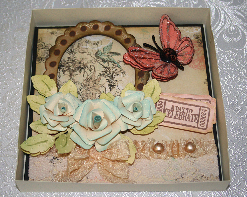
I decided to make a birthday card for my niece and this is my first time trying to make something that looks vintage.  I love the look of vintage but didn’t know how well I would do trying to create it.  I am happy with how it turned out, especially for a first try.

The paper I chose is the reason I went for the vintage look.  I picked up a pad of paper by Bo Bunny when I was shopping last week.  It is the Gabrielle Collection and there are some beautiful designs in it. 

The monthly challenge for May at the Cricut Circle is the Tic Tac Toe Challenge.  The object is to pick three prompts in a row from a tic tac toe grid and to include at least two Cricut cuts.

I chose a diagnoal row, going from the bottom left to the right top — which consisted of:  use a cut of a flower shape, use a ruffle, and use some buttons.

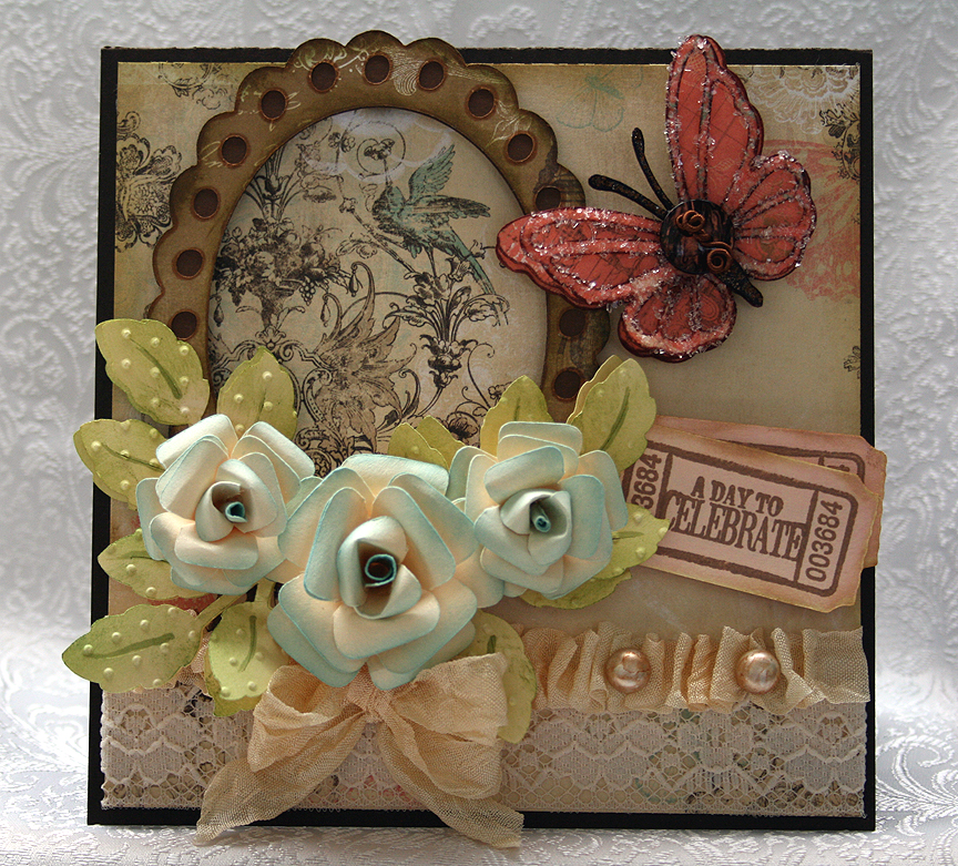
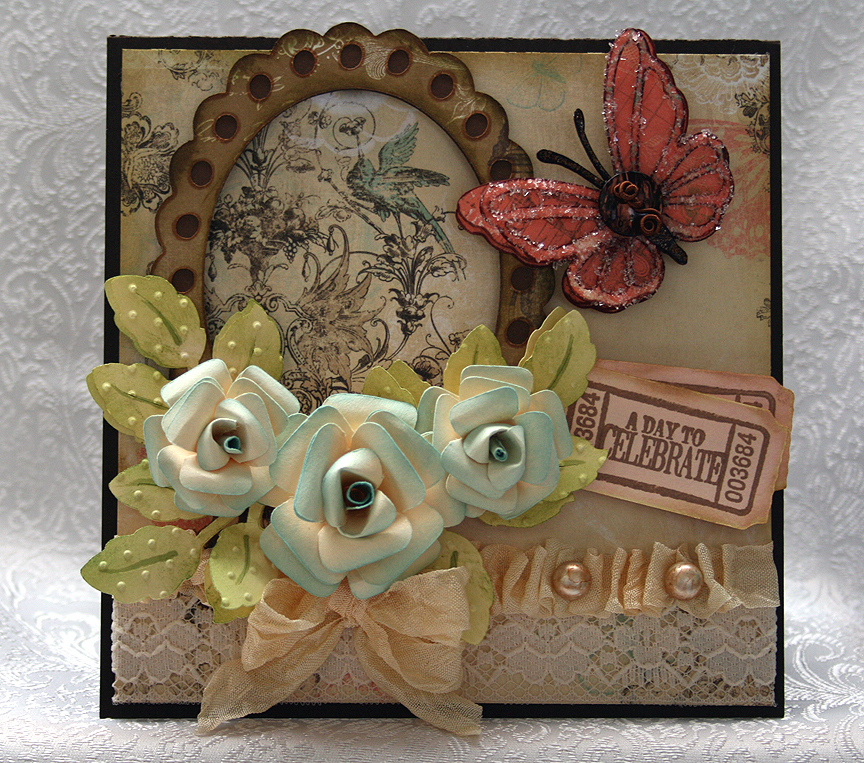
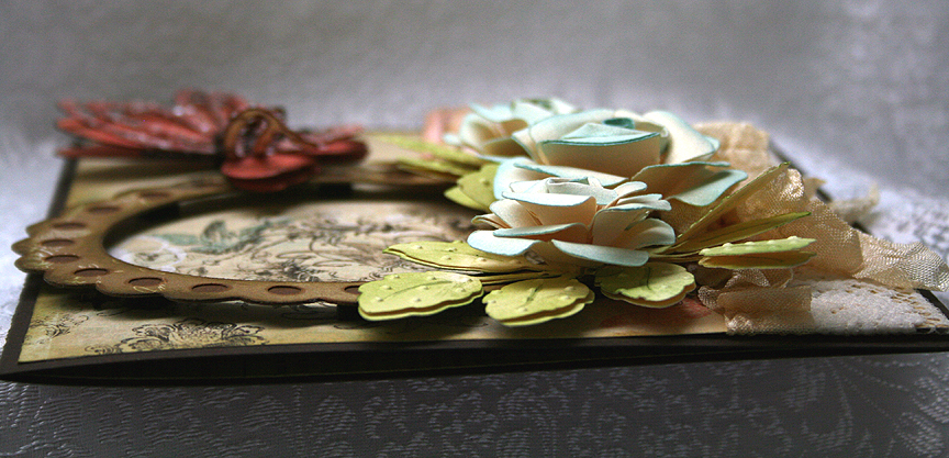
Because the paper is so pretty, I decided to use a frame around one of the designs.  I cut the frame from the Elegant Edges Cricut cartridge.  I made my ruffle from a piece of seam binding and laid down a piece of lace on the paper before adding the ruffle.  The pearls on the ruffle are actually white buttons that I colored with my Copics.  I cut the shanks off the button before gluing them on the ruffle.

The flowers were the most time-consuming part of my card.  I cut them out of plain off-white cardstock using my Accent Essentials cartridge.  I inked all the edges and then formed the cuts into roses.  I sprayed them with Glimmer Mist — sure wish the sparkle showed up in the pictures. 

I cut the leaves from the same off-white cardstock using the Picturesque cartridge, inked them green and then ran them through my Cuttlebug using the Swiss Dots folder.  The butterfly is from the Martha Stewart Elegant Cake Art cartridge.  I found a button in my stash that matched the butterfly beautifully.  I added some Memory Thread to the button and glued it on the body of the butterfly.  On the lacy layer of the butterfly, I added some sparkle using Glossy Accents and Diamond Dust.  I also used Distress Stickles on its body.

I cut some tickets using Wall Decor & More and inked them a light coral color.  I cut the tickets at 2″ and they fit the stamp set perfectly.  I then stamped them with a stamp set from Autumn Leaves called Ticketed. 

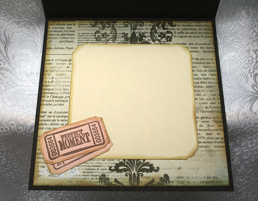
The inside of the card features a different piece of the Bo Bunny paper and another ticket.

I used lots of foam dots on this card.  Here is a photo showing a side view so you can get an idea of the dimension that this card has.

Since I can’t put this card into a normal envelope, I made a box to hold it.  But I need to take a picture of the box.  I will post the picture once I take it. 

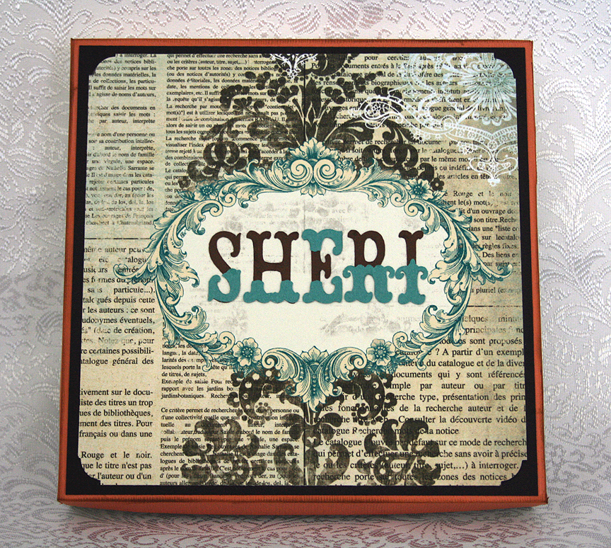
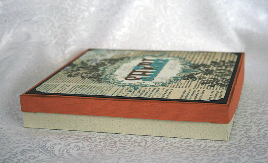
I’m back with some pics of the box.  I ended up adding my niece’s name to the top of the box, which I cut from Storybook.


  • Bo Bunny – Gabrielle Collection
  • Cricut cartridges used:  Accent Essentials, Elegant Edges, Martha Stewart Elegant Cake Art, Picturesque, Wall Decor & More
  • Cuttlebug folder – Swiss Dots
  • Glimmer Mist
  • Seam binding
  • Stickles
  • Autumn Leaves stamps – Ticketed
  • DMC Memory Thread
  • Glossy Accents
  • Diamond Dust
  • Buttons from stash

Duffy the Disney Bear Celebrates Cinco de Mayo Layout

Whoo hoo — I’m back with my second layout.  I haven’t posted in quite some time, but I am so excited because my first layout won in the Provocraft contest that was held in conjunction with the launch of the new Cricut Expression E2.  I was the next-to-the-last winner announced on Provo’s Facebook page and couldn’t believe my eyes when I saw my layout pictured on their wall.

This is my first “major award”  — and what did I win?……A new Cricut Expression E2 — whoooo hoooo.  It has already arrived and I hope to start playing with it soon.  Thank you so much Provo Craft!!

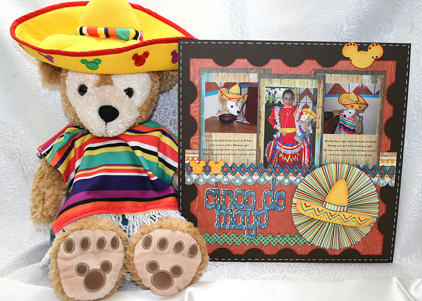
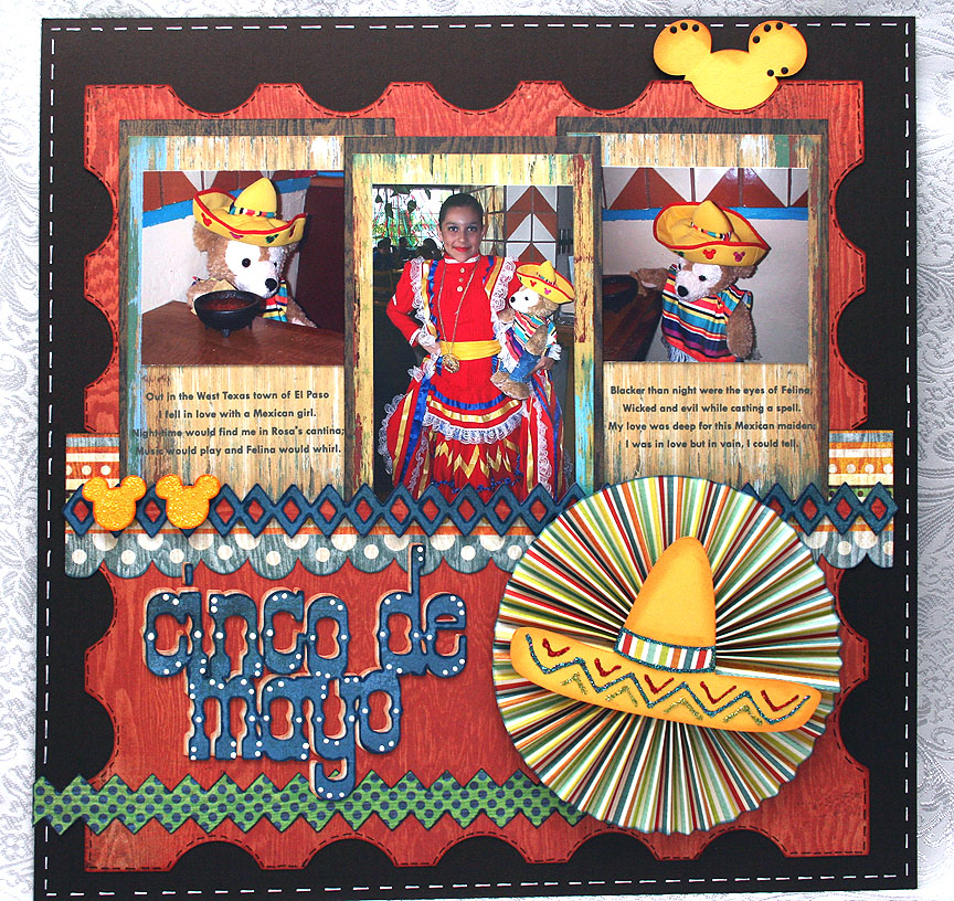
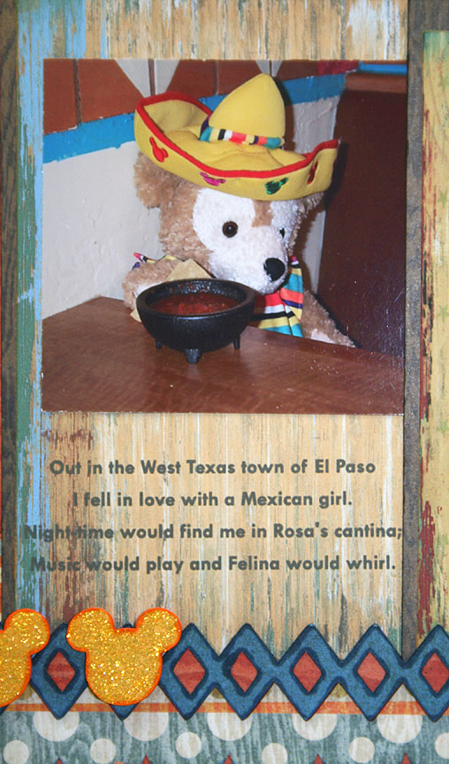
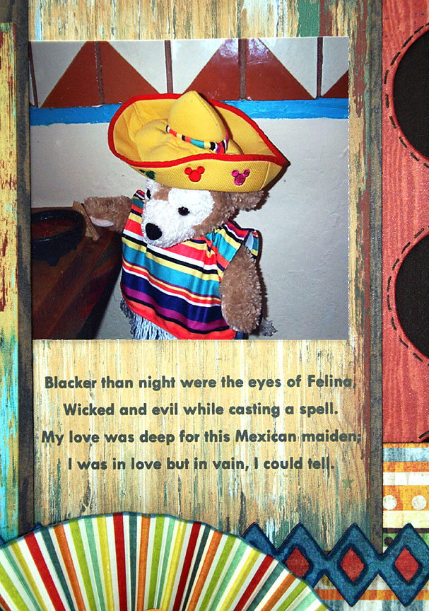
I created this layout to enter in the latest Cricut Circle Blog weekly challenge, which ends in just a few hours.  This is a sketch challenge and you have to follow the sketch posted on the blog.  It always takes me time to come up with inspiration, particularly when doing layouts.  Hopefully as I gain more experience the ideas will come more quickly. Now for a little background info about this layout.  Erin (my daughter and co-conspirator on this blog) is currently living in Taiwain and is a huge Disney fan.   She has visited all five parks many times.  She got bit by the Duffy Bear bug while on a visit to Tokyo Disneyland.  Duffy is Mickey Mouse’s teddy bear, sewn by Minnie Mouse to keep Mickey company while traveling.  Notice his face is shaped like Mickey’s head.  While Duffy was exclusive to Tokyo Sea, he is now being featured at Disney World, Disney California Adventure, and Hong Kong Disneyland. Erin brought me a Duffy and Shellie May (the girl version, and still only available at Tokyo Sea) on one of her visit’s home.  She has since given me a Duffy bear from Hong Kong Disneyland, and I added two of my own from California Adventure.  While Erin’s bears have traveled all over the world (Japan, Hong Kong, France, the Netherlands, Belgium, Germany, Switzerland, Luxembourg, Tahiti, Belize, to name a few), my bears are content to reside mainly in California. Living in Taiwain, Erin is about 15 hours ahead of our time here in California.  For Cinco de Mayo, she posted pictures of one of her Duffy bears celebrating Cinco de Mayo on her Disney travel blog, Pooh’s Travels.   She dressed him in his outfit from Mexico and shows him sitting at the dinner table with a meal of chicken taquitos and mango margaritas spread out before him.  As soon as I saw her post I knew I had to do something special with one of my Duffy bears for Cinco de Mayo so I could send pictures to Erin. As my hubby and I had plans to go to Acapulco restaurant for dinner on May 5, I dressed my bear in his serape and sombrero and he tagged along.  Yep, we took a bear to dinner!  The older I get the less I seem to care if people think I’m crazy! I took a couple of pictures of him sitting in the booth with chips and salsa.  And my hubby is the one who put the chip in Duffy’s paw and moved the salsa close to him.  But the coolest part was that the restaurant had this beautiful young lady acting as a greeter for Cinco de Mayo and she was all dressed up in a gorgeous outfit from Mexico.  On the way out of the restaurant I asked her if Duffy could take a picture with her and she obliged.  I couldn’t wait to get home and send the pictures to Erin. When I first saw the pictures, I thought Duffy looked like he was sitting in a cantina and a song immediately came to mind — El Paso, by Marty Robbins.  So I included the first two verses when I sent Erin the pics and decided to include them on my layout too.

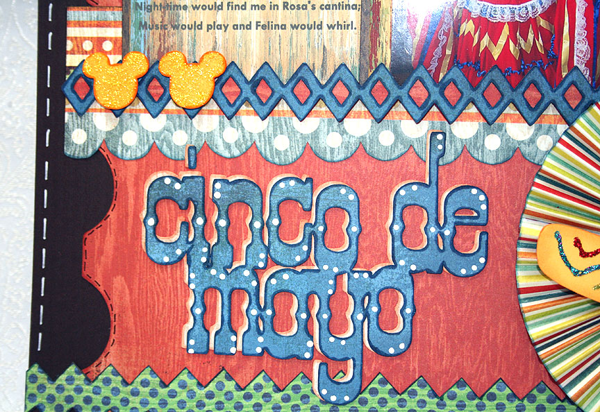
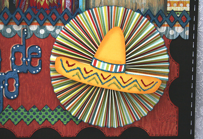
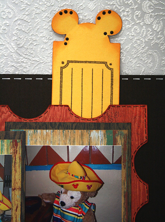
The patterned paper I used on this layout is from Basic Grey, their Life of the Party collection.  The cartridges I used are Elegant Edges for the stamped background mat and the diamond trim at the bottom of the pictures, Old West for the title, Mickey & Friends for the Mickey heads (I welded one to a rectangle for the tag that pulls out at the top), and Wild Card for the sombrero.

  • Basic Grey — Life of the Party
  • Cricut cartridges:  Elegant Edges, George & Basic Shapes, Mickey & Friends, Old West, Wild Card
  • Stickles

Easter Bunny Inside His Jelly Bean Seed Packet Card


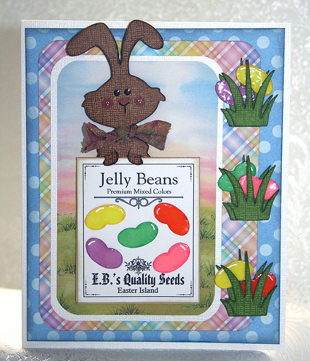
This was a fun card to make.  I wanted to make an Easter card so I could enter it in Jitterbuggin’s Spring Fling contest.  We had extra time to complete this challenge, but I waited until the last minute and am getting this in just under the wire.  It took a while for me to take my concept and come up with a finished project.   This time the challenge is open to voting, so that part is new to me. 

I was inspired by the movie Hop — I loved it and can’t wait for it to come out on DVD.  But my little bunny has to use seeds for his beans as he does not have the talent EB does when it comes to producing jelly beans.

I was a member of PC Hug Club for many years and received some very cute clip art each month.  Because I have such a large collection and never use it, I decided I was going to print my own paper to make this card.  All the background prints are images that I printed on an inkjet printer.  I really like using the clip art because I can resize it — so a 12″ x 12″ background can be reduced to 6″ x 6″ to make a card.  The size of the print becomes smaller too, so it is perfect for cardmaking. 

Fantabulous Cricut has a challenge called Do the Bunny Hop! this week that I will enter this card in.  You have to create a project using a rabbit or chick.

Also, at Cooking With Cricut, their challenge is called Cash in Your Stash and you are supposed to use things in your stash — items that you have had for at least a year.  My clip art collection certainly qualifies, and I also used scraps that I have had for ages to make the bunny and the grass.

I made the seed packet in Adobe Illustrator.  I am such a beginner using that program and was thrilled when I actually made something with it.  I made it a complete packet so I could slip the bunny inside. 

Making the jelly beans was probably the most time-consuming aspect of the card.  I first did an online search to see if I could find a Cricut cut file for a jelly bean as I was pretty sure there were no jelly beans on any of the Cricut cartridges.  I found a post where someone said they made a jelly bean using the George and Basic Shapes cartridge, using the crescent and heart shapes.    I used the same shapes and laid the beans out in Design Studio.  I cut the jelly beans from white cardstock and then colored them with Copic markers.  I applied two layers of Glossy Accents to give the beans their shine. 

The bunny is from the Paper Doll Dress Up cartridge — he’s the bunny from the magician’s costume.  I made a bow for him from seam binding that I spritzed with Glimmer Mist.  The grass is from Create a Critter.  I cut two layers of the grass for each clump so the jelly beans could be seen growing between the layers.  After I placed the bunny inside the seed packet, I pop dotted the entire piece on the front of the card.

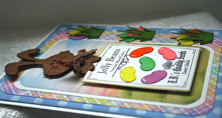
Side view showing some of the dimension of the card.

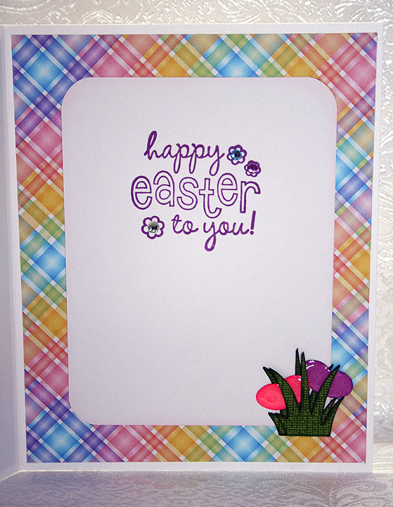
For the inside of the card, I used a stamp from a clear set that I picked up at a scrapbooking expo several months ago.  It came with the rhinestones that I put inside the stamped flowers.  I added another clump of grass with some more jelly beans.


  • Cricut cartridges:  George & Basic Shapes, Create a Critter, Paper Doll Dress Up
  • Cricut Design Studio
  • PC Hug Club clip art
  • Copic markers
  • Glimmer Mist
  • Rayon seam binding

Challenges:

Jitterbuggin — Follow the sketch, make an Easter card and use a Cricut cut somewhere on your card.

Cooking With Cricut — Use stuff in your stash, items that you have had for a year or more.

Fantabulous Cricut — Use a bunny or chick in your project.