Circleville NSD 2013 — What’s It Owl About?


Thank you for stopping by my blog.  To celebrate National Scrapbook Day, some of the crafty members of the Cricut Circle are posting projects and activities on the message board all weekend long.

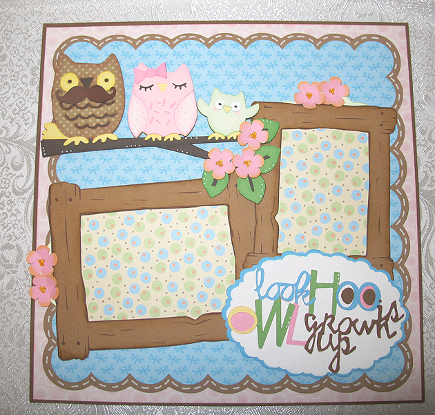
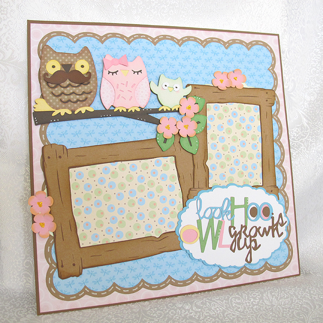
I created a challenge for my project and would like to share it with you.  My theme is owls — and the challenge is pretty simple, just create a project with an owl on it.  I made a layout using a cute owl family from Hoot ‘n’ Holler.

LO3

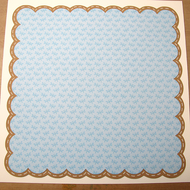
I laid out my design in Cricut Craft Room.  The patterned paper is printed on my Imagine using the Nursery Tails cartridge.  The solid cardstock is from Bazzill.  I began with Elegant Edges for the scalloped square in the background, cut at 10.5″, using <sclop2-s> and the shadow feature.  I used a white Sharpie poster paint marker to make the “stitch” lines around the square.

Scallop

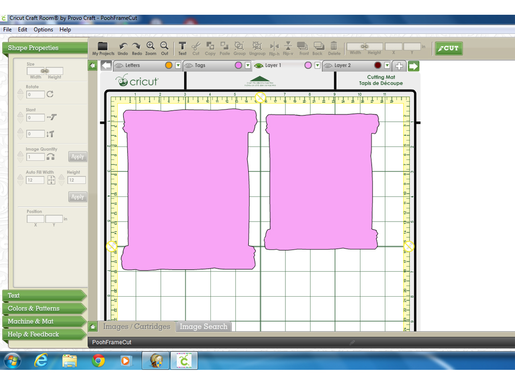
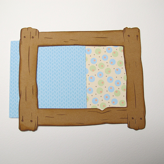
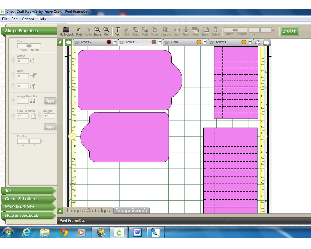
Next I cut the two wood frames from Pooh & Friends at   5.5″ and 6.5″.  The frames are three layers — the basic feature and then two on the blackout feature.  For the piece cut using the printed paper, I hid the inside cut lines in CCR, so the piece was solid — it did not look like a frame.   Here is a picture of what it looks like in CCR.

FrameMat

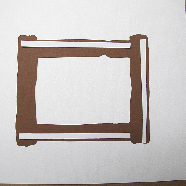
I first assembled the basic cut and the blackout frame feature, adhering them together.  Then I prepared to glue the frame to the printed frame piece.  I wanted to leave an edge open so the picture could slide inside, so after deciding which end I wanted to leave open, I glued the frame to the mat on three sides only.  I used a liquid glue, but for the photo I laid some papers on the frame to show you were I put the glue. I did this to both frames.

FrameToMat

You can see in this photo how the pictures will slide into the frames.  I used a piece of scrap cardstock for demonstration purposes.

FramePic

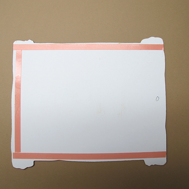
Next was adhering the frames to the layout.  Since I wanted to hide tags behind the frames, I put the adhesive on the back of the frame the same way — gluing only 3 sides.  I marked the back of my frame to indicate which side was open for the photo, so I could be sure and leave the same end open for the tag.  I used the red sticky tape to adhere the frames to the layout.

FrameTape

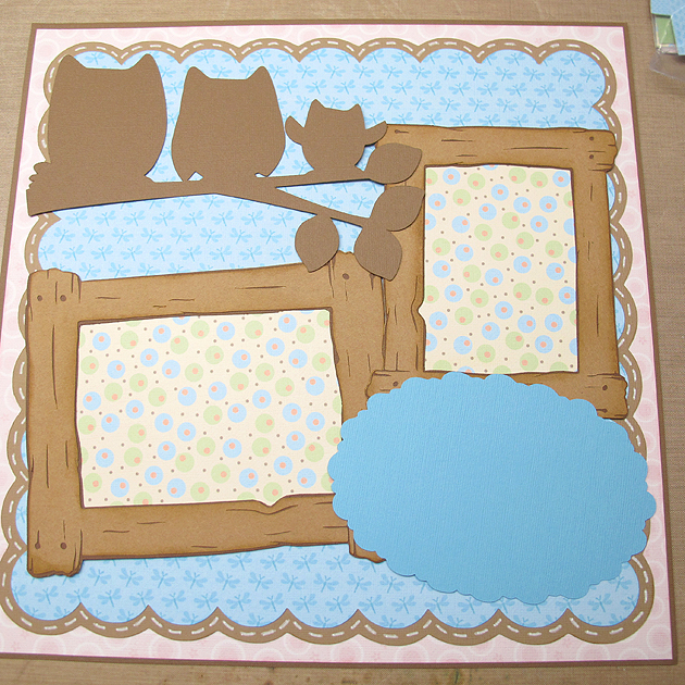
Before attaching the frames to my background, I laid the cut pieces on it to get an idea where I wanted to place the frames.  I made light pencil marks on the background to guide me in the placement.

FramePlacement

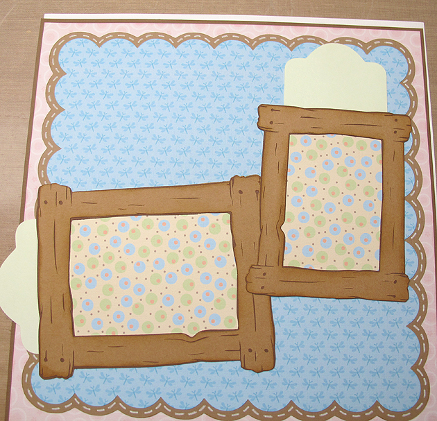
I then checked to make sure the tags slid into the pockets behind the frames.

FramePocket


I made the tags to fit behind the frames, adjusting them in CCR to get the proper fit.  I used Tags, Bags, Boxes & More and the cut is <rndtop2>.  The large tag is 6.5″ x 3.75″ and the small one is 5.5″ x 3.125″.   The lined notebook paper is from  Simply Charmed, cut at 2.75″ x 4.5″ and 3.375″ x 5.375″, with the facial features and holes hidden.  This is a screenshot of the CCR file for the tags.

Tags


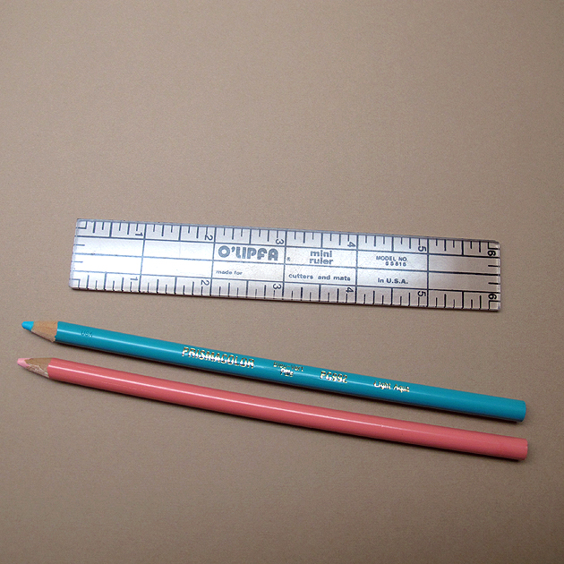
I used a punch to round the corners and a ruler and colored pencils to go over the score marks on the paper to make it look like actual notebook paper.  I just lightly held the pencils to the paper.

ColorPencils

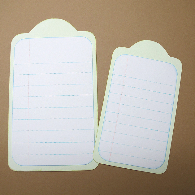
I adhered the notebook paper to the tags.

Tags3

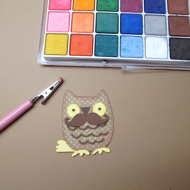
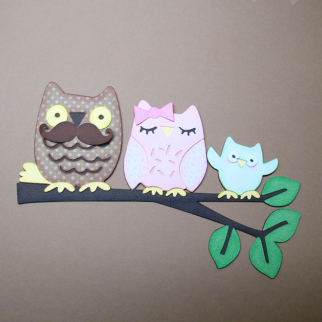
Next up was the owl family.  They were cut at 5″ using Hoot ‘n’ Holler.  After I cut all the pieces, I used chalk and ink to shade them.  I went over all the edges with chalk first, using a pom pom and chalk applicator.  Then I inked the edges using Distress Ink.

Chalk

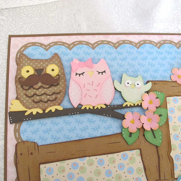
 I assembled each owl first and then glued them onto the branch.  I bought a mustache punch a couple of weeks ago, so I had to try it out on Papa owl.  I think he looks pretty dapper with it.  The bow on Momma owl’s head is from Simply Charmed.  I attached the leaves next.

Owls

After adhering all the owls and leaves onto the branch, I attached the branch to my layout.  The owl cut did not include the flowers.  I used Cricut Essentials, cutting Flower 4 at 1″.  I cut three for the branch and four for the tags.  I used Distress Ink (Squeezed Lemonade) to ink the edges of the flowers and Stickles for the centers.

OwlsCU

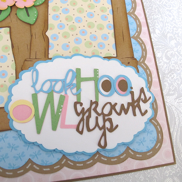
 The title is from Hoot ‘n’ Holler, cut at 3″.  The scallop oval is from Francy Frames and the cut is <fram13lr>.  I hid the inside cut so I ended up with a solid piece.  I resized the oval to fit the title and it measures roughly 5.625″ x 3.75″.

TitleCU

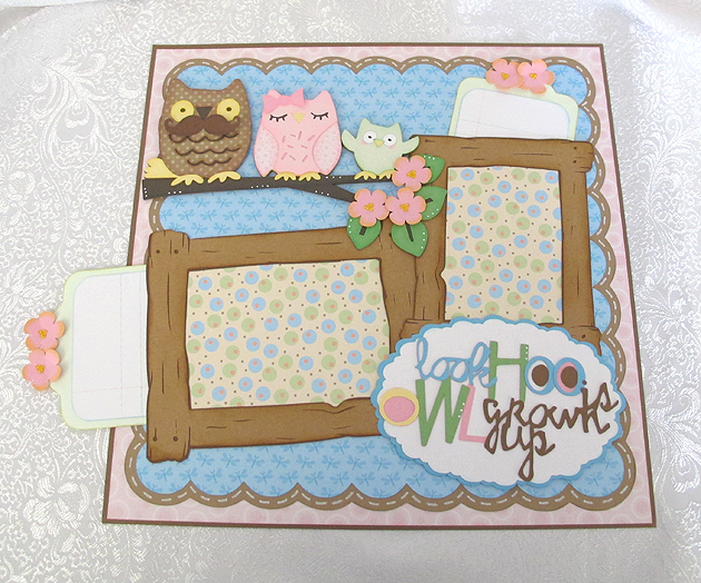
Here is a picture of the completed layout with the tags pulled partially out.  Hiding journaling tags behind your photo mats is easy to do.

LoTags

LO7

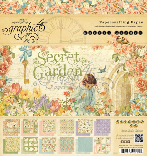
To top off the fun,  I am offering a prize for comments here on my blog.  All you have to do is leave a comment, but only one per person will go into the drawing.  I will leave it open for a week, until May 12 at 8 p.m. (EDT), when I will randomly draw a name.  I am giving away some Graphic 45 goodies — an 8″ x 8″ Secret Garden paper pad and a small matchbook box.
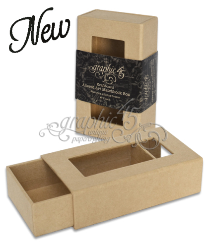
SecretGardenCover copy

SmMatchbook copy

I am sharing a list of some of the talented members of Circleville who have joined together for the weekend festivities and invite you to visit their blogs and see their wonderful projects:

NSD1_edited-200


Cricut cartridges used:  Elegant Edges, Fancy Frames, Hoot ‘n’ Holler, Nursery Tails (Imagine), Pooh and Friends, Simply Charmed, Tags, Bags, Boxes & More

  • Bazzill cardstock
  • Distress Ink
  • Chalk
  • Stickles
 

Cricut Circle Weekend Challenge Card


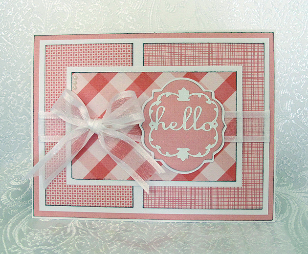
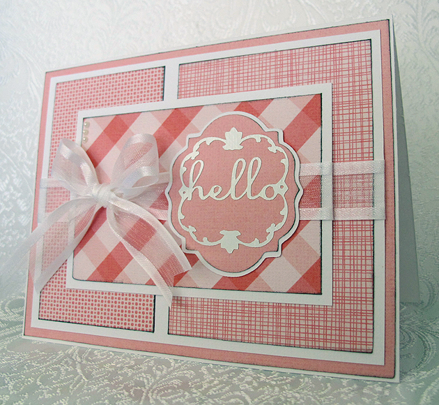
This is a quick card I did for a weekend challenge on the Cricut Circle message board.  Di challenged us to create a project using several tones of the same color.

I decided to go the easy route and went to my Imagine library for my papers, since it would have taken me hours to dig through my paper collection trying to decide what I wanted to use.  I used the Hey Diddle Diddle cartridge and printed out several different pink prints.

Front

The sentiment was cut from the Lacy Labels Lite cartridge at 2″.  The white letters at that size are very intricate, so I cut that layer from white vinyl.  I like using vinyl for intricate cuts because it is like making a sticker – I don’t have to apply any glue to the cut.  At that small a size, I would smear glue all over.  I do take a little stickiness off the transfer tape by sticking it a couple of times to a piece of cloth before applying it to the vinyl.  That way it doesn’t stick too tightly to my paper piece when I apply the vinyl.

Front4

I added some ribbon to two of the layers and then a bow to the top layer.  I also put three small pearls in the upper left corner.

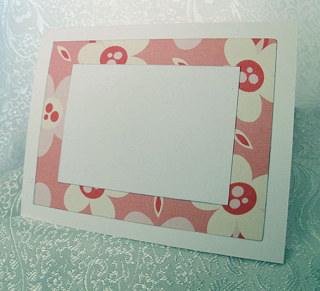
The inside is another piece of the pink print paper with a white piece on top for writing.

Inside

  • Cricut cartridges used:  Hey Diddle Diddle Imagine and Lacy Labels lite
  • American Craft cardstock
  • White vinyl
  • Pearls
  • Ribbon

Butterfly Kisses Baby Girl Card


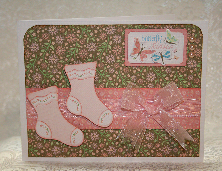
The weekly challenge on the Cricut Circle Blog is a card sketch challenge and you must use at least two Cricut cuts.  I thought I’d make a card on my Imagine, since I haven’t made a complete project using the Imagine.

I decided to make a baby card,  even though I don’t know anyone who is having a baby right now.  But it will be good to have on hand.  Again, for no particular reason, I made the card for a baby girl.

I used the Cricut Imagine cartridge Nursery Tails for this card.  All the paper is from this cartridge, as are the pink socks and the Butterfly Kisses title.  I embossed the brown floral background and the pink contrast strip with my Cuttlebug.  I cut the images in layers and inked around all the edges.   I added some ribbon, attached the socks with foam pop-dots and added three pearls by the tag.

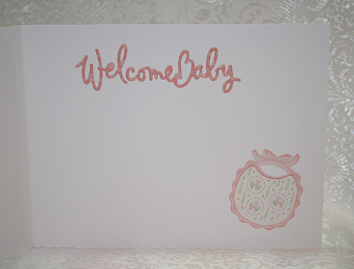
For the inside of the card, I used a Cuttlebug die for the “Welcome Baby” and the bib is from Nursery Tails.

This is a fairly simple card, but I like the way it turned out.

  • Cricut Imagine Cartridge Nursery Tails
  • Cuttlebug
  • Ribbon, pearls

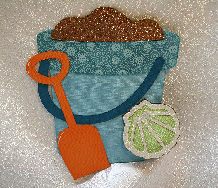
Cricut Circle National Scrapbook Day Crop Color Challenge: Beach Pail Gift Card Holder


To celebrate National Scrapbooking Day ( May 5), the Cricut Circle blog hosted a two-day online event.  There were challenges, tutorials, games, question-and-answers sessions — all kinds of fun.   Unfortunately I was not able to “attend” much of the live portion, but I did manage to make a project for one of the challenges.

When the Circle blog event was posted, I had just finished making eight beach pail gift card holders for a Kelly doll convention (Kelly is Barbie’s younger sister).  So I decided to make another one for the Color Challenge.  The challenge was to create a project using the color inspiration that they provided, which is shown below.  You had to use at least two Cricut image cuts on your project.

This is the picture the Circle blog provided for the color inspiration:

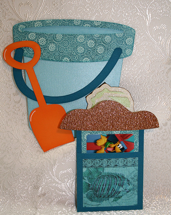
I made this card so that the sand section pulls out of the pail, similar to the flower pot cards where the flowers pull out.  I laid out the entire design in Design Studio.  I used Life is a Beach cartridge for the pail and shovel.  I glued around the outside edges only, leaving the oval section at the top open so the pocket holding the gift card would slide in.  I welded a rectangle from George & Basic Shapes to the sand to form the holder.

All the solid cardstock is from Bazzill and the printed pattern paper is from Graphic 45’s Tropical Travelogue collection — such beautiful paper!  I made the trim on the rim of the bucket using the patterned paper and cut the handle from a darker shade of cardstock.  The sand is cut from some glittered cardstock I bought at my local Joann’s.

Here is a picture showing the sand pulled out of the pail — holding the gift card.

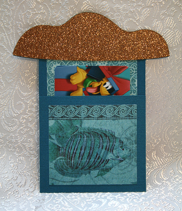
And another picture, showing  a close up of the gift card holder.

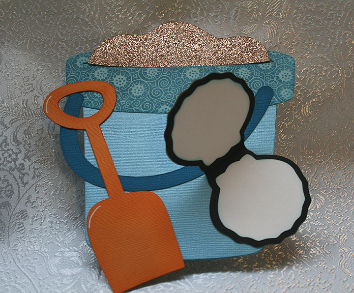
I decided to add a small tag to the card, so there would be a place for some writing.  I welded two shell shapes from Picturesque together to form the tag.  The top detail piece on the shell is cut from a piece of off-white glitter cardstock.  The shell flips open and there is a space on the top and bottom for some writing.

  • Cricut Cartridges:  Life is a Beach, Picturesque, George & Basic Shapes
  • Graphic 45 Tropical Travelogue paper
  • Bazzill solid color cardstock
  • Glitter cardstock


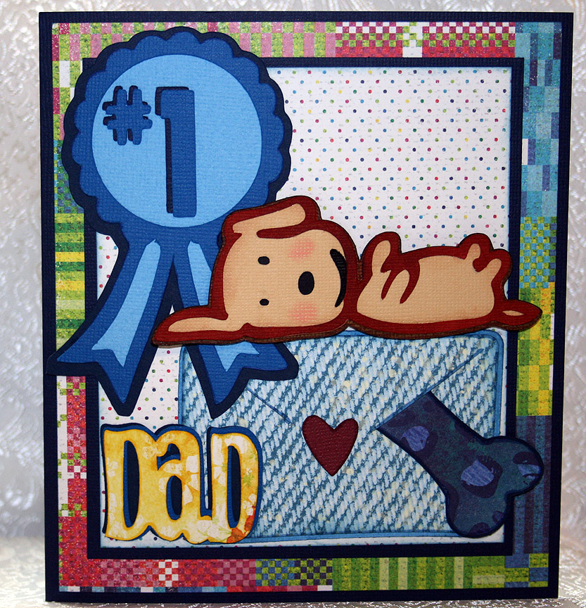
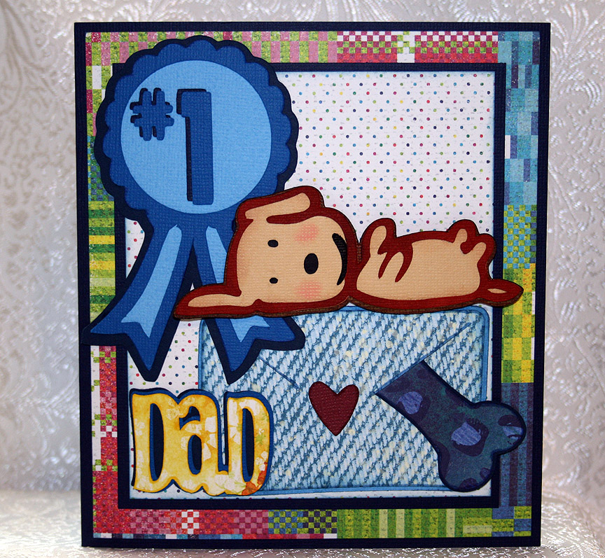
Father’s Day Card From The Smoochy Poochy


I decided to make my dear hubby a Father’s Day card from our dog.  Her name is Fifi and she is a rescue dog — part Pomeranian and part Chihuahua.  She is such a daddy’s girl that I figured he would enjoy it.

I call her our Smoochy Poochy because she loves to give kisses.  She also loves toys — her favorites are the fake fur bones with squeakers inside.  She has an assortment of them in all different types of prints — from giraffe to leopard prints. 

I made this card to enter into two challenges.  The weekly challenge at the Cricut Circle Blog is a sketch challenge, so I followed that for the layout of my card. 

The latest challenge at Cooking With Cricut is a Father’s Day related project that includes a Cricut cut.  I used several Cricut cuts on this card.

I couldn’t find a dog that looked like Fifi, so I opted for this cutie on the Paper Pups cartridge.  I chose this one because the dog is on its back and Fifi has a tendency to go “belly up” while she is sleeping.  The dog is lying on an envelope that she has so thoughtfully placed one of her squeaky bones inside for Dad.  The ribbon and bones are from Paper Pups also.

I used Doodlecharms for the envelope, Beyond Birthdays for “Dad” and Sans Serif for “#1”. 

The solid cardstock is Bazzill and the printed paper is all from Basic Grey — their Lauderdale collection.

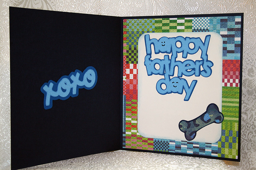
For the inside of the card, I used Paisley for the “xoxo” and Simply Charmed for the “Happy Father’s Day” sentiment.  I added another bone inside.

  • Cricut cartridges used:  Beyond Birthdays, Doodlecharms, Paisley, Paper Pups, Sans Serif, Simply Charmed
  • Bazzill cardstock
  • Basic Grey — Lauderdale collection

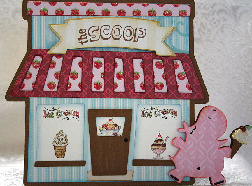
Ice Cream Shop Card for Cricut Circle Weekly Challenge


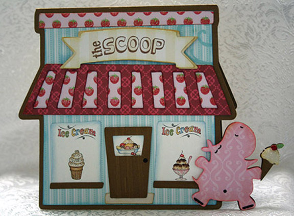
Weekly Challenge #33 over at the Cricut Circle Blog is called the Sweet Summertime Challenge.  You have to incorporate the shape of your favorite summertime treat and use a stamp somewhere on your project.

My summertime treat is easy — it’s the same treat I love all year long — ice cream!!  That being said, I knew right away what my card was going to have on it.  But I decided that I would not only include an ice cream cone but also the ice cream shop.

The lastest exclusive cartridge for Cricut Circle members is Pop-Up Neighborhood.  I was looking through the handbook and really liked some of the buildings.  While I didn’t use the pop-up feature on this card, I did take the bakery and turned it into an ice cream shop.

In Design Studio, I laid out two of the bakery shadow shapes and welded them together at the top.   I remembered the cute little hippo from Birthday Bash, who is blissfully running with her ice cream cone, and knew I wanted her on my card too.  So I laid out the hippo shape onto my base and welded that also.

I cut the shapes from the Sweet Stack by Die Cuts With A View.  The solid color cardstock is from Bazzill.  I used just the two cartridges — Birthday Bash and Pop-Up Neighborhood.   Oops, I just remembered a third cartridge that I used — the Lite cartridge Twinkle Toes.  I cut the banner for the shop name from it.

For the windows on my ice cream shop, I used graphics from Provo Craft — from their pccrafter.com site.  I thought they were perfect with my design.  I used a stamp to do the name of the shop.  I found a clear stamp in a set that I bought from K & Company that said “The Scoop” and when I saw it I knew that would be the name.

I used the Cuttlebug on the front door, the Distressed Stripes folder, and also on the ice cream cone, the Mesh Texture folder.  I needed something with a small pattern because the ice cream cone on the front of the card is quite small and this folder was great.  It gives the look of a waffle cone.  I used coarse glitter on the ice cream itself and red Stickles for the cherry on top.
Front3

This is a happy and fun creation and when I look at my card I can’t help but think of a book Erin had as a child.  It was called Yummers! and featured Miss Emily (a pig) and Eugene (a turtle).  When I look at the pink hippo, she just looks like she is running along thinking, yummers!!

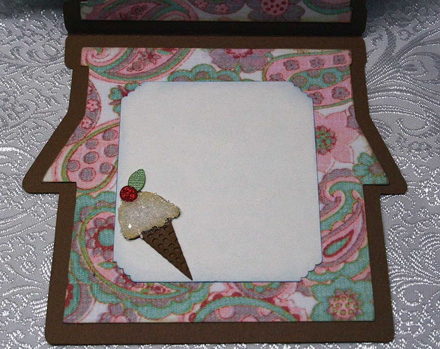
The patterned paper on the inside of the card is from daisyd’s.  I made another ice cream cone, this time a little larger, to adhere to a corner.

  • Cricut Design Studio
  • Cricut cartridges:  Birthday Bash, Pop-Up Neighborhood, Twinkle Toes
  • Cuttlebug folders:  Distressed Stripes and Mesh Texture
  • DCWV — Sweet Stack
  • Bazzill solid cardstock
  • Coarse glitter
  • Red Stickles
Vintage Birthday Card for Cricut Circle Blog’s Monthly Challenge


Here I am, getting another project submitted with just a few hours to spare.  I guess I work better with deadlines closing in on me, although I do not care for the stress.  But who can I blame for procrastinating?  Yep, no one but me!

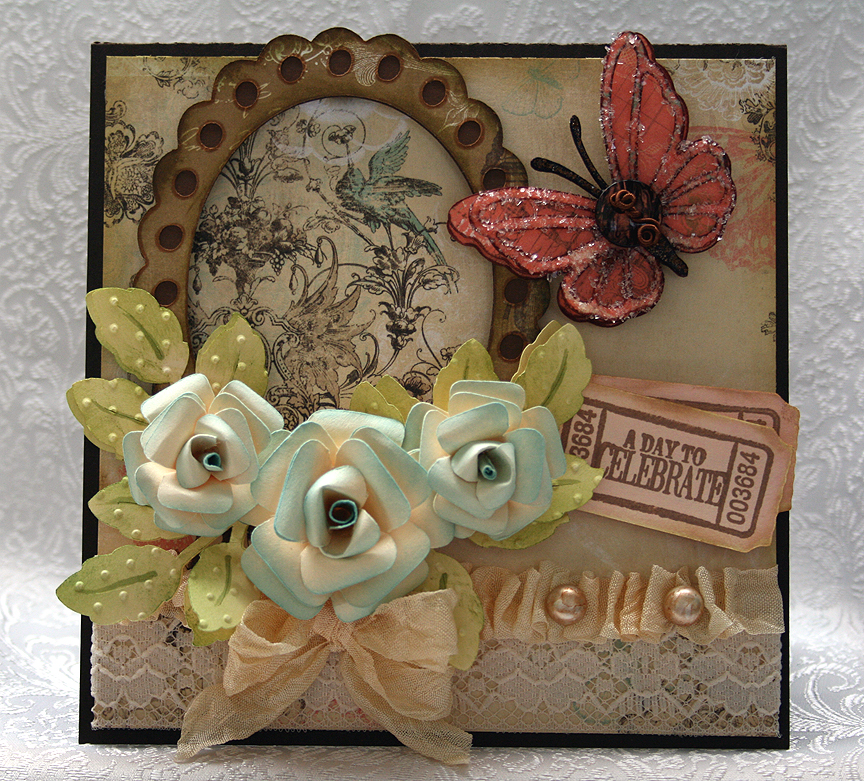
I decided to make a birthday card for my niece and this is my first time trying to make something that looks vintage.  I love the look of vintage but didn’t know how well I would do trying to create it.  I am happy with how it turned out, especially for a first try.

The paper I chose is the reason I went for the vintage look.  I picked up a pad of paper by Bo Bunny when I was shopping last week.  It is the Gabrielle Collection and there are some beautiful designs in it. 

The monthly challenge for May at the Cricut Circle is the Tic Tac Toe Challenge.  The object is to pick three prompts in a row from a tic tac toe grid and to include at least two Cricut cuts.

I chose a diagnoal row, going from the bottom left to the right top — which consisted of:  use a cut of a flower shape, use a ruffle, and use some buttons.

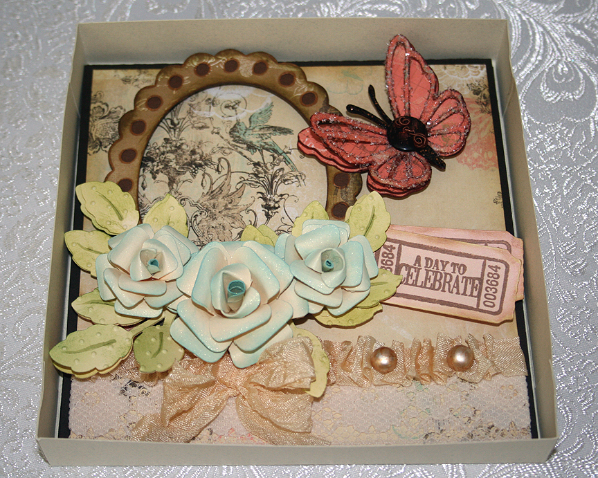
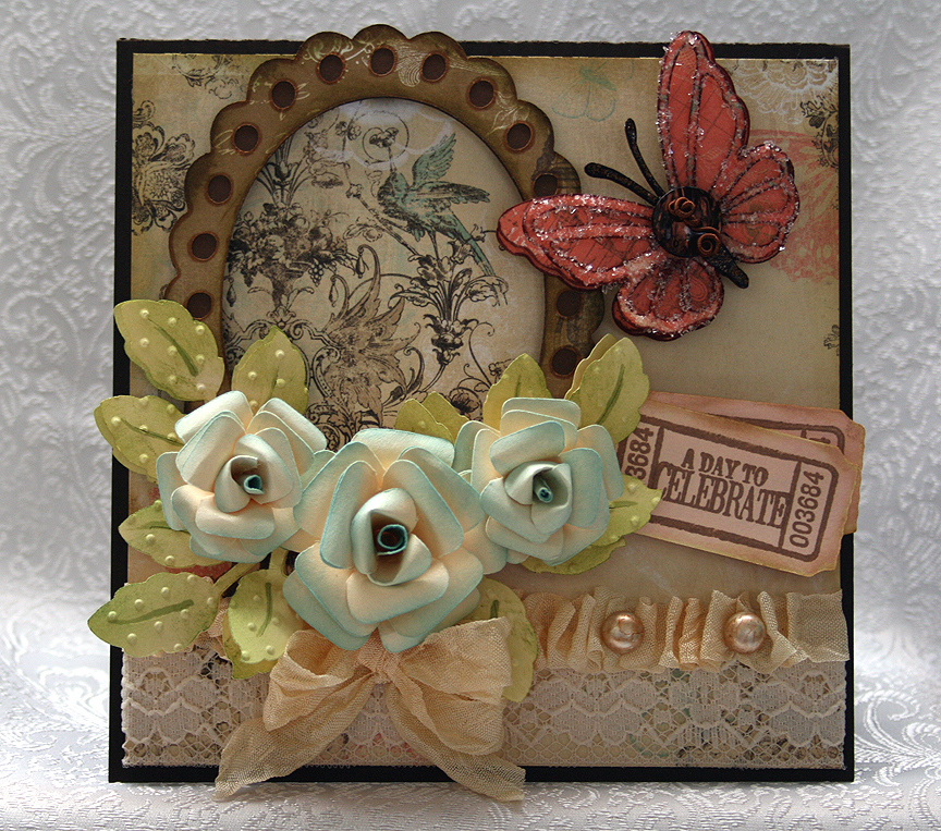
Because the paper is so pretty, I decided to use a frame around one of the designs.  I cut the frame from the Elegant Edges Cricut cartridge.  I made my ruffle from a piece of seam binding and laid down a piece of lace on the paper before adding the ruffle.  The pearls on the ruffle are actually white buttons that I colored with my Copics.  I cut the shanks off the button before gluing them on the ruffle.

The flowers were the most time-consuming part of my card.  I cut them out of plain off-white cardstock using my Accent Essentials cartridge.  I inked all the edges and then formed the cuts into roses.  I sprayed them with Glimmer Mist — sure wish the sparkle showed up in the pictures. 

I cut the leaves from the same off-white cardstock using the Picturesque cartridge, inked them green and then ran them through my Cuttlebug using the Swiss Dots folder.  The butterfly is from the Martha Stewart Elegant Cake Art cartridge.  I found a button in my stash that matched the butterfly beautifully.  I added some Memory Thread to the button and glued it on the body of the butterfly.  On the lacy layer of the butterfly, I added some sparkle using Glossy Accents and Diamond Dust.  I also used Distress Stickles on its body.
I cut some tickets using Wall Decor & More and inked them a light coral color.  I cut the tickets at 2″ and they fit the stamp set perfectly.  I then stamped them with a stamp set from Autumn Leaves called Ticketed. 

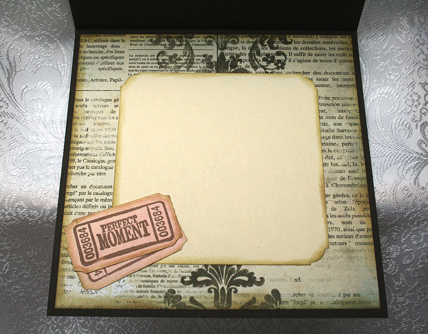
The inside of the card features a different piece of the Bo Bunny paper and another ticket.

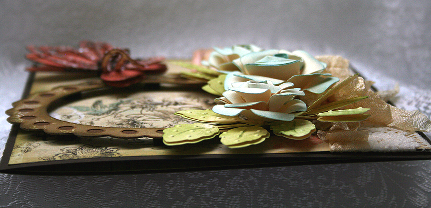
I used lots of foam dots on this card.  Here is a photo showing a side view so you can get an idea of the dimension that this card has.

Since I can’t put this card into a normal envelope, I made a box to hold it.  But I need to take a picture of the box.  I will post the picture once I take it. 

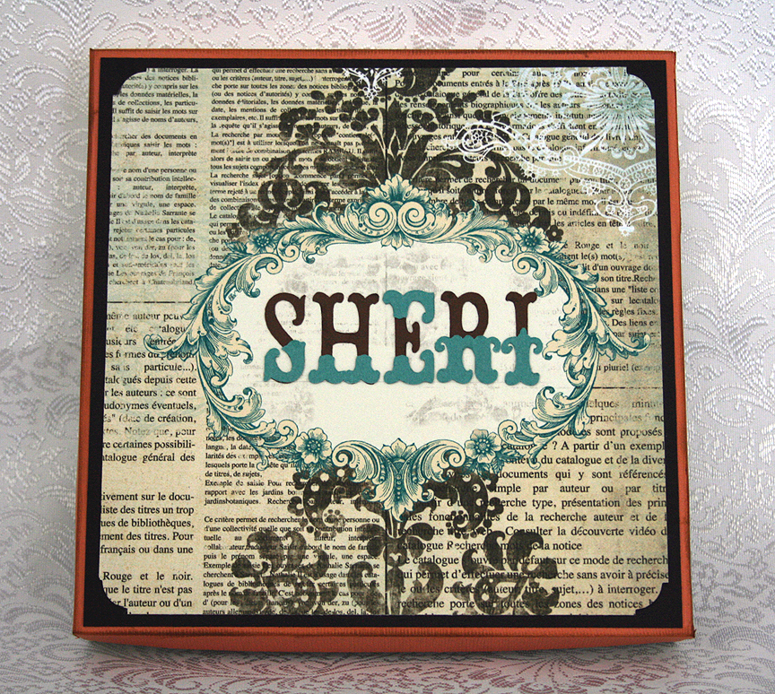
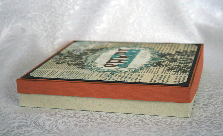
I’m back with some pics of the box.  I ended up adding my niece’s name to the top of the box, which I cut from Storybook.


  • Bo Bunny – Gabrielle Collection
  • Cricut cartridges used:  Accent Essentials, Elegant Edges, Martha Stewart Elegant Cake Art, Picturesque, Wall Decor & More
  • Cuttlebug folder – Swiss Dots
  • Glimmer Mist
  • Seam binding
  • Stickles
  • Autumn Leaves stamps – Ticketed
  • DMC Memory Thread
  • Glossy Accents
  • Diamond Dust
  • Buttons from stash

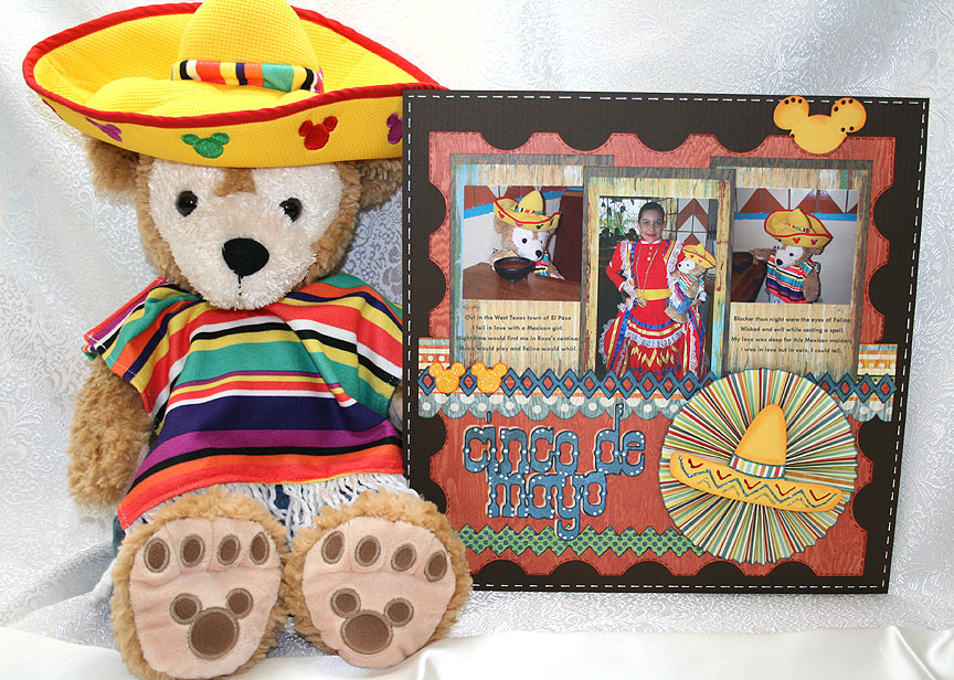
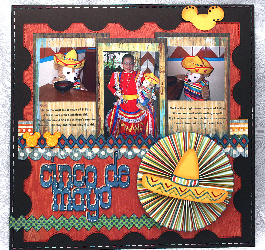
Duffy the Disney Bear Celebrates Cinco de Mayo Layout

Whoo hoo — I’m back with my second layout.  I haven’t posted in quite some time, but I am so excited because my first layout won in the Provocraft contest that was held in conjunction with the launch of the new Cricut Expression E2.  I was the next-to-the-last winner announced on Provo’s Facebook page and couldn’t believe my eyes when I saw my layout pictured on their wall.

This is my first “major award”  — and what did I win?……A new Cricut Expression E2 — whoooo hoooo.  It has already arrived and I hope to start playing with it soon.  Thank you so much Provo Craft!!

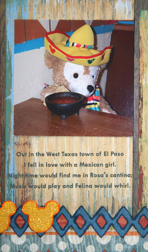
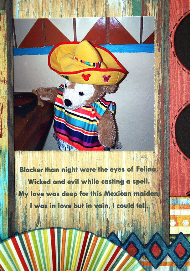
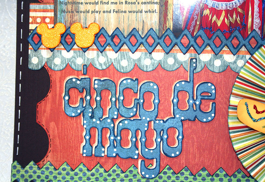
I created this layout to enter in the latest Cricut Circle Blog weekly challenge, which ends in just a few hours.  This is a sketch challenge and you have to follow the sketch posted on the blog.  It always takes me time to come up with inspiration, particularly when doing layouts.  Hopefully as I gain more experience the ideas will come more quickly. Now for a little background info about this layout.  Erin (my daughter and co-conspirator on this blog) is currently living in Taiwain and is a huge Disney fan.   She has visited all five parks many times.  She got bit by the Duffy Bear bug while on a visit to Tokyo Disneyland.  Duffy is Mickey Mouse’s teddy bear, sewn by Minnie Mouse to keep Mickey company while traveling.  Notice his face is shaped like Mickey’s head.  While Duffy was exclusive to Tokyo Sea, he is now being featured at Disney World, Disney California Adventure, and Hong Kong Disneyland. Erin brought me a Duffy and Shellie May (the girl version, and still only available at Tokyo Sea) on one of her visit’s home.  She has since given me a Duffy bear from Hong Kong Disneyland, and I added two of my own from California Adventure.  While Erin’s bears have traveled all over the world (Japan, Hong Kong, France, the Netherlands, Belgium, Germany, Switzerland, Luxembourg, Tahiti, Belize, to name a few), my bears are content to reside mainly in California. Living in Taiwain, Erin is about 15 hours ahead of our time here in California.  For Cinco de Mayo, she posted pictures of one of her Duffy bears celebrating Cinco de Mayo on her Disney travel blog, Pooh’s Travels.   She dressed him in his outfit from Mexico and shows him sitting at the dinner table with a meal of chicken taquitos and mango margaritas spread out before him.  As soon as I saw her post I knew I had to do something special with one of my Duffy bears for Cinco de Mayo so I could send pictures to Erin. As my hubby and I had plans to go to Acapulco restaurant for dinner on May 5, I dressed my bear in his serape and sombrero and he tagged along.  Yep, we took a bear to dinner!  The older I get the less I seem to care if people think I’m crazy! I took a couple of pictures of him sitting in the booth with chips and salsa.  And my hubby is the one who put the chip in Duffy’s paw and moved the salsa close to him.  But the coolest part was that the restaurant had this beautiful young lady acting as a greeter for Cinco de Mayo and she was all dressed up in a gorgeous outfit from Mexico.  On the way out of the restaurant I asked her if Duffy could take a picture with her and she obliged.  I couldn’t wait to get home and send the pictures to Erin. When I first saw the pictures, I thought Duffy looked like he was sitting in a cantina and a song immediately came to mind — El Paso, by Marty Robbins.  So I included the first two verses when I sent Erin the pics and decided to include them on my layout too.

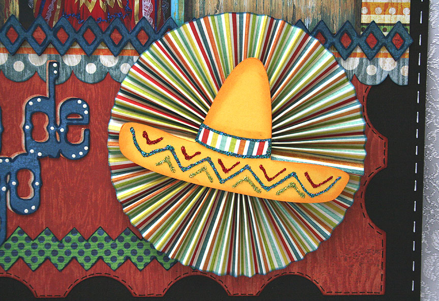
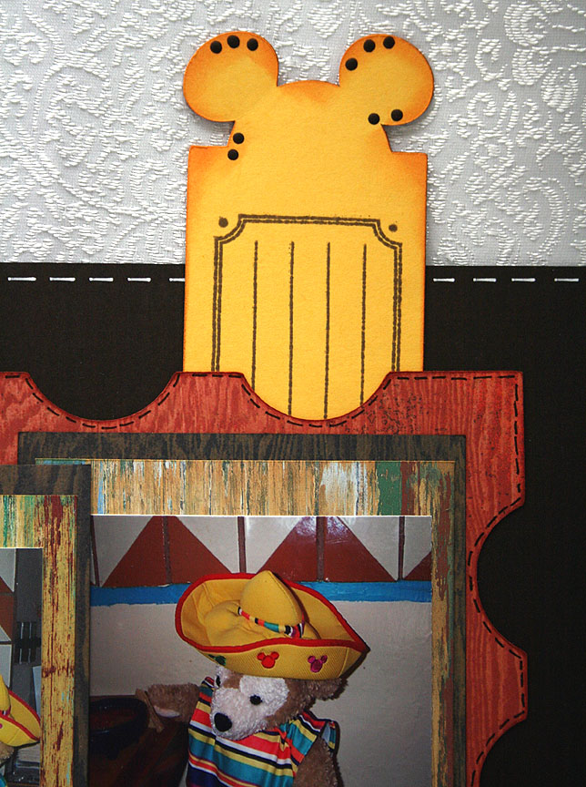
The patterned paper I used on this layout is from Basic Grey, their Life of the Party collection.  The cartridges I used are Elegant Edges for the stamped background mat and the diamond trim at the bottom of the pictures, Old West for the title, Mickey & Friends for the Mickey heads (I welded one to a rectangle for the tag that pulls out at the top), and Wild Card for the sombrero.

  • Basic Grey — Life of the Party
  • Cricut cartridges:  Elegant Edges, George & Basic Shapes, Mickey & Friends, Old West, Wild Card
  • Stickles
Bring It On — 1st Card of 2011!!


I haven’t posted in a quite a while.  I’m still busy with the business, so that is a good thing.  I decided to take a little down time and make a card.  The nice thing is that this card fits so many challenges that are starting off the new year. 

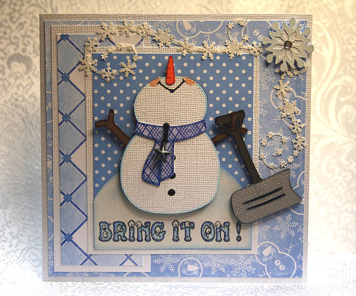
I made a whimsical snowman, who is looking up and telling Mother Nature to “bring it on!”  He is all prepared — he has his snow shovel at the ready.

The patterned paper is by Die Cuts With a View (DCWV) — from one of the holiday stacks that I picked up at Jo-Ann’s.  I cut the snowman with my Cricut using the Doodlecharms cartridge.  I used Design Studio to hide his face so I could move his nose to the top in order to have him looking up into the sky.  I sure hope this is what he looks like, and not some strange looking snowman/unicorn creature.

The snow shovel is cut from the Sesame Street Friends cartridge, the snowman’s scarf from 3 Birds on Parade, the large snowflakes from Accent Essentials, and the snow flurry swirls are from Calligraphy.  I printed the sentiment on the computer using a free font that I downloaded.  It has little snowmen faces peeking out of the letters.  I colored the letters using Copics.

I cut the flurry swirls from a transparency sheet (acetate) so they would be clear.  I then took some white paint and dabbed on them to give them a little opacity, but not too much.  I wanted them to remain in the background when I glued on all the small snowflakes, which I made using a Martha Stewart snowflake border punch.  I used the negative cuts (the part that usually gets thrown away).  Gluing those little snowflakes was a tedious job.

The finishing touches include a small metal star charm hanging from the snowman’s scarf and some rhinestones in the centers of the large snowflakes.  The charm was gold but I thought it looked too stark on the card, so I took my Copics and changed the color. 


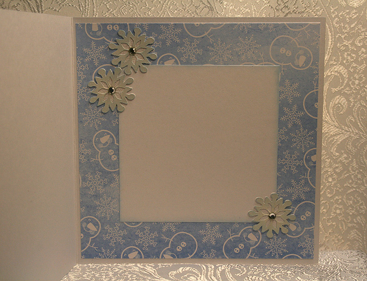
I placed three of the large snowflakes on the inside of the card:

Here are the challenges that I am entering :

Circle Blog Weekly Challenge #15:  Feeling Frosty!  The requirements are to use white paint, a snowflake and something metal.  I think I covered all of those bases with this card.

Jitterbuggin’ Challenge – Sketch 29 – Let It Snow!:  The requirements are to follow the sketch, use blue somewhere on the card, and include something snow related.

Fantabulous Cricut – Challenge Me Monday #41 – Snowy Delights:  The requirements are to create a project using snow or snowflakes.

Cooking With Cricut – Snow Fun!:  The requirement for this challenge is any project with snow or winter-time activities.

Made By Momo:  Make something with a snow theme.

My Sheri Crafts Challenge #39 – Winter:  What winter means to you. 

  • DCWV patterned paper
  • Cricut cartridges used:  Accent Essentials, 3 Birds on Parade, Calligraphy, Doodlecharms, and Sesame Street Friends
  • Clear acetate (transparency)
  • Martha Stewart snowflake border punch
  • Charm from stash
  • Rhinestones
  • Copics

Cricut Circle Magazine Challenge for November – Little Deer Shaker Ornament


The first thing I have to say is how excited I am again — my penguin shaker ornament card was one of the winners at the Fantabulous Cricut Challeng Blog.  Thank you so much FCCB!!

Now on to the Cricut Circle magazine challenge, which I forgot all about when I made my penguin shaker ornament last week.  I posted my ornament card on the Cricut message board, and a fellow Circlet asked me if I was going to enter my card in the Circle magazine challenge.  She was even kind enough to give me the link.  I went to the website and reviewed the rules and saw that the project must be newly created, so I figured my penguin card would not qualify — especially since it had just won a challenge.  With time running out on the magazine challenge, I decided to create a new shaker ornament card especially for it. 
For this challenge, which is only open to Circle members, the project has to have at least four Cricut cuts and also use one other Provo Craft product — like the Cuttlebug, Yudu, etc. 

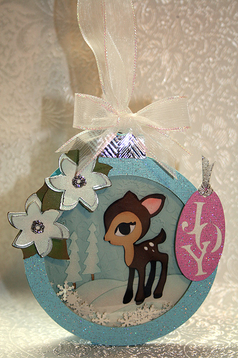
I made another shaker ornament card, only this time I put a deer inside.  I used Core’dinations Core Couture cardstock for the ornament — I like it’s glittery look.  I used the ornament from Joys of the Season cartridge.  I used Cricut Design Studio to weld two ornaments together to make the card.  I also welded a rectangle from George and Basic Shapes to the bottom so that the card can also stand alone if it is not hanging on the tree.
The deer is one of my favorite cuts and he is from the Cindy Loo cartridge.  The snowy hills are from Country Life, the trees from Christmas Cheer, the poinsettias from Winter Woodland, and the tag is from Very Merry Tags.  I cut the poinsettias from white cardstock and inked them blue.  I edged them using a Krylon Silver Leafing Pen and added silver Stickles to the centers.   

I used my Cuttlebug to emboss the background cardstock in the shaker using the Snowflakes embossing folder.  I also embossed the tops of the ornament, which I cut from silver metallic cardstock, using the Herringbone embossing folder. 

I used a Martha Stewart border punch to make the snowflakes that shake around in the card, using the negative cuts from the punch. 

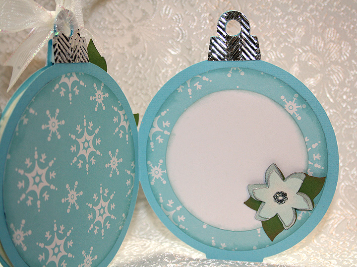
As I did on the penguin ornament card, I put the silver tops on the insides and back of the card.

  • Core’dinations Core Couture cardstock
  • Cricut cartridges:  Christmas Cheer, Cindy Loo, Country Life, George and Basic Shapes Joys of the Season, Very Merry Tags and Winter Woodland
  • Cuttlebug embossing folders:  Herringbone and Snowflakes
  • Martha Stewart snowflake border punch
  • Silver Stickles
  • Krylon Silver Leafing Pen