Chalkboard Birthday Card


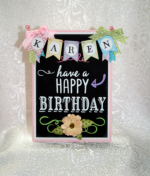
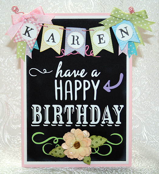
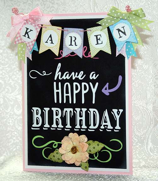
I was inspired by chalkboard art on Pinterest to create this birthday card for my sister-in-law, using Cricut’s new Chalkboard Fonts cartridge. When I first saw this cartridge, I didn’t know that much about chalkboard art or how popular it is right now.  Now it is one of my favorite cartridges.

The solid  cardstock on this card is the Recollection brand from Michaels. The patterned paper on the banner was printed on my Imagine using the Blossom and Imagine More Cards cartridges.  The leaves are from a scrap of Graphic 45 paper.

FrontSm

The card is 5″ x 7″, matted with a white layer.  The black (chalkboard) layer is inked with white on the edges.  I also lightly smudged white ink on the front so it looks like an actual blackboard.  The lettering and swirls are all from the Chalkboard Fonts cartridge, cut from vinyl.

Front10

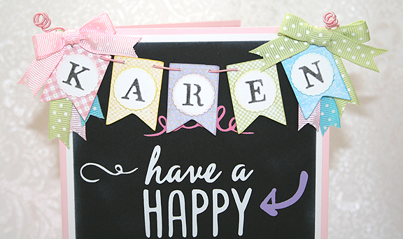
The banner is from the Birthday Bash cartridge, cut at 1.25″.  For the letters on the banner, I used a Cuttlebug Embossing Plus folder called Monogram Seals.  I inked the letters with black ink.  The banner is hung from the card with DMC Memory Thread.  I added some ribbons and bows and curled the ends of the Memory Thread by wrapping them around a chopstick.

Banner

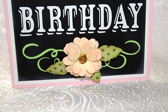
 The flower is also made with the Cuttlebug, using the Daisy quilling kit.  The petals are light yellow, inked with pink on the edges.  I brushed Glossy Accents on the completed flower and sprinkled it with coarse, clear glitter to add some sparkle.

Flower

 I will make a box for this card, since it is a little bulky to place in an envelope, and send it to my sister-in-law.  I hope she likes it.

Front7

  • Cricut cartridges:  Birthday Bash, Chalkboard Fonts, Imagine Blossom and Imagine More Cards
  • Cuttlebug:  Monogram Seals Embossing Plus folder, Daisy quilling kit
  • Vinyl
  • DMC Memory Thread
  • Ink
  • Ribbon
Circleville 2013 NSD – Oh The Places You’ll Go! Challenge


I just completed my second project for Circleville’s NSD Challenges.  This one is hosted by Marty (Eyelet on the message board) and she gave us a sketch to follow.  I made a card.

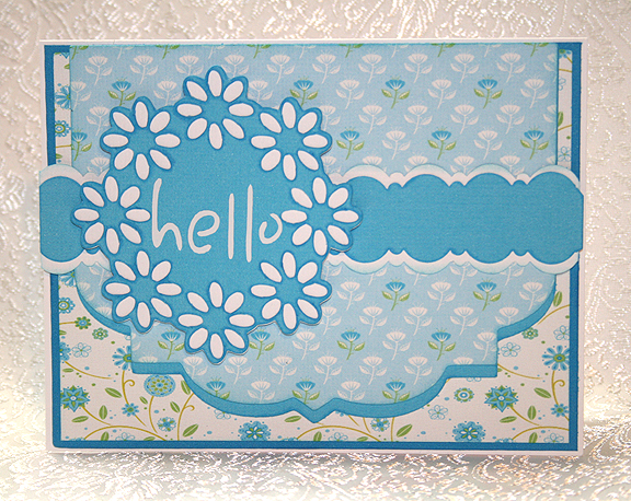
I used my Imagine again, printing the papers from the Floral Emporium cartridge.  It was my first time using this cartridge — it has some really pretty patterns on it.  I printed both the patterned and solid paper.

Front5

Here is the sketch:

card sketch.jpg

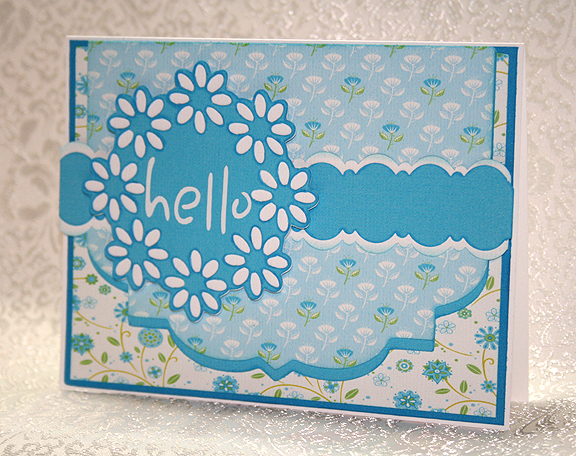
The blue flap (don’t know what else to call it) is from Elegant Edges <Eyelt1-s>.  I stretched it some in each direction in CCR to get it to the size of the card.  I then copied that shape and stretched it a bit more to get a shadow.  The circle of flowers is from Paper Trimmings <Flower8><Circle>, cut at 3″.  The sentiment is from Sentimentals <Letter2><Layer>, cut at 2.5″. Because the letters are so thin and small, I cut them from white vinyl.

The band on the card is two strips of cardstock, one 1″ wide, the other 1.25″ wide.  I used an EK Success border punch on them, Deco Scallops.

Front3

  • Cricut cartridges — Elegant Edges, Floral Emporium (Imagine), Paper Trimmings, Sentimentals
  • EK Success Deco Scallops border punch
  • White vinyl

Circleville NSD 2013: Go Big Or Go Home! Challenge


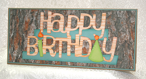
I made this card for one of  Circleville’s NSD Challenges.  The Go Big Or Go Home Challenge was created by Sara.  She challenged us to create a layout or card  using an oversized photo or title.

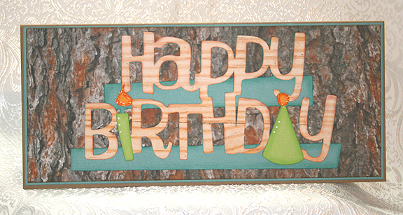
I made a card, since I needed one for my younger brother’s birthday today — he turned 64.  He recently bought a wood lathe and has been having a blast making some beautiful wood projects, so I wanted to use a wood theme for his card.  I pulled out my Imagine Snapshot: Nature cartridge and printed a bark pattern for the background and a lighter wood grain pattern for the letters.

Front10

The card itself is made from kraft paper.  Happy Birthday is from Something to Celebrate and is cut at 3.5″.  I inked and chalked all the pieces before gluing them together.  This card is simple, but I really like how it turned out.  I put some money inside so my brother can go to the wood store and get something he wants.

Front9

  • Cricut cartridges – Snapshot: Nature (Imagine), Something to Celebrate
  • Chalk
  • Ink
  • Stickles

Cricut Circle Weekend Challenge Card


This is a quick card I did for a weekend challenge on the Cricut Circle message board.  Di challenged us to create a project using several tones of the same color.

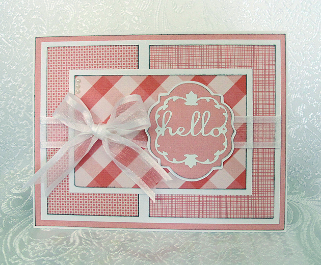
I decided to go the easy route and went to my Imagine library for my papers, since it would have taken me hours to dig through my paper collection trying to decide what I wanted to use.  I used the Hey Diddle Diddle cartridge and printed out several different pink prints.

Front

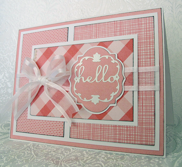
The sentiment was cut from the Lacy Labels Lite cartridge at 2″.  The white letters at that size are very intricate, so I cut that layer from white vinyl.  I like using vinyl for intricate cuts because it is like making a sticker – I don’t have to apply any glue to the cut.  At that small a size, I would smear glue all over.  I do take a little stickiness off the transfer tape by sticking it a couple of times to a piece of cloth before applying it to the vinyl.  That way it doesn’t stick too tightly to my paper piece when I apply the vinyl.

Front4

I added some ribbon to two of the layers and then a bow to the top layer.  I also put three small pearls in the upper left corner.

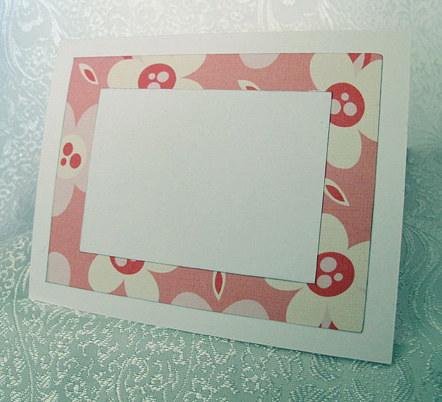
The inside is another piece of the pink print paper with a white piece on top for writing.

Inside

  • Cricut cartridges used:  Hey Diddle Diddle Imagine and Lacy Labels lite
  • American Craft cardstock
  • White vinyl
  • Pearls
  • Ribbon
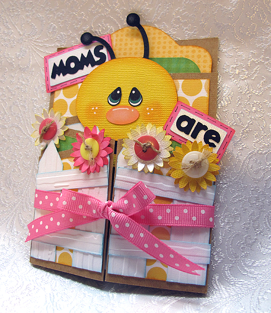
Cute Bee Card Created in Cricut Craft Room


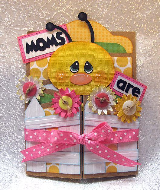
I spent most of this weekend creating this card in Cricut Craft Room.  I found a cute paper piecing card from Treasure Box Designs and fell in love with it.  When I saw the card, I wondered if I could create it in Cricut Craft Room.  I thought the cute bee on the Create a Critter cartridge would be perfect for it.

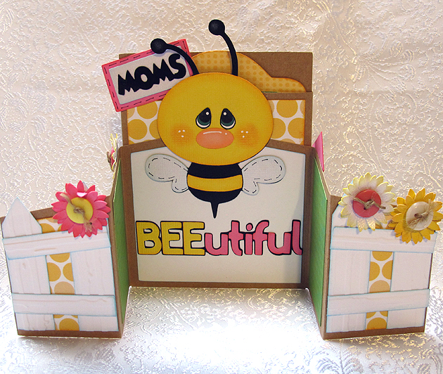
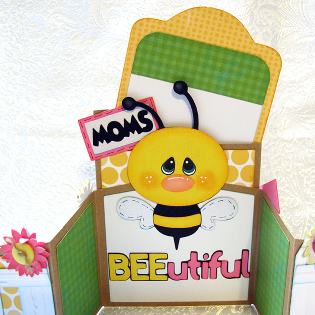
When a challenge was posted on the Cricut Circle message board to create a project in conjunction with Circle Mania that was going on in Atlanta, I decided to get cutting.  I was so happy that my design for the base of the card worked the first time I cut it.  I’m not sure how to describe this card, maybe a gate-fold card with a pocket for a tag in the back.

Card

Open

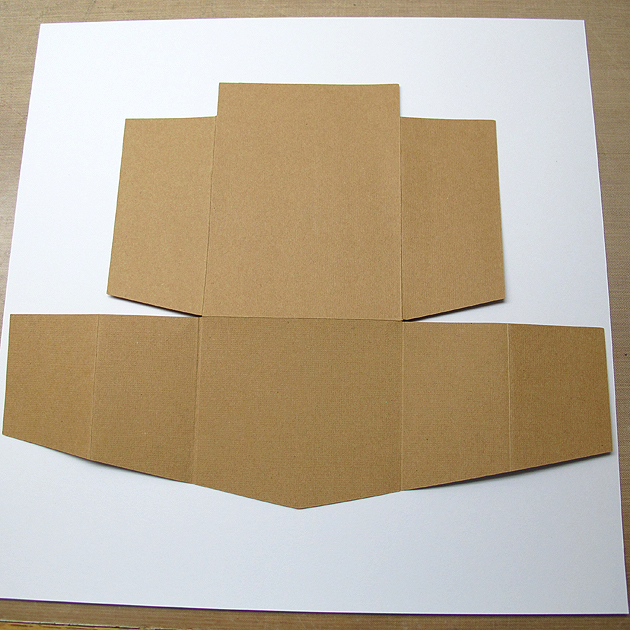
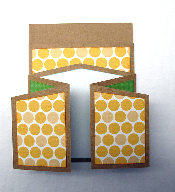
I cut the card base from kraft cardstock.  This is what the piece looked like after cutting and scoring.  And maybe you can see why it took me so long to design this card — I was doing a lot of figuring!  I used George and Basic Shapes and Cricut Craft Room Basics to design the card base.

ScoredPiece

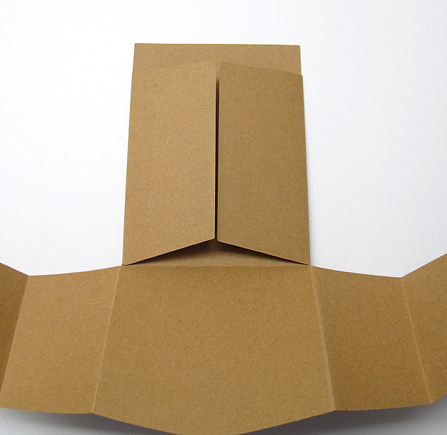
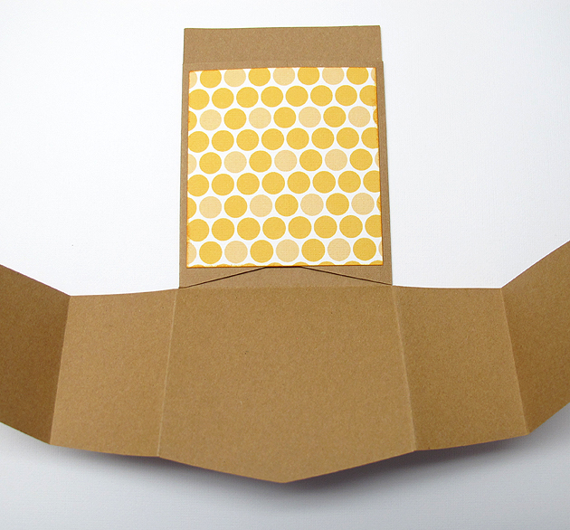
 After scoring, the first step was folding the edges of the pocket towards the center.

FoldPocket

 I printed all the patterned paper for this card on my Imagine.  I love that I can print the exact paper that I want when creating a project.  I used three cartridges for the paper, Bubble Gum Stripes for the gold circles, Blast Off for the green checks, and Hopscotch for the gold print on the tag.

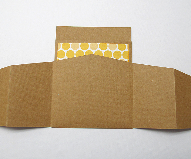
I adhered the piece over the pocket, being careful to not glue the bottom.  I applied glue to the top and side edges only.

GluePaperPocket

Next I folded the bottom piece up towards the top.  I glued the center section of the bottom piece and attached it to the pocket.  Again, I only glued three sides — the top and two sides.  I did not glue the bottom.

FoldUpBottom

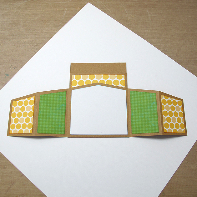
The next step was attaching the patterned paper to the panels on the card.  I cut two of the gold circles for the very front pieces and four of the green checked paper.  I attached a white piece of paper to the center panel.  It then looked like this.

GluePaperFront

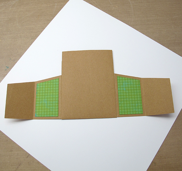
I adhered two green checked pieces to the back of the panels, as they show on the front when the card is folded.  This is a view of the back of the card, showing the two panels.

GluePaperBackSide

And here is what it looks like from the front, with the panels folded up.

GluePaperNoTag

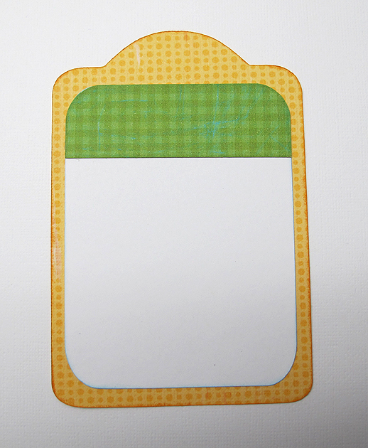
The tag was cut from Tags, Bags, Boxes & More.  The dimensions of the tag are roughly 3 3/8″ x 5 3/8″.  I adhered the white panel to the tag.  I also cut a piece of green checked paper for the top and rounded the upper corners with a punch.  I adhered that to the white panel on the tag, so the white didn’t show when the tag is in the pocket.

Tag

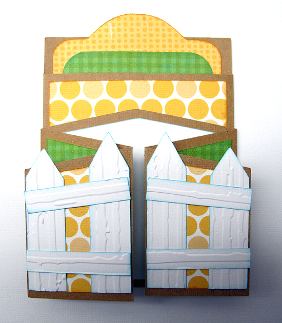
The fence posts are also from Tags, Bags, Boxes & More.  They are the pointed tag, just made skinny and with the hole hidden.  I cut four of the posts, with two of them being slightly taller.  Those I adhered to the center front of the card.  I ran the fence posts through the Cuttlebug using the Distressed Stripes folder before gluing them down.

GlueFence2

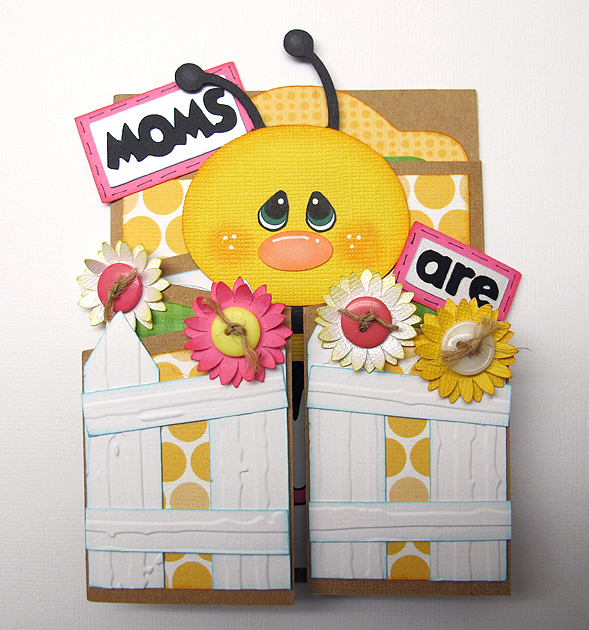
Next, I assembled the bee, flowers and letters.  The flowers were cut at 1″ using Flower Shoppe, using two layers for each flower.  I inked the edges and curled up the petals on the top layers.  I ran some twine through buttons and glued them to the center of the flowers.

The bee was cut at 4″ using Create a Critter.  I hid the facial features and used an oval that I made using Cricut Craft Room Basics (I squashed a circle until I got the shape I wanted) for his nose.  For his eyes, I printed out a free cut file I got at The Beary Scrap.  I don’t quite feel confident enough to try and paint my own eyes.  I did think about adding eyelashes but decided not to because I cut the bee’s face from textured cardstock.  I know my pen marks would have been all over heck and I would not have been happy.

The lettering was done using Craft Room Basics and Mickey Font.

BeeFlowers

All that was left was to adhere these pieces to the card.  I attached the bee first.   After he was adhered to the card, I glued the sentiment on and then the flowers.  My card looked like this.

GluingFlowers

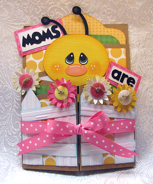
To keep the front of the card closed, I tied a ribbon around it.
Card2

I’ll add a few more pictures, showing the card open and the tag part way out.  I am very happy with how it turned out — made me feel all the work was worth it.  I will cut this card base again — I can picture many uses for it.  And I will also make the bee again, but with a different sentiment.  My mom is no longer living and this is the first Mother’s Day card I have made since she passed away.  I will probably give it to a friend or relative.

GluingInside

TagPartOut

Card3

  • Cricut Craft Room
  • Cricut cartridges used:  Cricut Craft Room Basics, George and Basic Shapes, Create a Critter, Flower Shoppe, Mickey Font, Tags, Bags, Boxes & More
  • Cricut Imagine cartridges used:  Blast Off, Bubblegum Stripes, Hopscotch
  • Cuttlebug — Distressed Stripes folder
  • Ink
  • Chalk
  • Buttons
  • Ribbon
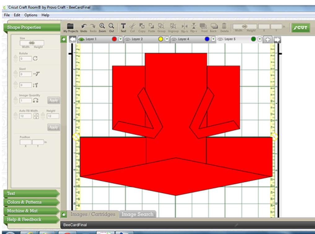
I’m going to add one last phot photo, which is a screen shot of my CCR file, to show what shapes I used to create the card base.  I hope this will help others wanting to re-create it.

ScreenShot

Window Card Using Cricut Creative Cards

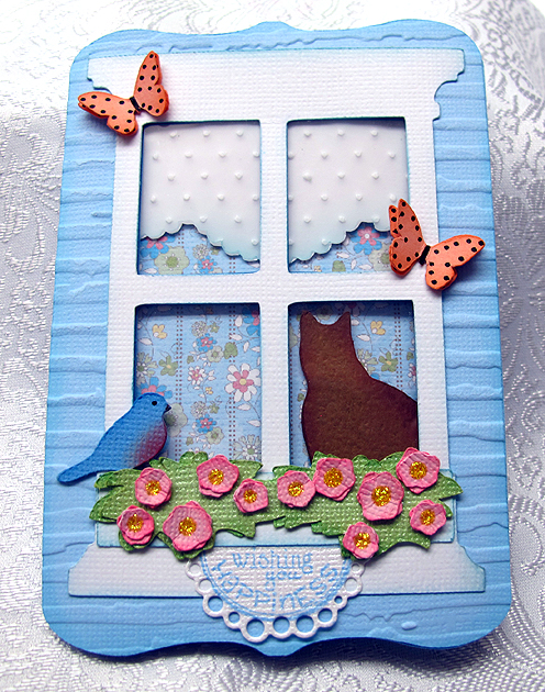
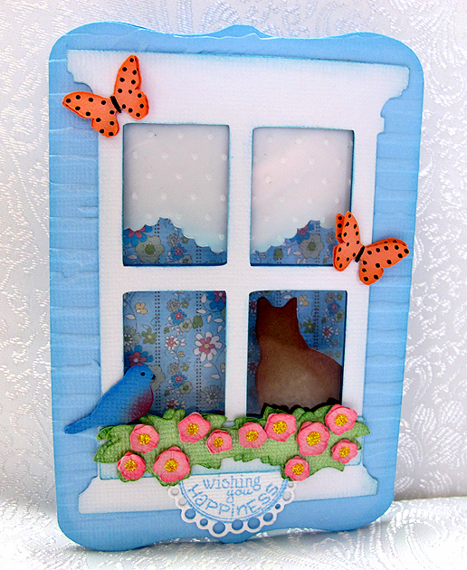
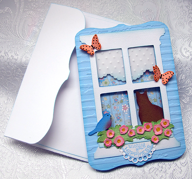
There is going to be a new Cricut cartridge available on February 21, 2013 and it is called Creative Cards.   For one week only, from February 14-20, there are seven cards and envelopes from this cartridge available to use for free in Cricut Craft Room.  I was  happy I found time to try one of these cuts — I chose to make the window card.

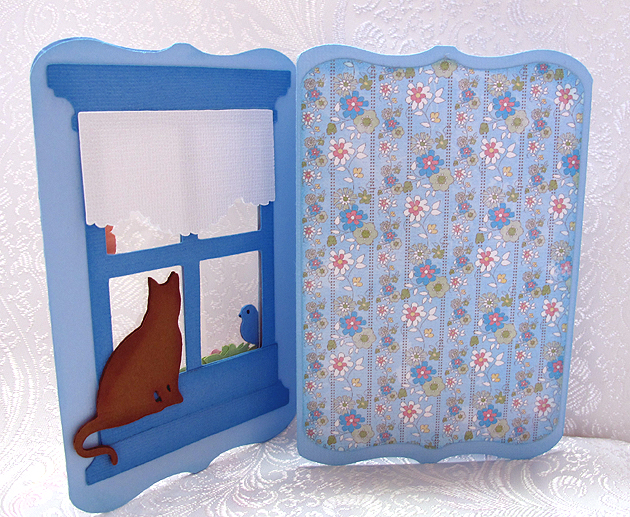
I really like this card, so much so that I will surely purchase Creative Cards.  I think the window card is called a tri-fold card.  I like this because the inside of the card, where I will write my greeting, is not visible through the window.

A

I made my card using spring colors and the first thing I did was decide what paper was going to show through the window.  I wanted something that looked like wallpaper, so it would look like the inside of a house.  I looked through my Imagine cartridges and found a striped print I liked on the Blossom cartridge.  After picking out my wallpaper, I decided my card would be blue.  All the small pieces were cut from scraps.

The card is cut at 5″ and the finished size is about 3.5″ x 5″.  I cut an extra front panel and ran it through the Cuttlebug using the Distressed Stripes embossing folder so that it would look like siding on a house.  I cut a piece of clear acetate and adhered it between the two front pieces to give the appearance of glass.

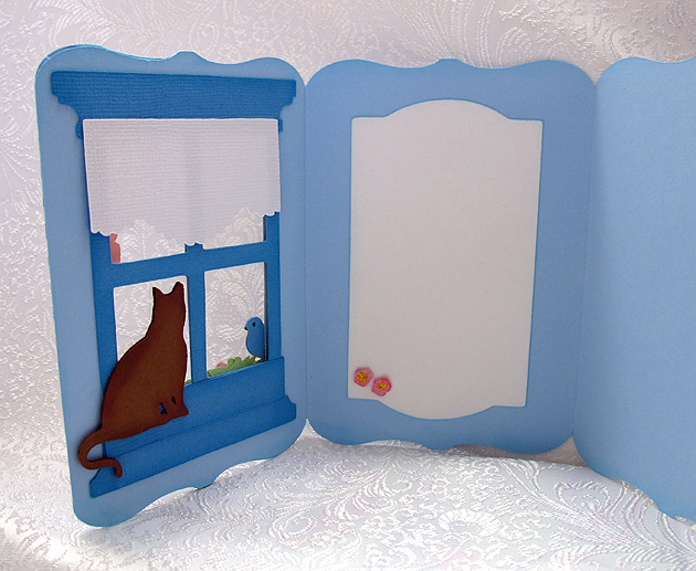
The curtain is a piece of vellum run through the Cuttlebug using the Swiss Dots folder, backed by a piece of white cardstock.  The outside window and flower box are white.  I cut an extra window in a darker blue and used it on the inside because I wanted a finished look in there too.

Inside2

The bird and butterflies are from Creative Cards and both were cut at 2.5″.  The only other cartridge I used was A Child’s Year to cut the silhouette of the cat, which was cut at 2″.  I inked and chalked all the pieces before assembling the card.  I used Stickles for the centers of the flowers.

Card6

The sentiment below the flower box is from Whimsy Stamps and it is from their Celebration Circle Pennants set.  I cut it out using the matching die.  This was my first time using both the stamps and die, and I am very happy with how it turned out.

On the inside of the card, I added a white mat to write on.   It is the inside of the window from the card cut — I just hid the outline for the card and cut only the window.  I embellished it with a couple of the same flowers from the window box on the front.

Inside

The last step was making the envelope, and that turned out to be an easy task.  I simply cut the envelope at the same size I cut the card, which was 5″.  I scored along the two side flaps and then at both the top and bottom.  I folded at the score marks and then inked all the edges.  I glued the bottom to the side flaps and the envelope was done.  I’ll seal the top flap when I send the card.

Envelope


  • Cricut cartridges:  Creative Cards, Imagine Blossom, A Child’s Year
  • Ink & Chalk
  • Whimsy Stamps
  • Stickles


Welcome Spring — Cricut Campin’ Critters

This little card is for the Spring is in the Air weekly challenge at Bitten by the Bug 2.   The seasons may be more subtle here in California than in other states, but I always look forward to spring.  I love seeing all the birds and listening as they fill the air with chirping.  Right now we have mockingbirds building nests in the trees outside our kitchen door.   And yesterday I watched a hummingbird in our orange tree as I sat at the dining table.

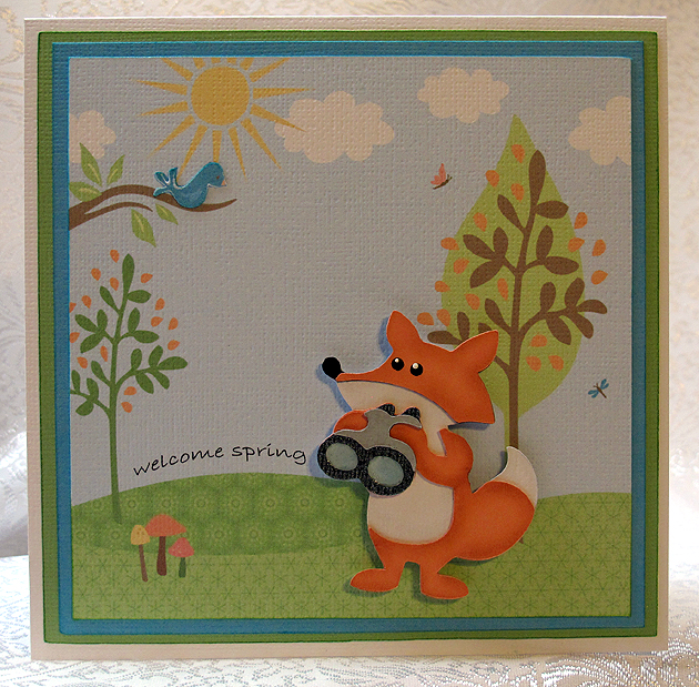
My card is whimsical — a little fox doing some bird watching on a beautiful spring day.  I printed the papers using my Imagine and the Nursery Tails cartridge.  I love that you can print to fit whatever you are making, as in the background.  I printed this at 5″.

Front2

I made the  “welcome spring” sentiment for the card using Photoshop.  I took the text and put it on an arc.  I printed it out on a piece of plain paper and put the background piece over top.  I held both up to a light so I could see where the sentiment was going to be and when I got it where I wanted it, I held it in place with a few pieces of the blue painter’s tape.  I just lightly pressed the tape down — I didn’t want it sticking too much and removing any of the color.  Then I ran both pieces through the printer.

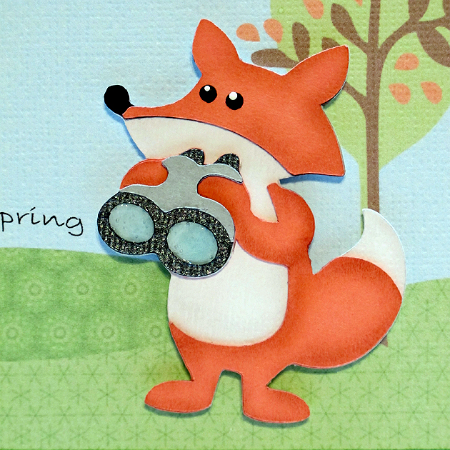
The fox is from Campin’ Critters and cut at 2.5″.  I used chalk to give his body some definition and used pop-dots to attach him to the front.  I added Glossy Accents to the lenses in his binoculars.

Fox2

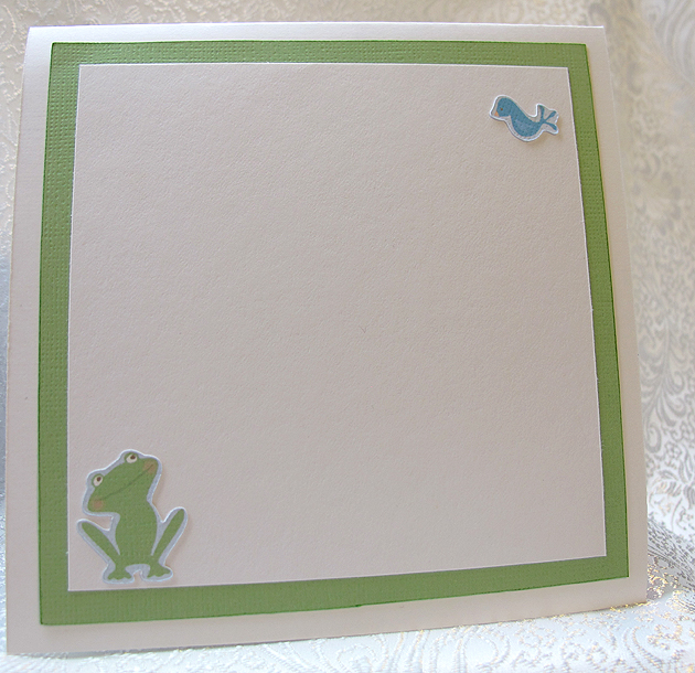
I cut an extra bird and layered it on the front.  For the inside I added another bird and a frog, also from Nursery Tails.

Inside

I hope you enjoy my spring card.

  • Cricut cartridges – Campin’ Critters, Imagine Nursery Tails
  • White cardstock – American Crafts
  • Chalk
  • Ranger Glossy Accents

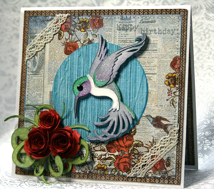
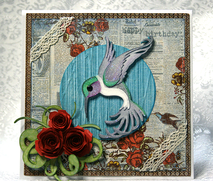
Cricut Art Nouveau Hummingbird Birthday Card


I wanted to make a card to enter in a couple of challenges and this is what I came up with.  The first challenge is Things that Fly in Nature over at Bitten by the Bug 2. The second challenge is Texture at Cooking with Cricut.

I made a 5″ x 5″ card and the patterned paper was all printed on the Imagine using the Country Carnival cartridge.  I love the paper selection on this cartridge and have been wanting to use the design that is on the background of my card for some time.  The reason I bought this cartridge is because of the paper — and the very cool font that it has.

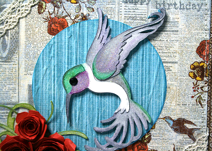
 I cut the hummingbird (at 3″) from watercolor paper using the Art Nouveau cartridge and colored him with Copics.  This is only my second time trying to color with Copics, and I have lots to learn.  I discovered I don’t have enough green markers — I didn’t have enough in the same color group to do any blending.

After I colored the hummingbird, I used a crystal glaze (something I got years ago) to go over sections of his body to try and simulate the iridescence you see in their feathers.

Oh, dear — after looking at the close-up I’m not too sure I should be posting it.  My coloring definitely leaves a lot to be desired!  The circle behind the hummingbird was embossed using the Forest Branches folder.

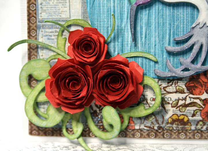
I recently got the Art Philosophy cartridge, mainly because of the flowers I have seen so many crafters make with it. The roses on this card represent my first time using this cartridge.  I cut them at 2″ and 2.5″ using some Recollections paper from Michaels.  I inked the edges with Tim Holtz Fired Brick Distress Ink.  I used a quilling tool from one of my Cuttlebug quilling kits to roll up the flowers.  I was surprised at how quickly they went together.  The greenery behind the roses is also from Art Philosophy.

I wanted the sentiment to be subtle, so I stamped it in the upper right hand corner (using distress ink) trying to make it look like it is part of the print on the paper.  I added a couple of pieces of lace across two corners and used my sewing machine to stitch around the card.

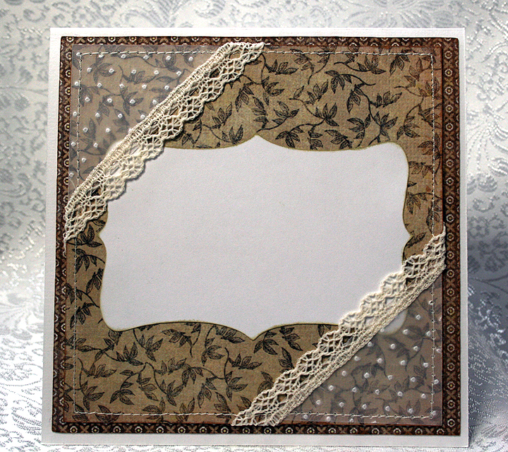
For the inside of the card, the white area is a shape cut using Art Philosophy.  The corners are a 2″ square of vellum, cut diagonally, embossed with the Swiss Dots folder, and trimmed with lace sewn across the top edges.  I then secured them to the card by stitching around the entire piece.

I originally planned on using the vellum corners on the front of the card, but when I laid everything out, I thought they hid too much of the paper on the front.  So they got moved inside, which worked out fine because I had no plans yet for the inside of the card.

  • Cricut cartridges:  Art Nouveau, Art Philosophy, Imagine Country Carnival
  • Cuttlebug embossing folders:  Forest Branches, Swiss Dots
  • Copics
  • Vellum, scraps of lace

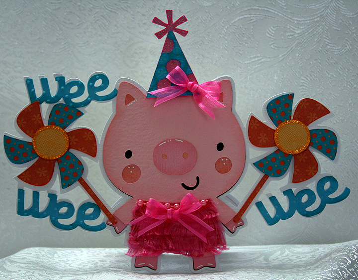
Wee Wee Wee!! Pig With Pinwheels Shaped Card

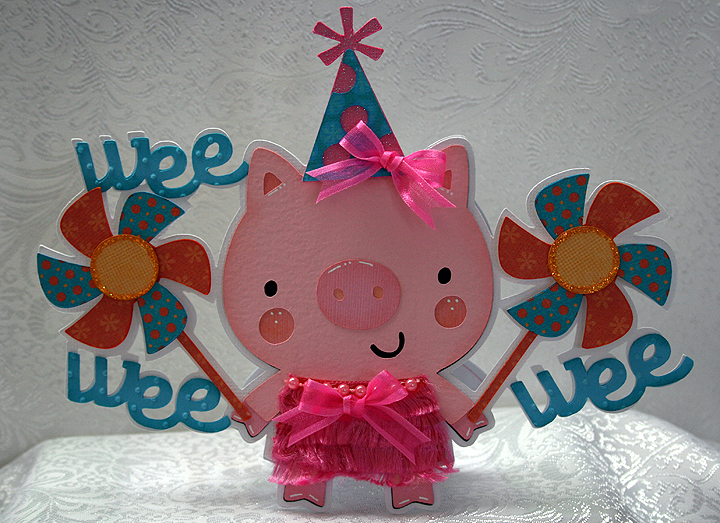
I wanted to make a birthday card for my sister-in-law and I wanted to create one that was very whimsical — and I hope I succeeded.  I enjoy making shaped cards and when I found the All Shaped Up Challenge on Bitten by the Bug 2, the idea for my card was hatched.

I love the pig with the pinwheels in the Geico commercials.  You can’t help but smile when one comes on TV, and I have been wanting to do something along those lines for while now.   I decided to make my pig a girly girl and give her a fancy party dress, complete with a birthday party hat.

I started laying out my design in Cricut Craft Room.  Unfortunately, the program still has issues and I ran into some of them while creating this card — and ended up wasting time.  I find CCR so frustrating at times that bad words will just start popping out of my mouth.

When I got ready to cut my card, Cricut Craft Room was down and I could not log in.  I kept getting a message that the program couldn’t connect to the internet.   I kept trying and after an hour or so, I was able to log in and cut my layers.

All the solid color cardstock is from Bazzill, except for the glitter cardstock on the hat — that is from Core’dinations. The patterned paper I printed on the Imagine using the Blast Off cartridge.

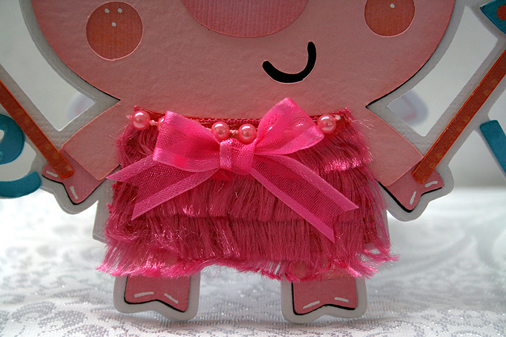
I used Create a Critter for the pig and pinwheels and B is for Boy, a Lite cartridge, for the “wee” words.  I welded them all together to form the base of the card.  I used the Swiss Dots folder and my Cuttlebug to emboss the words.  I found some eyelash-type yarn at Joann’s that I used for her dress, layering it so it looks like a fringe dress — reminds me of a flapper dress.  I added some pearls at the neckline and a bow on both the dress and hat.  I used Stickles on the center of the pinwheels.

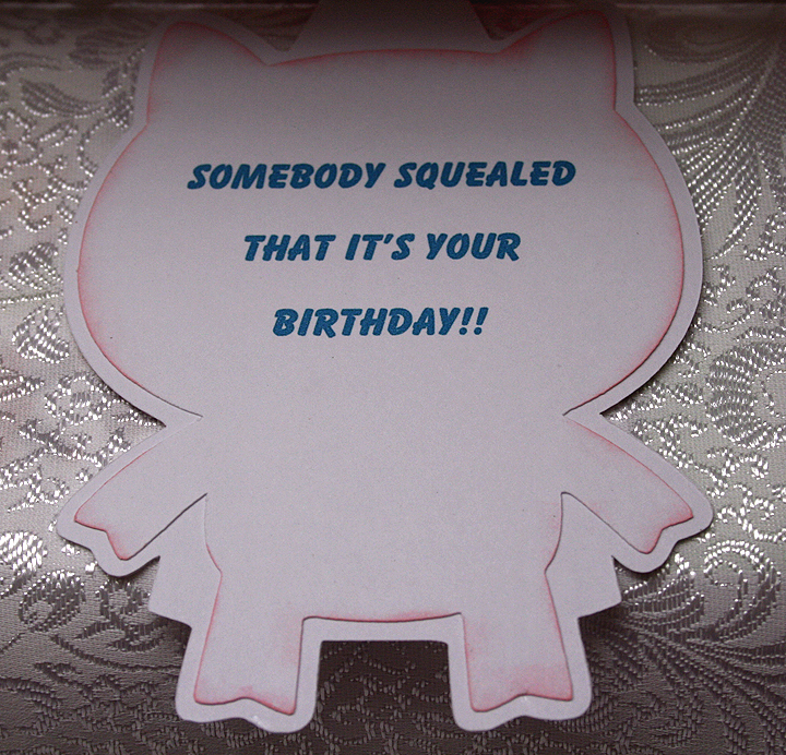
The inside of the card features a computer-generated sentiment.

I hope this little piggy card brings a smile to my sister-in-law’s face.  I need to make an envelope so I can get it in the mail.  Since it is a over-sized card, I will probably send it in a padded envelope.

I am also entering this card into the following challenges:

Cricut Chirp Challenge #6 – Create a Critter Craft:  use any animal Cricut cut on your project

Scrappy Moms Stamps – Terrific Tuesday Challenge – Shape Up:  create a shape project

  • Cricut cartridges:   B is for Boy Lite, Blast Off (Imagine), Create a Critter
  • Cuttlebug:  Swiss Dots embossing folder
  • Bazzill cardstock
  • Stickles
  • Yarn, pearls, ribbon
Wild About You Onesie Gift Set Using Cricut Create a Critter 2


One of the more popular Cricut cartridges surely must be Create a Critter.  Provo Craft is giving users of Cricut Craft Room a sneak peak of one of their newest cartridges by making five cuts from Create a Critter 2 available for free. There is also a contest, which ends on September 5,  where you can enter your projects using these latest designs through the Cricut Project Center.
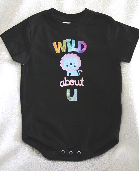
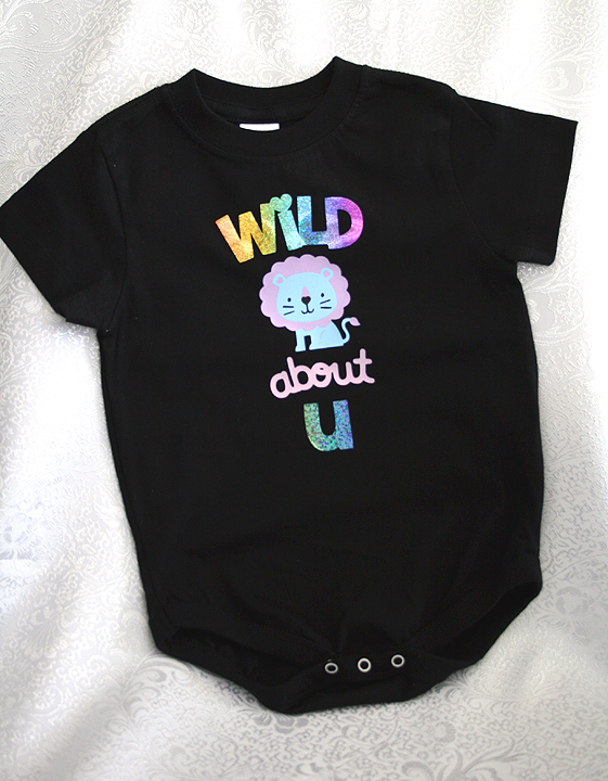
My project is a onesie gift set that includes a black onesie decorated with the lion and phrase designs from Create a Critter 2.  All were cut from heat transfer vinyl.  I constructed a box from Sweet Tooth Boxes and made a small gift card using the bird that is on the Icon tab of the lion feature on Create a Critter 2.

When using heat transfer vinyl, it is important to remember that you must mirror (flip) your images in Craft Room because you are cutting the back of the vinyl.  Then when you iron it on your garment everything is facing the correct way and you can read your phrases.

“Wild about U”  is cut from a holographic vinyl that I picked up years ago at a trade show — long before I knew what a Cricut was.   I fell in love with the sparkly rainbow colors and brought a roll home with me.  Unfortunately the vinyl did not come with application instructions, so I did some test runs before applying it on the onesie.  My first attempt at ironing it on produced negative results as I was getting it too hot.  I didn’t realize it and started increasing the time I was pressing, getting even worse results.  I finally dialed back on the heat and the time to get proper application.

The lion is cut from a vinyl that can be peeled hot or cold.  Because he has four layers, I applied him first.  I put down the first layer and pressed for only 4 seconds, immediately peeling off the backing.  I let that layer cool and then added the next.  Again, I pressed for 4 seconds and peeled.  I did this until all four layers were down.

When doing layers, you have to remember to cover up the vinyl that has already been applied and is no longer protected by the clear film.  I use a teflon sheet to cover my design before pressing each layer.

After the lion and the “about” from the phrase were in place, I then added the holographic phrase and applied it.

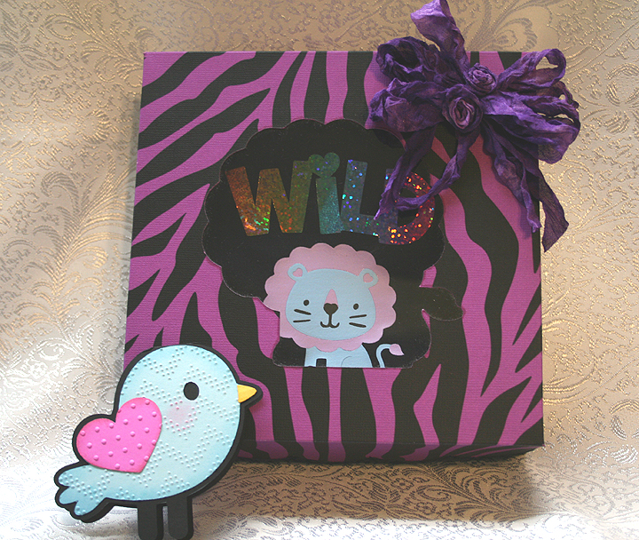
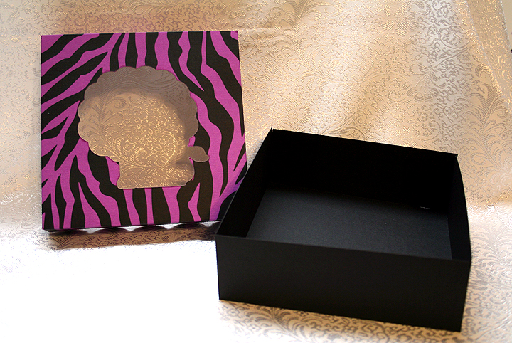
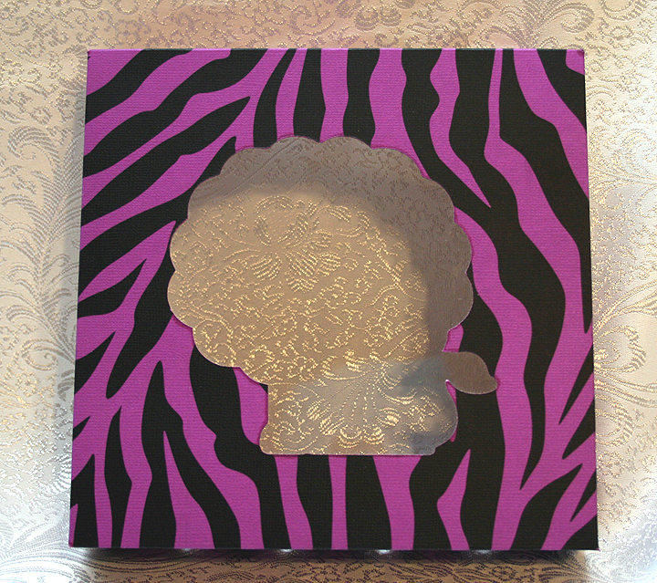
The gift box is from Sweet Tooth Boxes.  I cut the box that begins on page 10 of the handbook, using just the bottom and lid.  I hid the cut-out area in the lid and then added the shadow feature of the lion — so my box has a lion window to tie in with the theme of the onesie.

I printed the zebra paper for the box lid using my Imagine.  I used a bright purplish cardstock and printed the stripes using the Teresa Collin’s Black & White cartridge.  This put a lot of black ink on the paper, so I used a blow dryer on it and then I let it dry for over an hour.  When I rubbed my fingers on it, the black was still smudging, so I gave it a coat of clear matte spray.

Because Cricut Craft Room does not work with the Imagine, I used my Imagine only to print the paper.  I then transferred the paper to my Expression and cut the lid.  I scored all the lines on the box and lid and assembled them, adding a layer of clear acrylic to form the window of the box.

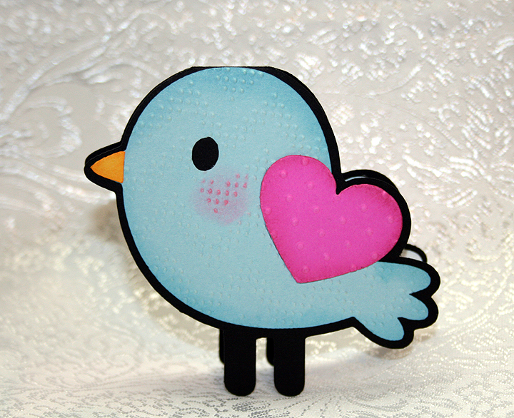
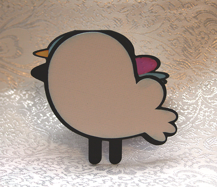
A gift card was created using the shadow feature and welding two shapes together at the top of the head.  I used two Cuttlebug folders on the bird, Charles (a chevron design) and Swiss Dots.   I did the layers on both the front and back of the card, as I wasn’t sure which way I wanted him facing.

I added a white layer to the inside of the card so there would be a place to write a message.

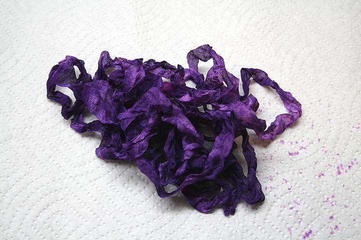
To finish off the box, I dyed some seam binding using Tattered Angels Glimmer Mist and Adirondak Color Wash.  I scrunched it up while it was wet and let it dry.  Then I tied a bow and made a couple of ribbon roses to add in the middle.

  • Cricut Craft Room:  Create a Critter 2, Sweet Tooth Boxes
  • Cricut Imagine:  Teresa Collin’s Black & White cartridge
  • Cricut Expression
  • Cuttlebug:  Charles and Swiss Dots
  • Tattered Angels Glimmer Mist
  • Adirondak Color Wash