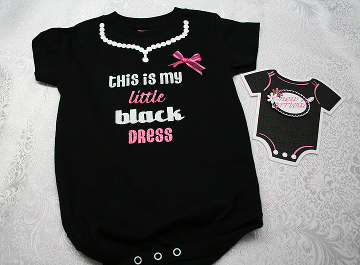
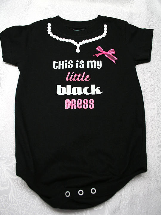
This is My Little Black Dress Onesie and Matching Card


Several months ago I bought some black onesies so I could decorate them using heat transfer vinyl.  I went on to other things and the onesies just sat — until Bitten by the Bug 2 posted their Fashion Challenge.  That was the push I needed to get the onesies done.  And when I finished with the onesies (I made a 6 mos size and a 12 mos size), I made a matching card.  Now I have a couple of gift sets ready when I need them.


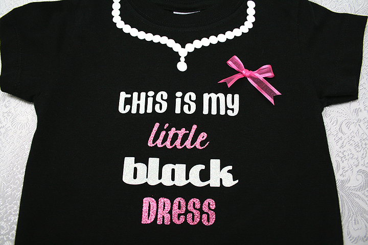
I saw this phrase on a onesie on the Internet a long time ago and always thought it would be fun to do.  I cut all the vinyl with my Cricut, using Design Studio to lay out everything.  For the necklace, I brought a cut from the Paper Doll Dress Up cartridge into Design Studio to use as a guide.  I enlarged the design until it fit the neck of the onesie.  I then took circles from George and laid them along the contour of the necklace, making sure they touched so I could weld them. Once I had circles completely covering the necklace shape, I deleted the necklace so that all was left was a string of pearls.  I cut this from white flock vinyl, so it has a fuzzy feel to it.

I used a variety of cartridges for the letters — sort of felt like I was putting together a ransom note.  I used Don Juan for the “this is my” and “dress” cuts.  I used Forever Young for “black” and Graphically Speaking for “little”.  I cut these out of white and pink glitter vinyl.

When cutting heat transfer vinyl, you have to remember to mirror the images.  I had no problem mirroring the words  “little” and “black” —  just had to check the “flip shapes” button in Design Studio.  But because I was putting the other words together myself using individual letters, I was having issues getting the words to mirror.  I finally figured out if I typed the words in backwards and then checked the “flip shapes” button that it worked.

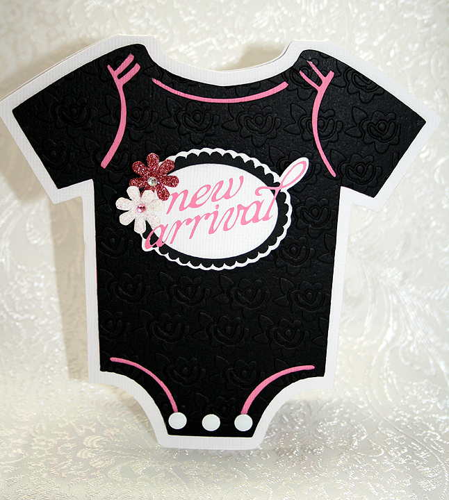
I used Life’s a Party for the onesie card.  I welded two of the shadow bases together at the shoulders.  I embossed the black layer using my Cuttlebug and a 5″ x 7″ folder from the Once Upon a Princess Companion Set that has little roses all over.

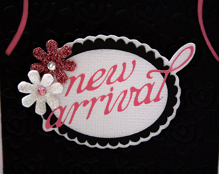
The label on the front of the onesie is from the Phrases cartridge.  Because the lettering is so thin, I cut it from pink vinyl and used transfer tape to put it on the scalloped ovals.  I added a couple of glittery flowers that I picked up at a Tuesday Morning store a while ago.  I used 3 white dot embellishments that I got in one of Joann’s $1 bins for the snaps on the onesie.

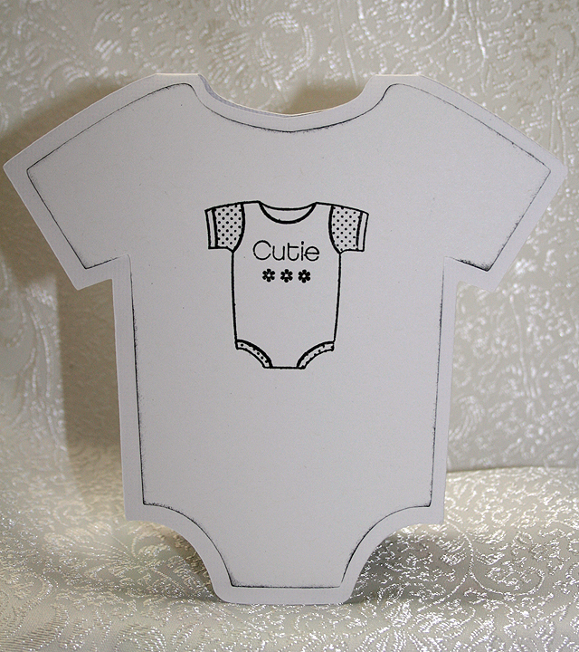
For the inside of the card, I cut a white layer and inked the edges and then I stamped an image from a stamp I have in my stash.

  • Cricut cartridges – Don Juan, Forever Young, George & Basic Shapes, Graphically Speaking, Life’s a Party, Phrases
  • Cuttlebug – Once Upon a Princess Companion Set
  • Heat transfer vinyl
  • Assorted embellishments

Bitten by the Bug 2

A few days ago I found out my most recent project, the Diorama/Luminaria card, was chosen as Project of the Week at Bitten by the Bug 2  in their Window to the World Challenge.  I am so thrilled.  Thank you so much!!

They have a great design team and list a new challenge every Monday, so be sure and check them out.  I just completed my project for their challenge that ends today, so I am off to get busy writing so I can post it here.


Enjoy the Season Winter Window Card Luminaria

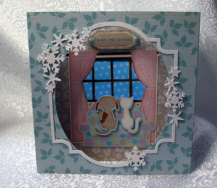
I’m not sure what to call my latest project.  I like to think of it as a hybrid — a cross between a window and diorama card and a luminaria.

It all began with the Window to My World Challenge at Bitten by the Bug 2.  I knew immediately what window I wanted to use for this challenge — the cute little dog and cat looking out the window at the snow on the Enjoy the Seasons Cricut Imagine cartridge.    Then my brain started spinning with what I could do to make the card unique.  For a couple of days that’s all that happened — my brain spun and not one good idea.  Then it hit me — I wondered what it would look like if I printed the window part on vellum and lit it from the back.

That is where the diorama card comes into play, as it has sections.  I used the tutorial for a diorama card posted on splitcoaststampers.com as my guide.

I altered the measurements so that a battery operated tealight candle would fit in the back section.  My two print papers I used on the diorama were printed from the Elise Imagine cartridge.  I wanted a print that was not necessarily holiday looking and thought the prints on Elise went well with the cat and dog image.   My finished card/luminaria measures about 6″ x 6″x 2.5″.

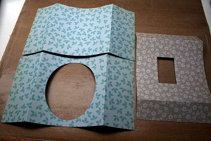
I cut my print paper so that the two blue pieces (the outside) were 11″ x 6″, cutting an oval from George & Basic Shapes out of one section for the front.   I scored 2.5″ from each end and folded on those marks.   Because the oval takes a huge chunk out of the front of the card, I found I had to stabilize it.  I cut a  piece of plain white cardstock with the oval, this time a little under 6″ wide,  and glued it to the inside center to give it some strength.

The middle section was cut from the mocha print at 9″ x 6″ with a 2.5″ x 1.5″ window cut from the center.  I scored each end of this piece at 1.5″ and folded.  This is what my pieces looked like.

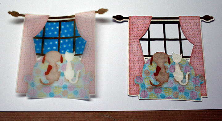
I printed the cat and dog on the Imagine at 4″, printing it on vellum and then in layers on regular white cardstock.  I took my craft knife and cut out the sky between the window panes from the cardstock piece, so that the vellum sky would show through.  This pictures shows both the vellum print and the piece with the sky cut out of it.

I added some Stickles to the snow on the vellum and let it dry.  I trimmed the vellum and glued it on the mocha piece, lining the sky up with the cut-out rectangle.  Then I attached the cardstock piece with the cut out sky over that.  I did two layers of the love seat and attached it, then layered the cat and dog twice and attached them with pop-dots.  I printed a little sign from Enjoy the Seasons to hang above the window and added a blue pearl on each side.

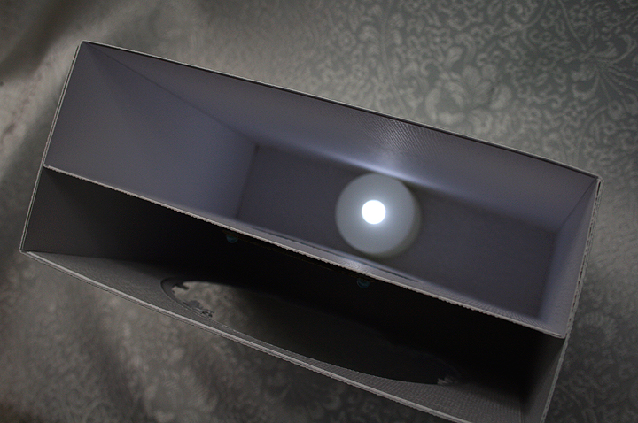
I started assembling my pieces, putting the mocha and back section together first.  Before attaching the front, I cut a snowflake frame from Lacy Labels that I adjusted in Design Studio to fit the oval on the front.  I cut two layers, the top layer from a glittery cardstock and attached the frame around the oval.  I cut extra stars and snowflakes and popped them up on the frame.  Then I attached the frame to the other sections.   I used a tealight with a white LED flame, which I ordered online.  All I could find at my local stores were tealights with amber flames and I didn’t want an amber cast to my snow.  This picture shows the card from above, showing the different sections.  The tealight sits right below the vellum window.  Because there is no bottom to the card, you just have to set it over top of the tealight.

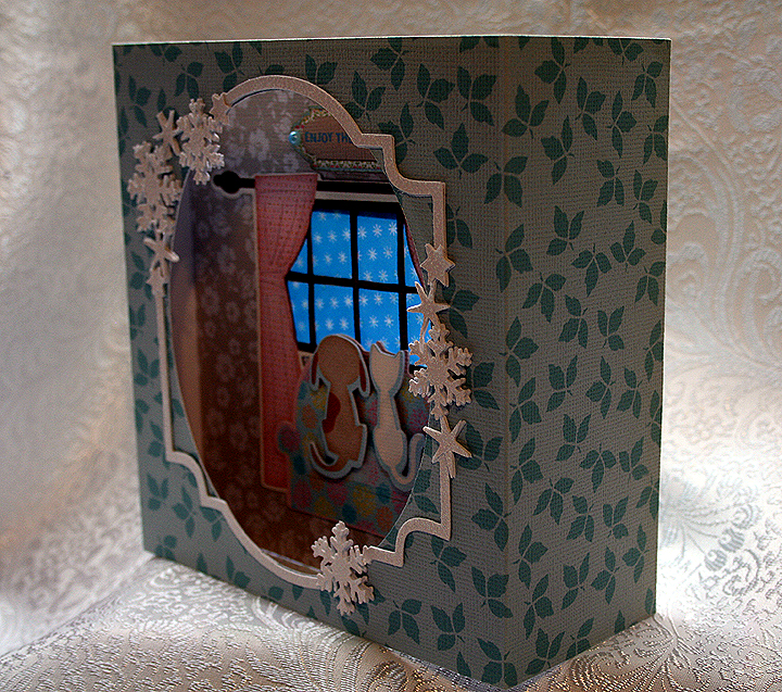
This picture shows the card from the side, so you can see how the front and back overlap each other.

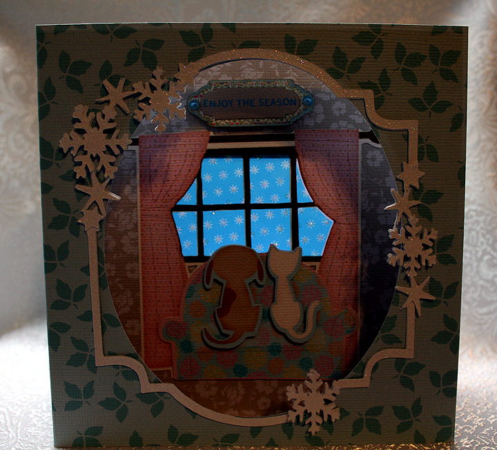
It was hard trying to take a picture showing the lit window, but I think this one gives you a good idea of what it looks like.  The card will fold up, but it doesn’t  go completely flat.  I think I stuffed it too much.  I would not send it in an envelope — it would have to hand delivered or sent in a box.  But this one I plan on keeping for myself!

I had a lot of fun creating this card — it’s a little different from what I usually do.  I am already thinking of other projects using this concept.

  • Cricut cartridges – George & Basic Shapes, Imagine Elise, Imagine Enjoy the Seasons, Lacy Labels
  • Glitter cardstock
  • Stickles
  • Battery operated tealight candle

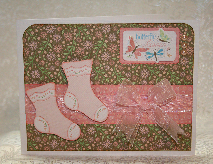
Butterfly Kisses Baby Girl Card


The weekly challenge on the Cricut Circle Blog is a card sketch challenge and you must use at least two Cricut cuts.  I thought I’d make a card on my Imagine, since I haven’t made a complete project using the Imagine.

I decided to make a baby card,  even though I don’t know anyone who is having a baby right now.  But it will be good to have on hand.  Again, for no particular reason, I made the card for a baby girl.

I used the Cricut Imagine cartridge Nursery Tails for this card.  All the paper is from this cartridge, as are the pink socks and the Butterfly Kisses title.  I embossed the brown floral background and the pink contrast strip with my Cuttlebug.  I cut the images in layers and inked around all the edges.   I added some ribbon, attached the socks with foam pop-dots and added three pearls by the tag.

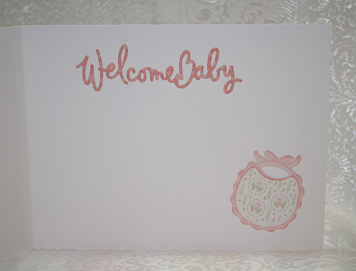
For the inside of the card, I used a Cuttlebug die for the “Welcome Baby” and the bib is from Nursery Tails.

This is a fairly simple card, but I like the way it turned out.

  • Cricut Imagine Cartridge Nursery Tails
  • Cuttlebug
  • Ribbon, pearls

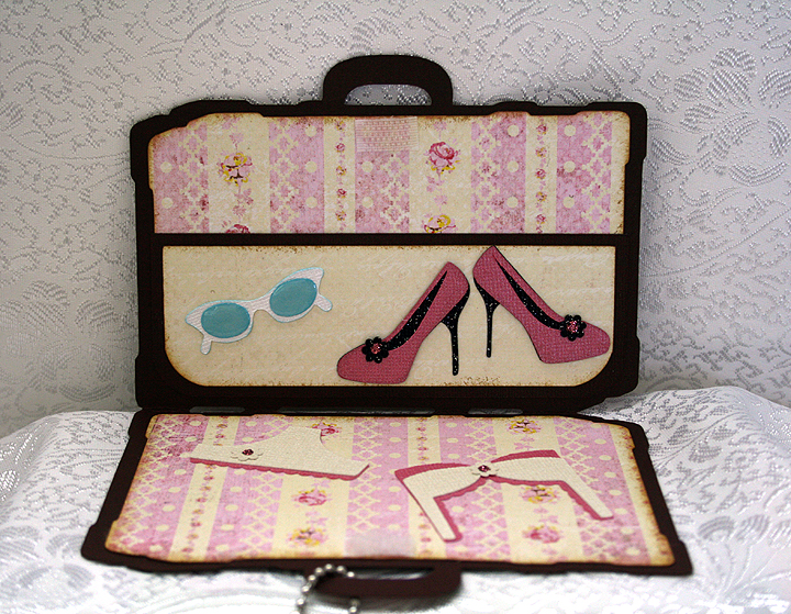
Barbie Suitcase Gift Card Holder for National Convention


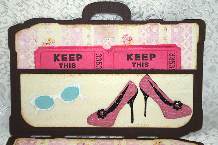
I had a lot of fun with this project.  I was asked to make ten gift card holders that were to be handed out at the 2012 National Barbie Doll Collectors Convention this week in Garden Grove, CA.  They were originally going to hold gift cards, but then it was decided that they would contain raffle tickets.  I guess there are some fabulous prizes in the Raffle Room.  The theme of this year’s convention is The Grand Tour.

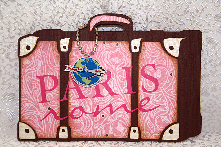
My first thought was to make the card shaped like a suitcase, as a rectangular shape would work well with a gift card.  I searched through suitcase cuts on mycutsearch.com and decided to use the one on the Summer Celebrations cartridge, since it looked sort of vintage.

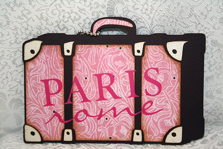
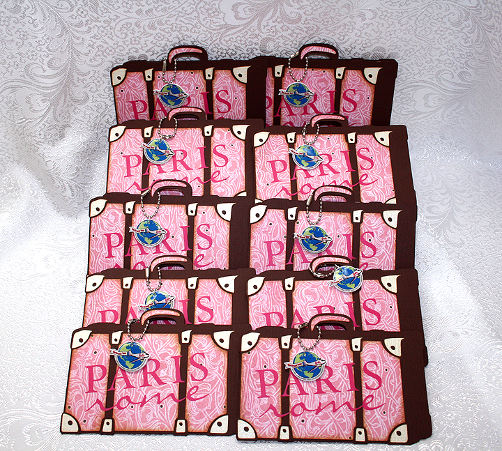
I welded two shapes together at the bottom in Cricut Design Studio.  I cut the base of the card from chocolate Bazzill cardstock.  All the solid cardstock is Bazzill and the prints are from Basic Grey.  I chose a pink print for the front of the suitcase, using a neutral color for the hardware.  Since Paris and Rome are on the itinerary of the Convention, I cut those words from pink vinyl using the Word Collage cartridge.  Here is a picture of the vinyl lettering.

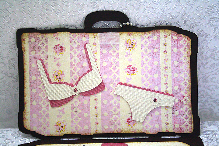
I chose a vintage stripe print for the lining of the suitcase.  I used a rectangle from George & Basic Shapes to create the pocket on the inside, using a punch to round the bottom corners.  Velcro at the top holds the suitcase together when closed.

The shoes, sunglasses and bra and panties are all cut from Forever Young.  I used a black glitter cardstock from Core’dinations for the shoes.  I applied Glossy Accents to the lenses on the sunglasses.

For the small flower embellishments on the shoes and bra and panties, I used the negative cuts from a Martha Stewart punch called Flower Shower.  It makes the tiniest of flowers.  I added Stickles to the centers of the flowers.
Now comes the most fun part — making the charms.  This was my first time using Ink Jet Shrinky Dinks to make charms.  I followed a great tutorial from the talented Nadia to make my charms.  Here are her step-by-step instructions.

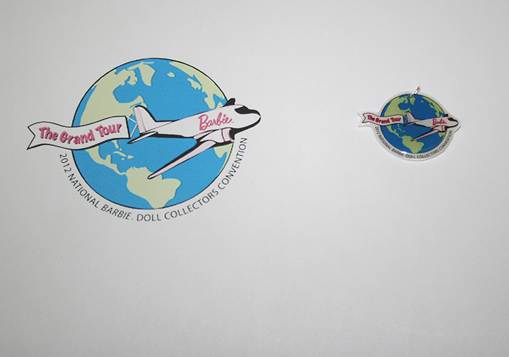
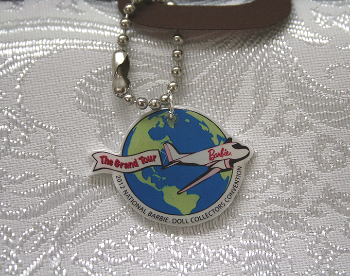
I did not use my Imagine to make the charms as I used a jpg of the Convention logo.  I printed the design on the Shrinky Dink material using my ink jet printer.  So instead of having a Cricut to do my cutting, I hand cut around the charms.  I am not the greatest when it comes to cutting around objects — I got a little wobbly in places.  But the great thing about the Shrinky Dinks is that you don’t really see my wonky cuts.  Here is a photo showing the size of the print I started out with and what it looked like after shrinking.  I also lightened the jpg in Photoshop before printing, as the colors get intense with baking.

Following Nadia’s instructions, after the Shrinky Dinks baked and were flat, I applied some Ultra Thick Embossing Enamel (UTEE) to them.  I then popped them back in the oven and waited for the UTEE to melt.

I was so happy with the way they turned out — even my hubby thought they were neat.  The circle part of the charm is not quite an inch across — and look how well you can read the tiny lettering.

I attached jump rings in the holes and hung the charms from key chains that I shortened to fit on the suitcases.

Here are all ten suitcases.

  • Cricut Cartridges – Forever Young, George & Basic Shapes, Summer Celebrations, Word Collage
  • Bazzil cardstock
  • Basic Grey designer paper
  • Vinyl
  • Martha Stewart Flower Shower punch
  • Stickles
  • Glossy Accents by Ranger
  • Ink Jet Shrinky Dinks

So Happy For You! Card

OutForPublication

I think this is my first time making a card using the card feature on a Cricut cartridge.  I searched through the suns I had and found this cute shaped card on Something to Celebrate.  This is also one of the few times that I have used only one cartridge to make a card.

I cut the card base out of white cardstock and then started adding layers.  My colored cardstock is all from Stampin’ Up.  I added a layer of turquoise, three layers of the yellow/gold and two layers for the white cloud.  Inking was all done with Tim Holtz Distress Inks.

I used my Cuttlebug to emboss the sun, using a new folder called Charles.  It has a neat chevron pattern of small dots. I used Divine Swirls on the cloud and Swiss Dots on the pink “Happy”.  I traced the lines of the swirls on the clouds with Glossy Accents and sprinkled with Martha Stewart crystal glitter.  Then I used Glossy Accents around the edges of the cloud and sprinkled with MS coarse glitter.
  • Cricut cartridge – Something to Celebrate
  • Cuttlebug folders – Charles, Divine Swirl, Swiss Dots
  • Stampin’ Up cardstock
  • Martha Stewart glitter

Graduation Card — You Rock!!

A friend’s daughter graduated from middle school a few days ago.  I wanted to make her a card that was not the average grad card — I wanted something a little funky and feminine.  I know she enjoys music, and just to prove how old I am, I have never heard of the groups she likes!

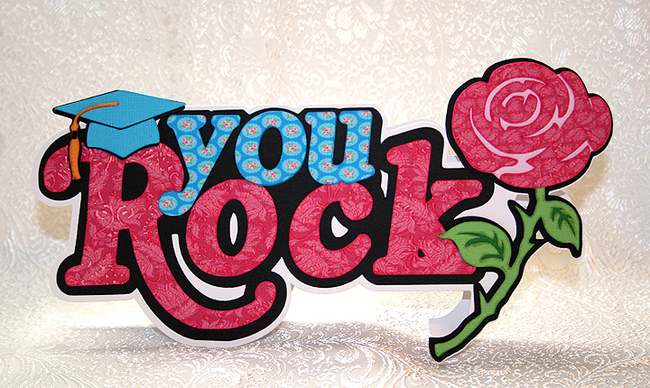
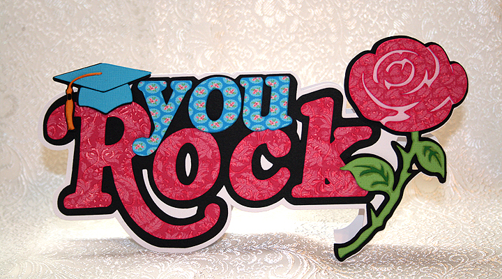
I decided to go with the phrase, “You Rock.”  I found the phrase on the Cricut Phrases cartridge and liked the bold design.  However, this particular phrase came with a lightning bolt at the end of it.  So to make it more feminine, I welded a rose from the Indie Art cartridge over top of the lightning bolt.  I also decided to make this a shaped card.

The fun part of this card was printing and cutting the layers on my Imagine.  I used the Floral Emporium cartridge for the prints and solid colors (excluding the black cardstock).  I love the bright colors and fun prints on this cartridge.  I used my Cuttlebug to emboss the bright pink print paper on the phrase and rose.  The grad hat was cut from Everyday Pop-Up cartridge.

I used pop dots on the grad hat, rose and the “you” on the phrase to add depth.

For the inside of the card, I printed and cut a greeting from the Imagine cartridge, Greeting Cards Inside & Out.

When I was laying out the card in Design Studio, I was trying to keep the dimensions so the card would fit into a #10 envelope.  However, this is a big card and ended up being about an 1″ too large either way, so I made a custom envelope for it.  Luckily the card was hand delivered so I didn’t have to worry about postage.

As I was working on this card, Bitten by the Bug 2 announced their latest challenge — the Rose Challenge.  I was so happy because I would be able to enter this card in the challenge.

  • Cricut Cartridges:  Everyday Pop-Up, Imagine Floral Emporium, Imagine Greeting Cards Inside & Out, Indie Art, Phrases
  • Cuttlebug

Surf’s Up Card Using Cricut Paper Pups Cartridge


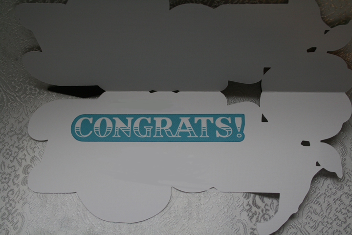
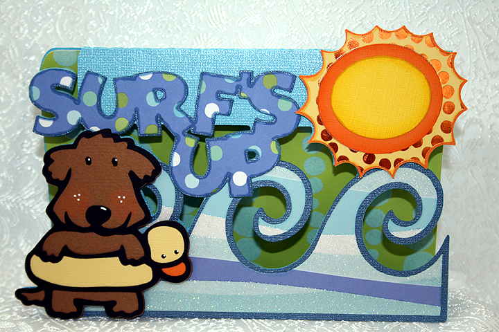
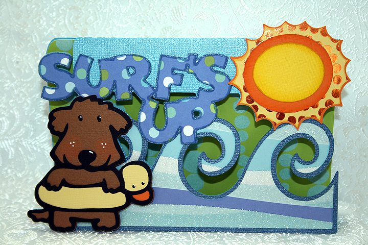
This is a card I made to enter in Bitten by the Bug 2‘s Water Theme Challenge.  The Design Team made some fantastic projects that provided lots of inspiration.  Donna, a member of the Design Team, makes wonderful shaped front cards and I have always wanted to try making one myself.  When I saw her card for this challenge, I decided it was time to give it a try.

The patterned paper is from a me & my Big ideas paper pad that I picked up at their warehouse sale a few years ago.  What a fun day that was — Erin & I brought home a car load of goodies! The solid cardstock is from Bazzill.

Besides not knowing what I was doing, all the welding proved challenging.  I laid out lots of shapes in Design Studio and welded them together.  For the card front, I welded a rectangle from George and Basic Shapes cartridge with waves from Life is a Beach, a sun from Mickey & Friends, letters to spell “Surf’s Up” from Mickey Font, and finally the little dog with the duck floaty from Paper Pups.  All these shapes I then welded to a larger rectangle to form the back of the card.

I cut out lots of layers, did some inking, and then applied them using lots of pop dots.  My card doesn’t have the depth that Donna’s cards have, but I am happy with my first try.

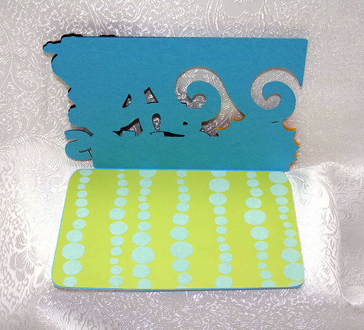
I added a piece of pattern paper to the inside, but I have to figure out where I will write a message.  The paper I used is flocked, so it is bumpy and will not be good for writing.  I liked the paper, though, because it reminds me of air bubbles.

  • Cricut Cartridges:  George & Basic Shapes, Life is a Beach, Mickey & Friends, Mickey Font, Paper Pups
  • Cardstock:  Bazzill, me and my Big ideas

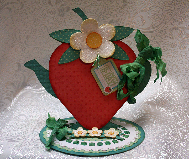
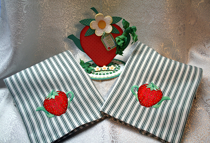
Strawberry Teapot Card — My First Easel Card


I made this card for the Kitchen Challenge over at Bitten by the Bug 2. Your project must be based on something you would find in a kitchen and have a Cricut cut on it.  I started out with all sorts of ideas but narrowed it down to a teapot.  I was laying out my design in Cricut Design Studio and thought it was looking pretty good.  I decided to try making an easel card, going for a floral, frilly teapot.

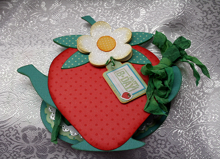
Then, a couple of nights ago I was checking out one of my favorite embroidery websites, EmbLibrary.com, and happened upon a strawberry teapot.  I kept looking at it and wondered if I could make something similar using my Cricut.  So I started playing around in Design Studio and ended up with this card.

I used Core’dinations solid cardstock for the base of the card.  All the dotted printed paper I did on my Imagine, using The Good Old Days cartridge.  I am really having fun using my Imagine.

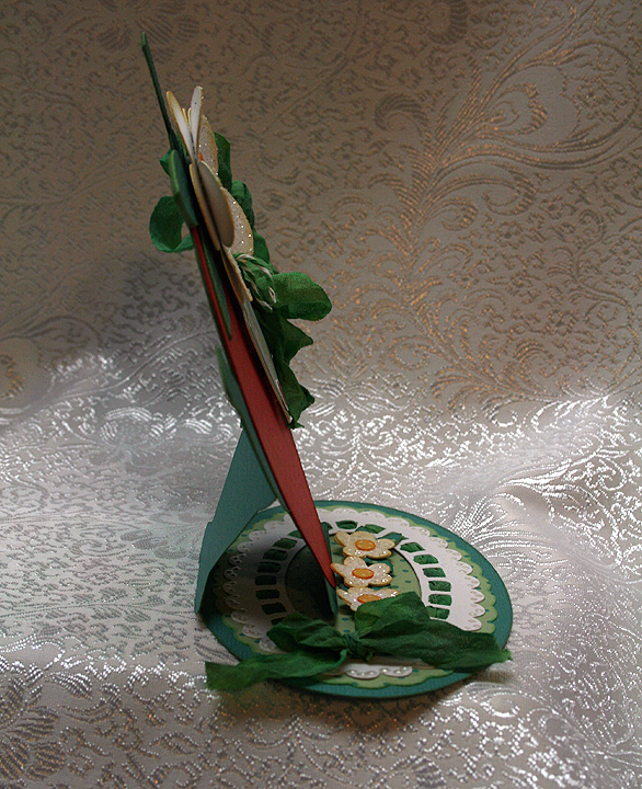
The teapot I used is from Kate’s ABCs cartridge and I welded a strawberry from Preserves over top of the teapot, so just the spout and handle were sticking out beyond the strawberry.  I then welded an oval from George & Basic Shapes onto the bottom of the teapot, to form the base of my easel card.  Here is a side view of the card, so you can see how it stands up.

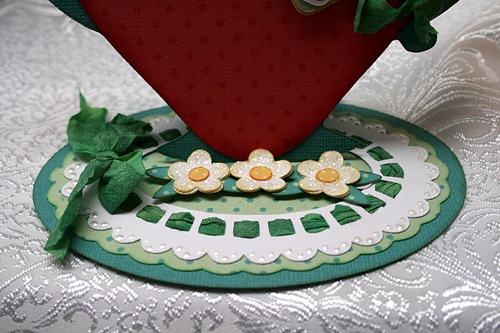
I cut a scalloped oval and doily shape from Lacy Labels to go on my base.  Through the holes of the doily shape, I threaded seam binding that I dyed using Tattered Angels Glimmer Mist.  Where my seam binding met, I tied a bow.  Here is a close-up of the base so you can see how I threaded the binding, and also how the three small flowers allow the card to stand up.  I used Liquid Pearls to add some dots on the doily.

I also used seam binding to tie a bow around the handle of the teapot.  I used Glossy Accents and Martha Stewart coarse glitter to add some sparkle to the flowers.

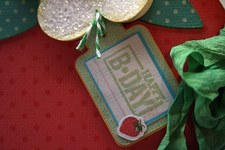
I made the tag using my Imagine and the Imagine More cartridge.  I am very happy with how it came out — it is my first cut and print piece that I have used on a project.  I changed the color on one of the layers and left off the sentiment that was on this particular tag.  I then took a Studio G stamp and stamped Happy B-Day on the front and tied it up with some twine.

And here is a picture to show you what the card looks like when it is flat.

When I finished my card, I thought it would be nice if I embroidered some tea towels using the strawberry embroidery design that inspired my creation.  I found a couple of blank striped towels that I thought the design would look OK on and proceeded to stitch them out.  So now I have a nice gift set to give to someone.

And, finally, I want to thank the wonderfully talented Design Team at Bitten by the Bug 2 for the prize that I won in the frame challenge.  My number was picked to receive the Smash Book prize — and I am so excited!  Thank you everyone at Bitten by the Bug 2.

  • Cricut cartridges:  George & Basic Shapes, Kate’s ABCs, Lacy Labels (Lite), Preserves
  • Imagine cartridges:  Imagine More, The Good Old Days
  • Core’dinations cardstock
  • Martha Stewart coarse glitter
  • Glossy Accents
  • Rayon seam binding
  • Liquid Pearls

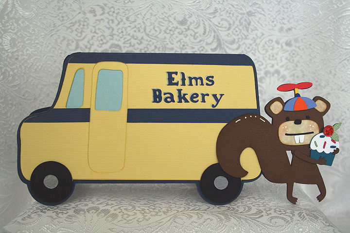
Elms Bakery Truck Birthday Card


I made this card for the Bakery Challenge at Bitten by the Bug 2.  This is a theme challenge and you have to create a project using something you would find in a bakery.

My inspiration will definitely give away my age, but the bakery theme brought back childhood memories of when the Helms Bakery trucks used to come to neighborhoods in So. California in the 1950’s.  I remember my mom putting the blue Helms placard in the corner of the picture window in our living room.  That told the driver to stop at our house.  The Helms motto was “Daily at Your Door.”

The truck was just like having a bakery parked in front of your house.  The driver would pull out drawers filled with baked goodies — so yummy.  The Helms truck delivered the bread that my brothers and I grew up on.

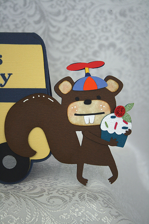
For my bakery truck, since it delivers to whimsical woodland creatures, I changed the name to Elms Bakery.  I created a shaped card using the milk truck from the Cricut cartridge, Pop-Up Neighborhood.  I tried to keep the colors true to the original Helms trucks.  My cardstock is a mix of both Bazzill and Core’dinations.

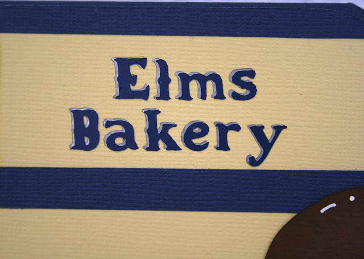
For the base of the card, I welded the squirrel from the Birthday Bash cartridge to the truck in Design Studio.  I made the card so it will just squeeze into a #10 envelope.  The lettering on the side of the truck is done in vinyl and the font is from Noah’s ABC Animals cartridge.  I cut the lettering twice, in two colors, so it looks like it has a shadow layer.

For the squirrel, I decided to put a beanie cap on his little head.  I used Baby Steps cartridge to cut the cap portion. To make the propeller on top, I used a number “8” and deleted the inside cuts in Design Studio.  Then I took the sizing handles and squished the “8” close together.  The little post that the propeller attaches to is a small rectangle from George & Basic Shapes.

I cut the cupcake from Birthday Bash and placed it in the squirrels arms.  I used red Stickles on the cherry.

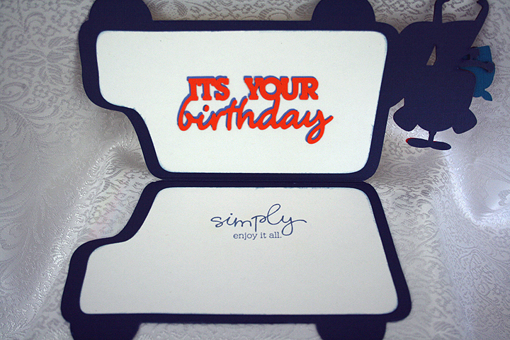
I decided to make this a birthday card, so I cut a sentiment from Birthday Bash to put inside.  I also stamped another sentiment on the opposite side.

  • Cricut Cartridges:  Baby Steps, Birthday Bash, George & Basic Shapes, Noah’s ABC Animals, Pop-Up Neighborhood
  • Cardstock:  Bazzill, Core’dinations
  • Vinyl
  • Stickles