So Happy For You! Card

OutForPublication

I think this is my first time making a card using the card feature on a Cricut cartridge.  I searched through the suns I had and found this cute shaped card on Something to Celebrate.  This is also one of the few times that I have used only one cartridge to make a card.

I cut the card base out of white cardstock and then started adding layers.  My colored cardstock is all from Stampin’ Up.  I added a layer of turquoise, three layers of the yellow/gold and two layers for the white cloud.  Inking was all done with Tim Holtz Distress Inks.

I used my Cuttlebug to emboss the sun, using a new folder called Charles.  It has a neat chevron pattern of small dots. I used Divine Swirls on the cloud and Swiss Dots on the pink “Happy”.  I traced the lines of the swirls on the clouds with Glossy Accents and sprinkled with Martha Stewart crystal glitter.  Then I used Glossy Accents around the edges of the cloud and sprinkled with MS coarse glitter.

  • Cricut cartridge – Something to Celebrate
  • Cuttlebug folders – Charles, Divine Swirl, Swiss Dots
  • Stampin’ Up cardstock
  • Martha Stewart glitter
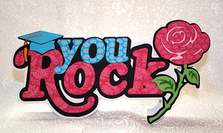
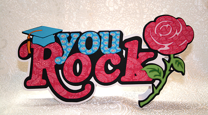
Graduation Card — You Rock!!

A friend’s daughter graduated from middle school a few days ago.  I wanted to make her a card that was not the average grad card — I wanted something a little funky and feminine.  I know she enjoys music, and just to prove how old I am, I have never heard of the groups she likes!

I decided to go with the phrase, “You Rock.”  I found the phrase on the Cricut Phrases cartridge and liked the bold design.  However, this particular phrase came with a lightning bolt at the end of it.  So to make it more feminine, I welded a rose from the Indie Art cartridge over top of the lightning bolt.  I also decided to make this a shaped card.

The fun part of this card was printing and cutting the layers on my Imagine.  I used the Floral Emporium cartridge for the prints and solid colors (excluding the black cardstock).  I love the bright colors and fun prints on this cartridge.  I used my Cuttlebug to emboss the bright pink print paper on the phrase and rose.  The grad hat was cut from Everyday Pop-Up cartridge.

I used pop dots on the grad hat, rose and the “you” on the phrase to add depth.

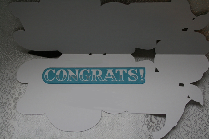
For the inside of the card, I printed and cut a greeting from the Imagine cartridge, Greeting Cards Inside & Out.

When I was laying out the card in Design Studio, I was trying to keep the dimensions so the card would fit into a #10 envelope.  However, this is a big card and ended up being about an 1″ too large either way, so I made a custom envelope for it.  Luckily the card was hand delivered so I didn’t have to worry about postage.

As I was working on this card, Bitten by the Bug 2 announced their latest challenge — the Rose Challenge.  I was so happy because I would be able to enter this card in the challenge.

  • Cricut Cartridges:  Everyday Pop-Up, Imagine Floral Emporium, Imagine Greeting Cards Inside & Out, Indie Art, Phrases
  • Cuttlebug

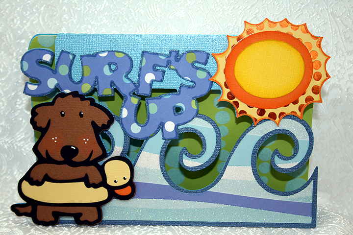
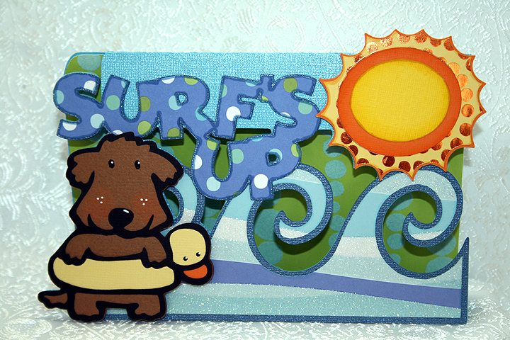
Surf’s Up Card Using Cricut Paper Pups Cartridge


This is a card I made to enter in Bitten by the Bug 2‘s Water Theme Challenge.  The Design Team made some fantastic projects that provided lots of inspiration.  Donna, a member of the Design Team, makes wonderful shaped front cards and I have always wanted to try making one myself.  When I saw her card for this challenge, I decided it was time to give it a try.

The patterned paper is from a me & my Big ideas paper pad that I picked up at their warehouse sale a few years ago.  What a fun day that was — Erin & I brought home a car load of goodies! The solid cardstock is from Bazzill.

Besides not knowing what I was doing, all the welding proved challenging.  I laid out lots of shapes in Design Studio and welded them together.  For the card front, I welded a rectangle from George and Basic Shapes cartridge with waves from Life is a Beach, a sun from Mickey & Friends, letters to spell “Surf’s Up” from Mickey Font, and finally the little dog with the duck floaty from Paper Pups.  All these shapes I then welded to a larger rectangle to form the back of the card.

I cut out lots of layers, did some inking, and then applied them using lots of pop dots.  My card doesn’t have the depth that Donna’s cards have, but I am happy with my first try.

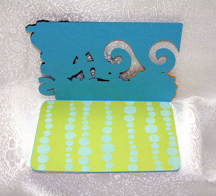
I added a piece of pattern paper to the inside, but I have to figure out where I will write a message.  The paper I used is flocked, so it is bumpy and will not be good for writing.  I liked the paper, though, because it reminds me of air bubbles.

  • Cricut Cartridges:  George & Basic Shapes, Life is a Beach, Mickey & Friends, Mickey Font, Paper Pups
  • Cardstock:  Bazzill, me and my Big ideas

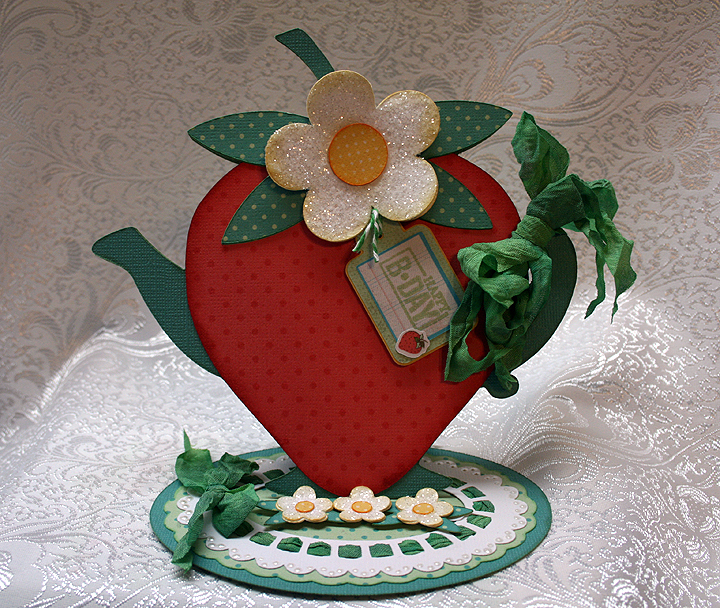
Strawberry Teapot Card — My First Easel Card


I made this card for the Kitchen Challenge over at Bitten by the Bug 2. Your project must be based on something you would find in a kitchen and have a Cricut cut on it.  I started out with all sorts of ideas but narrowed it down to a teapot.  I was laying out my design in Cricut Design Studio and thought it was looking pretty good.  I decided to try making an easel card, going for a floral, frilly teapot.

Then, a couple of nights ago I was checking out one of my favorite embroidery websites, EmbLibrary.com, and happened upon a strawberry teapot.  I kept looking at it and wondered if I could make something similar using my Cricut.  So I started playing around in Design Studio and ended up with this card.

I used Core’dinations solid cardstock for the base of the card.  All the dotted printed paper I did on my Imagine, using The Good Old Days cartridge.  I am really having fun using my Imagine.

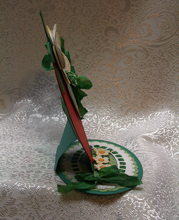
The teapot I used is from Kate’s ABCs cartridge and I welded a strawberry from Preserves over top of the teapot, so just the spout and handle were sticking out beyond the strawberry.  I then welded an oval from George & Basic Shapes onto the bottom of the teapot, to form the base of my easel card.  Here is a side view of the card, so you can see how it stands up.

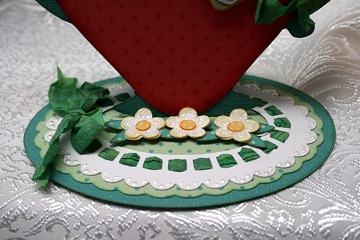
I cut a scalloped oval and doily shape from Lacy Labels to go on my base.  Through the holes of the doily shape, I threaded seam binding that I dyed using Tattered Angels Glimmer Mist.  Where my seam binding met, I tied a bow.  Here is a close-up of the base so you can see how I threaded the binding, and also how the three small flowers allow the card to stand up.  I used Liquid Pearls to add some dots on the doily.

I also used seam binding to tie a bow around the handle of the teapot.  I used Glossy Accents and Martha Stewart coarse glitter to add some sparkle to the flowers.
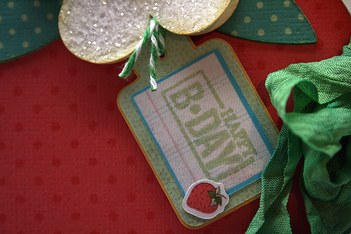
I made the tag using my Imagine and the Imagine More cartridge.  I am very happy with how it came out — it is my first cut and print piece that I have used on a project.  I changed the color on one of the layers and left off the sentiment that was on this particular tag.  I then took a Studio G stamp and stamped Happy B-Day on the front and tied it up with some twine.

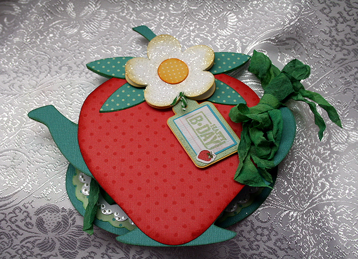
And here is a picture to show you what the card looks like when it is flat.

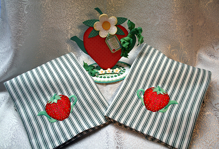
When I finished my card, I thought it would be nice if I embroidered some tea towels using the strawberry embroidery design that inspired my creation.  I found a couple of blank striped towels that I thought the design would look OK on and proceeded to stitch them out.  So now I have a nice gift set to give to someone.

And, finally, I want to thank the wonderfully talented Design Team at Bitten by the Bug 2 for the prize that I won in the frame challenge.  My number was picked to receive the Smash Book prize — and I am so excited!  Thank you everyone at Bitten by the Bug 2.

  • Cricut cartridges:  George & Basic Shapes, Kate’s ABCs, Lacy Labels (Lite), Preserves
  • Imagine cartridges:  Imagine More, The Good Old Days
  • Core’dinations cardstock
  • Martha Stewart coarse glitter
  • Glossy Accents
  • Rayon seam binding
  • Liquid Pearls

Elms Bakery Truck Birthday Card


I made this card for the Bakery Challenge at Bitten by the Bug 2.  This is a theme challenge and you have to create a project using something you would find in a bakery.

My inspiration will definitely give away my age, but the bakery theme brought back childhood memories of when the Helms Bakery trucks used to come to neighborhoods in So. California in the 1950’s.  I remember my mom putting the blue Helms placard in the corner of the picture window in our living room.  That told the driver to stop at our house.  The Helms motto was “Daily at Your Door.”

The truck was just like having a bakery parked in front of your house.  The driver would pull out drawers filled with baked goodies — so yummy.  The Helms truck delivered the bread that my brothers and I grew up on.

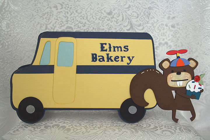
For my bakery truck, since it delivers to whimsical woodland creatures, I changed the name to Elms Bakery.  I created a shaped card using the milk truck from the Cricut cartridge, Pop-Up Neighborhood.  I tried to keep the colors true to the original Helms trucks.  My cardstock is a mix of both Bazzill and Core’dinations.

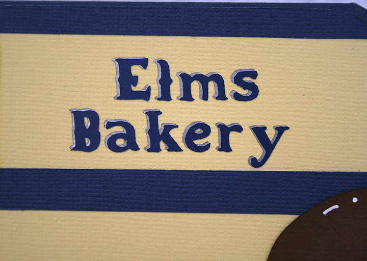
For the base of the card, I welded the squirrel from the Birthday Bash cartridge to the truck in Design Studio.  I made the card so it will just squeeze into a #10 envelope.  The lettering on the side of the truck is done in vinyl and the font is from Noah’s ABC Animals cartridge.  I cut the lettering twice, in two colors, so it looks like it has a shadow layer.

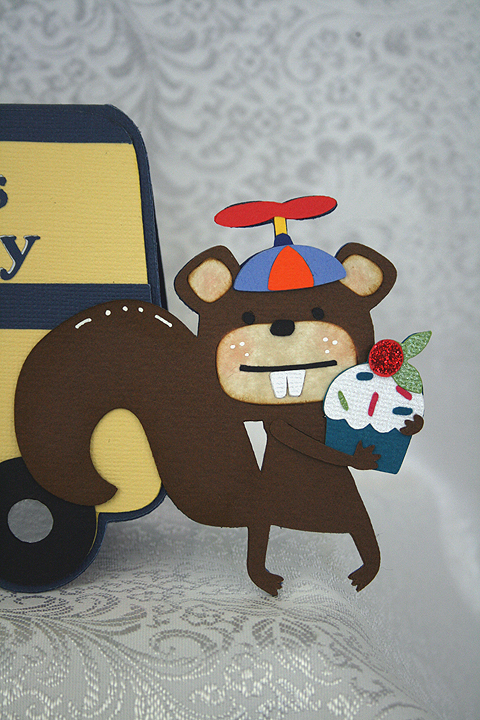
For the squirrel, I decided to put a beanie cap on his little head.  I used Baby Steps cartridge to cut the cap portion. To make the propeller on top, I used a number “8” and deleted the inside cuts in Design Studio.  Then I took the sizing handles and squished the “8” close together.  The little post that the propeller attaches to is a small rectangle from George & Basic Shapes.

I cut the cupcake from Birthday Bash and placed it in the squirrels arms.  I used red Stickles on the cherry.

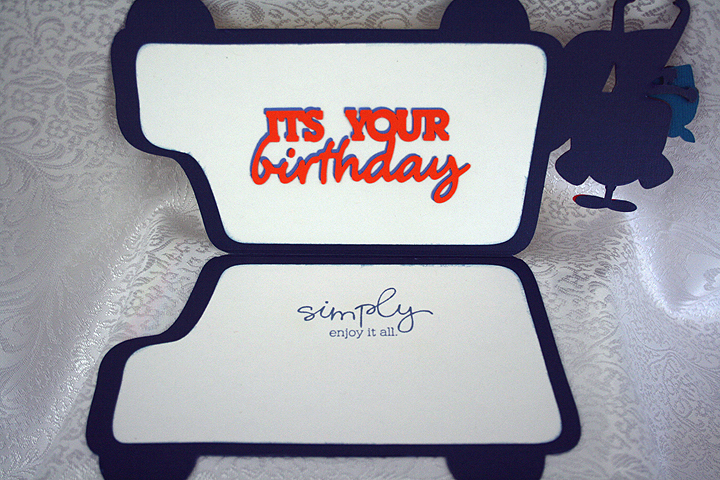
I decided to make this a birthday card, so I cut a sentiment from Birthday Bash to put inside.  I also stamped another sentiment on the opposite side.

  • Cricut Cartridges:  Baby Steps, Birthday Bash, George & Basic Shapes, Noah’s ABC Animals, Pop-Up Neighborhood
  • Cardstock:  Bazzill, Core’dinations
  • Vinyl
  • Stickles

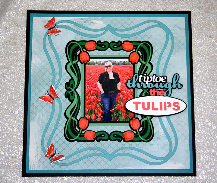
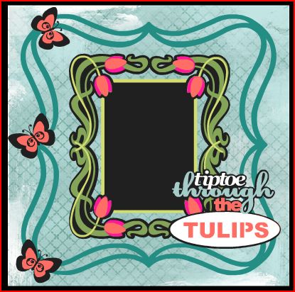
Tiptoe Through the Tulips Layout — Tulip Field in the Netherlands

I was inspired to make this layout after my dear daughter, Erin, posted a picture of herself standing in a tulip field in the Netherlands.  Erin and her hubby, Brett, were in the Netherlands the first week of May looking for a place to live as they will be moving there at the end of June.  They are currently living in Taiwan — have been there about 2 1/2 years.

Erin has been to the Netherlands several times before, but she has never been in the country when the tulips are blooming.  She thought they would be too late to see any this trip, but on their way to the airport in Amsterdam to leave, they found this field still in bloom.  Brett snapped the picture and Erin posted it on Facebook.  Once I saw the picture I knew I wanted to do something special with it.

Bitten by the Bug 2 has a frame challenge that began on May 7, right around the time I first saw the picture, so I designed my layout around that challenge.  We were to use a Cricut frame on any project.  The challenge ends today, so once again I am getting my project in just under the wire.

I have to first say that on this layout I finally used my Cricut Imagine.  It has been sitting in the box for some time.  I read some of the problems people were having with their Imagines and it took me quite a while to get up the courage to fire it up.  I discovered that the cartridge that came with my Imagine (Imagine More) was defective.  Luckily I had another cartridge I could use to get the machine running.  I called Provo Craft customer service and they are sending me a new cartridge.

I did manage to get it printing and cutting.  I am having some issues with the machine not cutting each time though.  Sometimes it just spits the mat out after printing.  I will play around with it some more and hopefully it behaves.

For this layout I printed the background paper on the Imagine.  I used a pattern from the Yummy cartridge and filled an 11″ square with the design.  I love that I can now print my own paper!

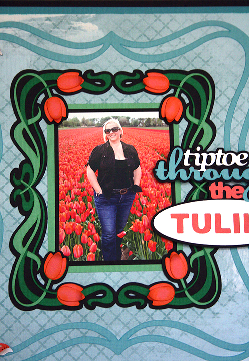
The solid color cardstock is mostly from Core’dinations, with a little Stampin Up thrown in the mixture.  For my swirly frame, I used the Cricut cartridge Fancy Frames.  I made the tulip frame in Design Studio by welding four corner shapes together from the Art Nouveau cartridge.  I welded just the shadow layer (black layer) only.  I cut the other layers separately so the tendrils would overlap on the center sides.  I also cut some extra tulip petals so I could layer them on the flowers and inked all the flower petals with some Tim Holtz Distress ink.  Here is a close-up of the frame.

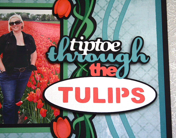
The title is cut from the Bloom Cricut Lite cartridge.  Erin posted on Facebook shortly after she arrived in the Netherlands that she was hoping to tiptoe through some tulips, so this was a perfect choice for the title.  I used pop-dots under the title.

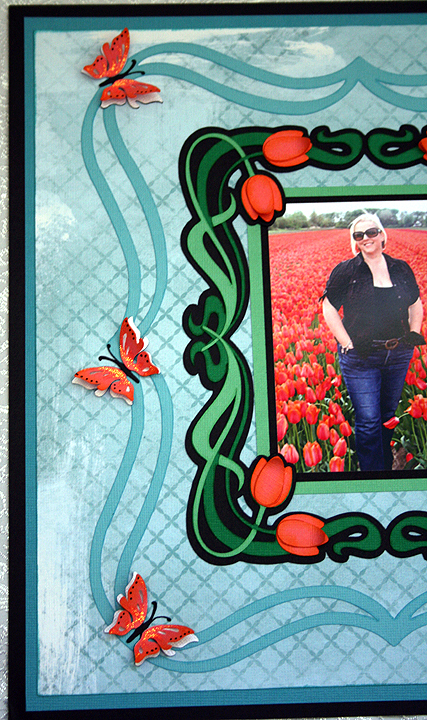
And, finally, to balance out the left side of the layout I added three butterflies from the Indie Art cartridge.  I cut three different layers, and on the last layer I only glued down the inside portion of the wings so I could bend them up.  I added some Stickles to the wings.

I have been playing around some in Cricut Craft Room and have to say that I am impressed by what it can do.  As with the Imagine, I have read some problems people have encountered with CCR, so I haven’t tried cutting with it yet.  I just didn’t have time to try it with this project, but I want to share what my project looked like laid out in CCR.  It is a great design aid because you can color your layers and see exactly what your project will look like.  For my background paper, I tried several different patterns before I decided on this one.  With the click of a button I could see what a different pattern would look like with my layout.  I think the final project looks pretty much like what I laid out in CCR.  I made a few changes as I started working on the layout, but this was my blueprint for my project.

  • Cricut cartridges:  Art Nouveau, Bloom, Fancy Frames, Indie Art
  • Cardstock:  Core’dinations, Stampin Up
  • Tim Holtz Distress Ink
  • Stickles

Cricut Circle National Scrapbook Day Crop Color Challenge: Beach Pail Gift Card Holder


To celebrate National Scrapbooking Day ( May 5), the Cricut Circle blog hosted a two-day online event.  There were challenges, tutorials, games, question-and-answers sessions — all kinds of fun.   Unfortunately I was not able to “attend” much of the live portion, but I did manage to make a project for one of the challenges.

When the Circle blog event was posted, I had just finished making eight beach pail gift card holders for a Kelly doll convention (Kelly is Barbie’s younger sister).  So I decided to make another one for the Color Challenge.  The challenge was to create a project using the color inspiration that they provided, which is shown below.  You had to use at least two Cricut image cuts on your project.

This is the picture the Circle blog provided for the color inspiration:

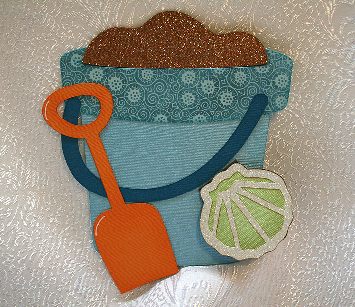
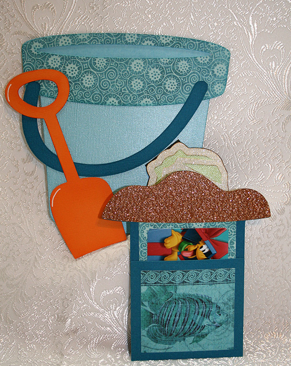
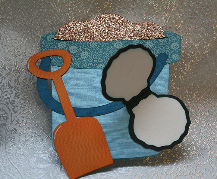
I made this card so that the sand section pulls out of the pail, similar to the flower pot cards where the flowers pull out.  I laid out the entire design in Design Studio.  I used Life is a Beach cartridge for the pail and shovel.  I glued around the outside edges only, leaving the oval section at the top open so the pocket holding the gift card would slide in.  I welded a rectangle from George & Basic Shapes to the sand to form the holder.

All the solid cardstock is from Bazzill and the printed pattern paper is from Graphic 45’s Tropical Travelogue collection — such beautiful paper!  I made the trim on the rim of the bucket using the patterned paper and cut the handle from a darker shade of cardstock.  The sand is cut from some glittered cardstock I bought at my local Joann’s.

Here is a picture showing the sand pulled out of the pail — holding the gift card.

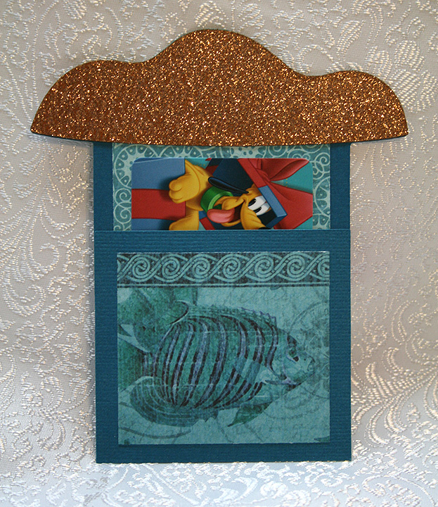
And another picture, showing  a close up of the gift card holder.

I decided to add a small tag to the card, so there would be a place for some writing.  I welded two shell shapes from Picturesque together to form the tag.  The top detail piece on the shell is cut from a piece of off-white glitter cardstock.  The shell flips open and there is a space on the top and bottom for some writing.
  • Cricut Cartridges:  Life is a Beach, Picturesque, George & Basic Shapes
  • Graphic 45 Tropical Travelogue paper
  • Bazzill solid color cardstock
  • Glitter cardstock
 

1st Banner for Cricut Expression 2 Design Challenge


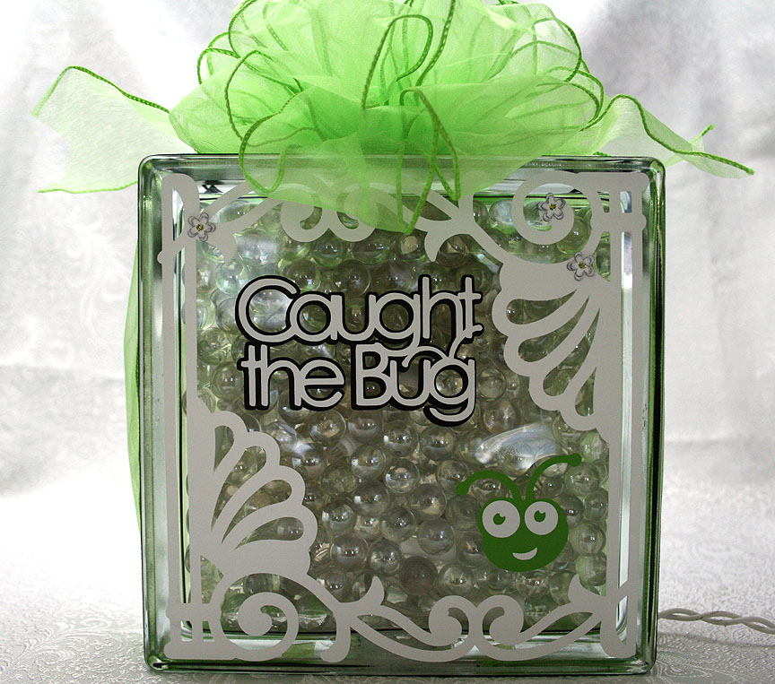
On Monday, September 26 at 12:01 a.m. EST, Provo Craft is going to launch their newest machine — the Cricut Expression 2 on HSN.  They posted a challenge to design and make a banner and they are going to give away five new Expression 2’s to some very lucky winners.  You were able to make two banners to enter, so this is the first banner I made.

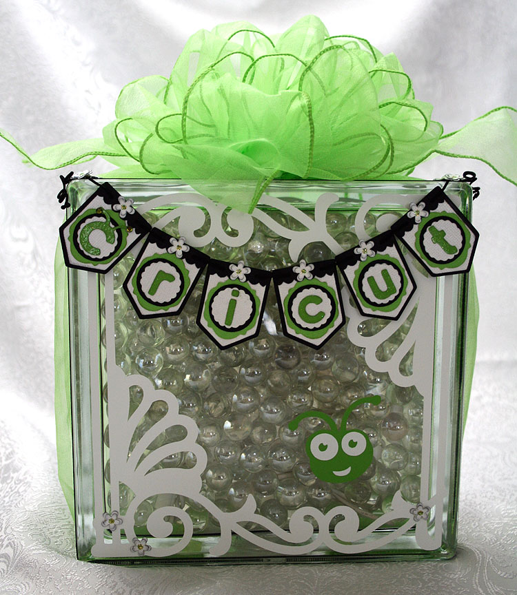
I knew the competition was going to be tough because there are so many talented Cricut users, so I tried to think a little “outside the box.”  For some reason, hanging a mini banner on a glass block was my first idea.   I originally planned on using etching cream to frost the glass, but because I was using a small string of LED lights I ended up putting glass marbles inside to help hold the lights in place.

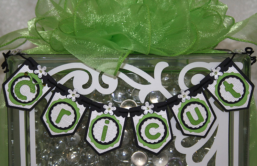
The banner is made using Bazzill and Core’dinations cardstock.  I used the Birthday Bash cartridge for my banner base.  The green frame was cut from Lacy Labels, the scalloped circles from Mini Monograms, the regular circles from George and Basic Shapes, and the black valances were cut from Straight from the Nest.  The Cricut lettering is from Cricut Everyday and I cut it out of a glitter cardstock from DCWV.  I used two Swarovski crystals on the antennae.  I added some small flowers punched from a Martha Stewart Punch Around the Page combo called Flower Shower and used lime green Stickles for the centers.
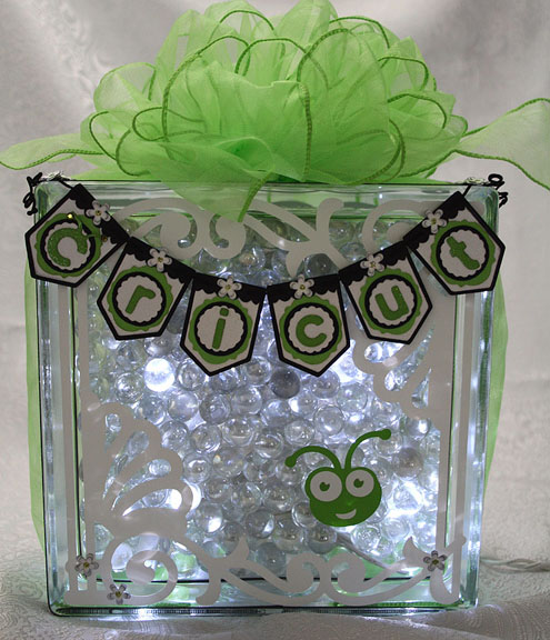
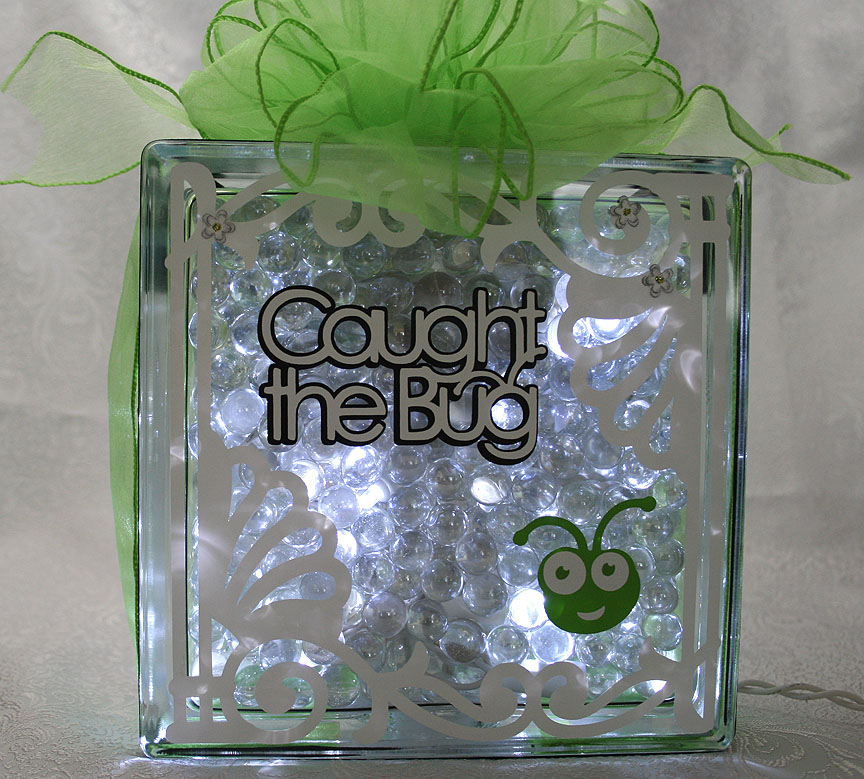
The pieces on the glass were cut from vinyl — the white fancy scroll frame is from Ornamental Iron 2 and the Bug head is from Cricut Everyday.  I was impressed with how well the Cricut cut the vinyl.  Here is a picture of the block all lit up.

FrontLit4

I decided to decorate the back of the block too and I used the same frame that I put on the front, cut from Ornamental Iron 2.  I recently bought this cartridge and I am lovin’ it!  It has some beautiful designs on it and I think they look great cut out of vinyl.

The phrase and Bug head on the back are both cut from Cricut Everyday.  And here is a picture of the back of the block with the lights on.

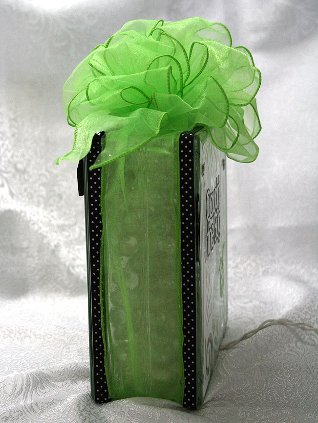
To hang the banner on the glass block, I glued some black & white dotted ribbon around the edges using Terrifically Tacky Tape.  I strung the banner together using DMC’s Memory Thread.  I sewed and glued the ends of the Memory Thread on the banner.  To cover up my stitches, I punched some more flowers and glued them on top.  I also scattered a few flowers on the front and back of the block.  I tied some wide Cricut green organza ribbon around the entire block and made a big bow using my Bowdabra.

The last picture is of the side of the block.

  • Cricut cartridges used:  Birthday Bash, Cricut Everyday, George and Basic Shapes, Lacy Labels, Mini Monograms, Ornamental Iron 2 and Straight from the Nest
  • Cardstock:  Bazzill, Core’dinations, DCWV
  • Cricut vinyl
  • DMC Memory Thread
  • Terrifically Tacky Tape
  • Martha Stewart Flower Shower punch
  • Lime green Stickles
  • Swarovski crystals

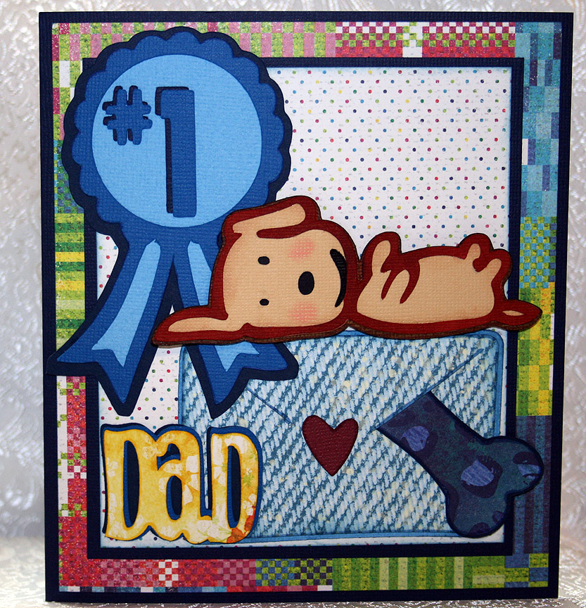
Father’s Day Card From The Smoochy Poochy


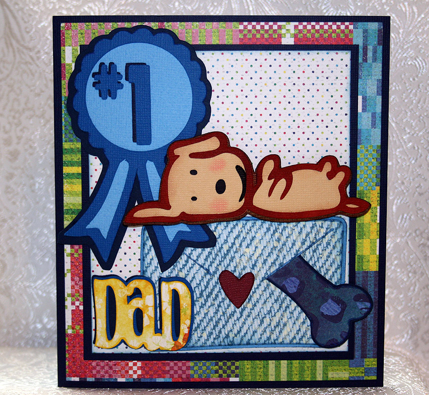
I decided to make my dear hubby a Father’s Day card from our dog.  Her name is Fifi and she is a rescue dog — part Pomeranian and part Chihuahua.  She is such a daddy’s girl that I figured he would enjoy it.

I call her our Smoochy Poochy because she loves to give kisses.  She also loves toys — her favorites are the fake fur bones with squeakers inside.  She has an assortment of them in all different types of prints — from giraffe to leopard prints. 

I made this card to enter into two challenges.  The weekly challenge at the Cricut Circle Blog is a sketch challenge, so I followed that for the layout of my card. 
The latest challenge at Cooking With Cricut is a Father’s Day related project that includes a Cricut cut.  I used several Cricut cuts on this card.

I couldn’t find a dog that looked like Fifi, so I opted for this cutie on the Paper Pups cartridge.  I chose this one because the dog is on its back and Fifi has a tendency to go “belly up” while she is sleeping.  The dog is lying on an envelope that she has so thoughtfully placed one of her squeaky bones inside for Dad.  The ribbon and bones are from Paper Pups also.
I used Doodlecharms for the envelope, Beyond Birthdays for “Dad” and Sans Serif for “#1”. 

The solid cardstock is Bazzill and the printed paper is all from Basic Grey — their Lauderdale collection.

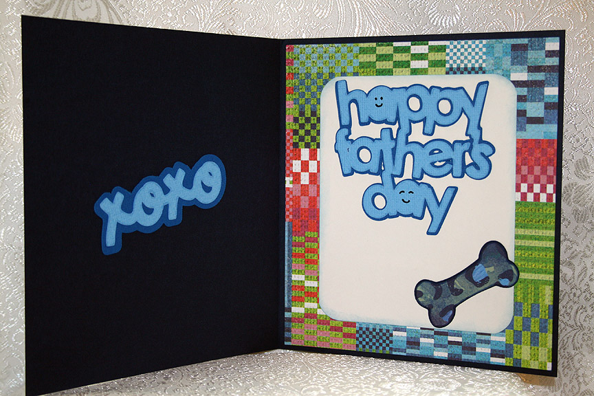
For the inside of the card, I used Paisley for the “xoxo” and Simply Charmed for the “Happy Father’s Day” sentiment.  I added another bone inside.

  • Cricut cartridges used:  Beyond Birthdays, Doodlecharms, Paisley, Paper Pups, Sans Serif, Simply Charmed
  • Bazzill cardstock
  • Basic Grey — Lauderdale collection

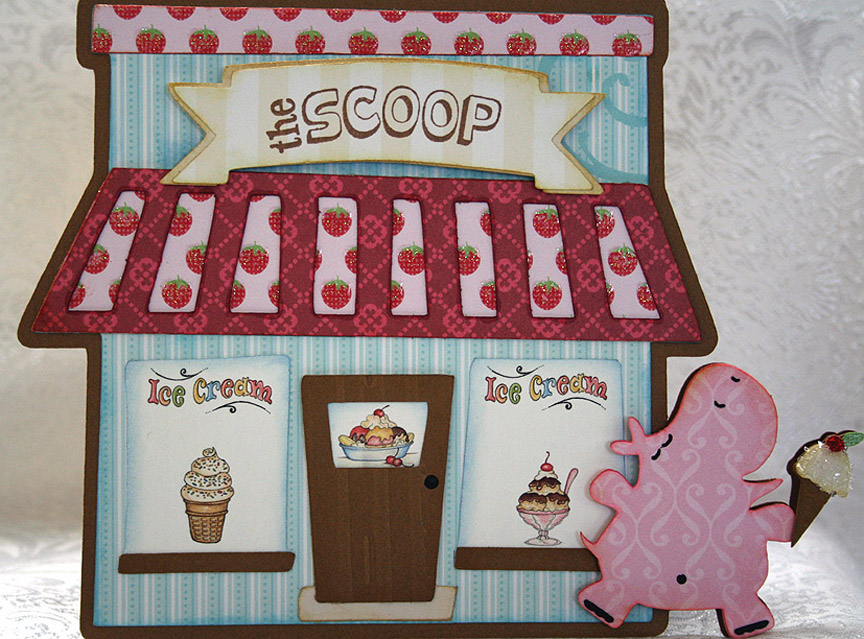
Ice Cream Shop Card for Cricut Circle Weekly Challenge


Weekly Challenge #33 over at the Cricut Circle Blog is called the Sweet Summertime Challenge.  You have to incorporate the shape of your favorite summertime treat and use a stamp somewhere on your project.

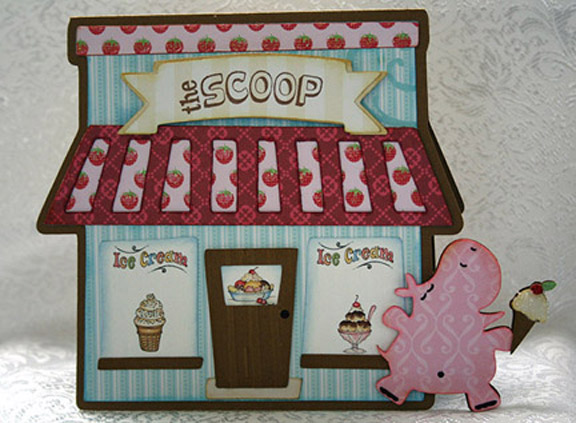
My summertime treat is easy — it’s the same treat I love all year long — ice cream!!  That being said, I knew right away what my card was going to have on it.  But I decided that I would not only include an ice cream cone but also the ice cream shop.

The lastest exclusive cartridge for Cricut Circle members is Pop-Up Neighborhood.  I was looking through the handbook and really liked some of the buildings.  While I didn’t use the pop-up feature on this card, I did take the bakery and turned it into an ice cream shop.

In Design Studio, I laid out two of the bakery shadow shapes and welded them together at the top.   I remembered the cute little hippo from Birthday Bash, who is blissfully running with her ice cream cone, and knew I wanted her on my card too.  So I laid out the hippo shape onto my base and welded that also.

I cut the shapes from the Sweet Stack by Die Cuts With A View.  The solid color cardstock is from Bazzill.  I used just the two cartridges — Birthday Bash and Pop-Up Neighborhood.   Oops, I just remembered a third cartridge that I used — the Lite cartridge Twinkle Toes.  I cut the banner for the shop name from it.

For the windows on my ice cream shop, I used graphics from Provo Craft — from their pccrafter.com site.  I thought they were perfect with my design.  I used a stamp to do the name of the shop.  I found a clear stamp in a set that I bought from K & Company that said “The Scoop” and when I saw it I knew that would be the name.

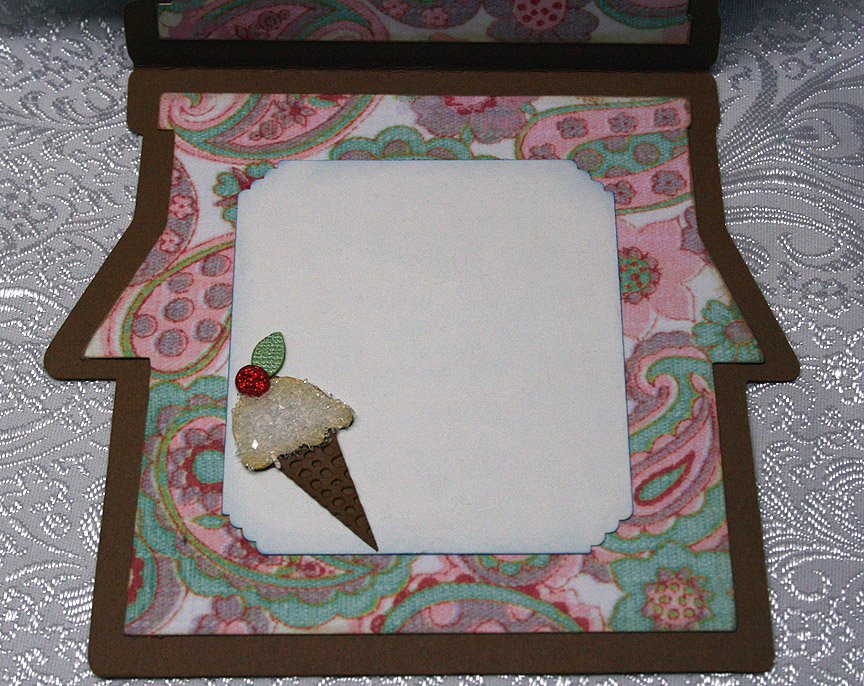
I used the Cuttlebug on the front door, the Distressed Stripes folder, and also on the ice cream cone, the Mesh Texture folder.  I needed something with a small pattern because the ice cream cone on the front of the card is quite small and this folder was great.  It gives the look of a waffle cone.  I used coarse glitter on the ice cream itself and red Stickles for the cherry on top.

Front3

This is a happy and fun creation and when I look at my card I can’t help but think of a book Erin had as a child.  It was called Yummers! and featured Miss Emily (a pig) and Eugene (a turtle).  When I look at the pink hippo, she just looks like she is running along thinking, yummers!!

The patterned paper on the inside of the card is from daisyd’s.  I made another ice cream cone, this time a little larger, to adhere to a corner.

  • Cricut Design Studio
  • Cricut cartridges:  Birthday Bash, Pop-Up Neighborhood, Twinkle Toes
  • Cuttlebug folders:  Distressed Stripes and Mesh Texture
  • DCWV — Sweet Stack
  • Bazzill solid cardstock
  • Coarse glitter
  • Red Stickles