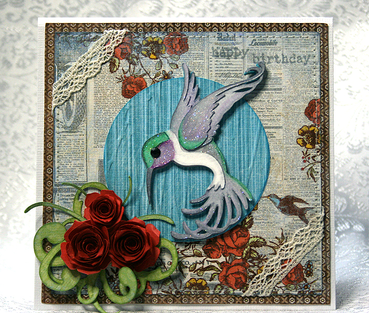
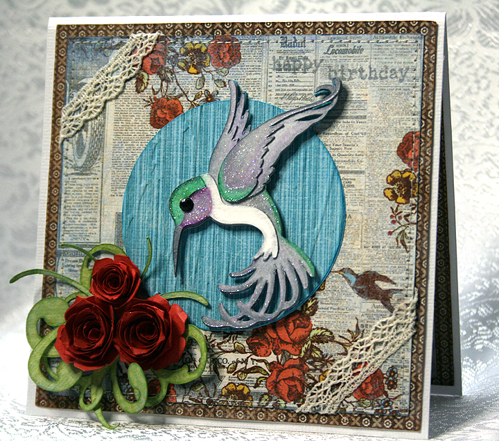
Cricut Art Nouveau Hummingbird Birthday Card


I wanted to make a card to enter in a couple of challenges and this is what I came up with.  The first challenge is Things that Fly in Nature over at Bitten by the Bug 2. The second challenge is Texture at Cooking with Cricut.

I made a 5″ x 5″ card and the patterned paper was all printed on the Imagine using the Country Carnival cartridge.  I love the paper selection on this cartridge and have been wanting to use the design that is on the background of my card for some time.  The reason I bought this cartridge is because of the paper — and the very cool font that it has.

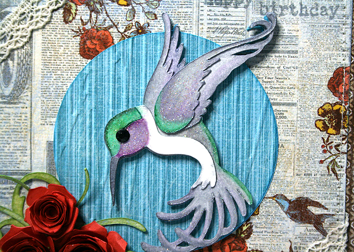
 I cut the hummingbird (at 3″) from watercolor paper using the Art Nouveau cartridge and colored him with Copics.  This is only my second time trying to color with Copics, and I have lots to learn.  I discovered I don’t have enough green markers — I didn’t have enough in the same color group to do any blending.

After I colored the hummingbird, I used a crystal glaze (something I got years ago) to go over sections of his body to try and simulate the iridescence you see in their feathers.

Oh, dear — after looking at the close-up I’m not too sure I should be posting it.  My coloring definitely leaves a lot to be desired!  The circle behind the hummingbird was embossed using the Forest Branches folder.

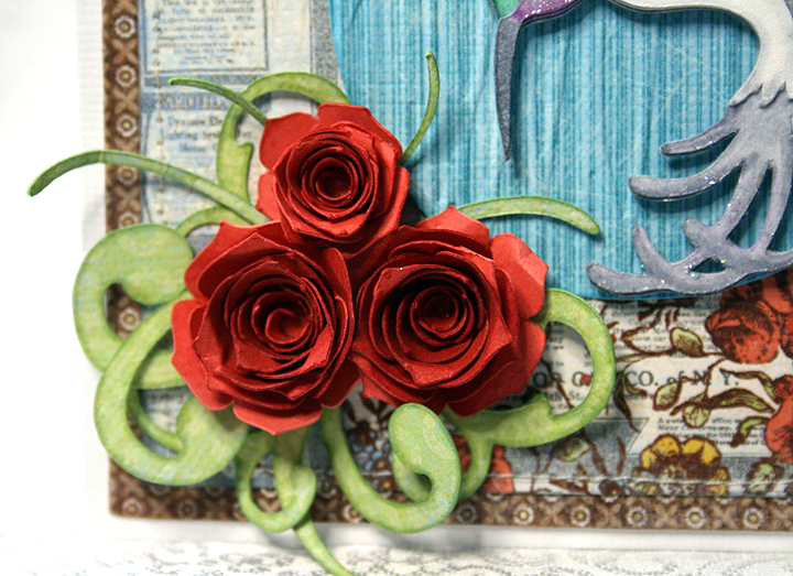
I recently got the Art Philosophy cartridge, mainly because of the flowers I have seen so many crafters make with it. The roses on this card represent my first time using this cartridge.  I cut them at 2″ and 2.5″ using some Recollections paper from Michaels.  I inked the edges with Tim Holtz Fired Brick Distress Ink.  I used a quilling tool from one of my Cuttlebug quilling kits to roll up the flowers.  I was surprised at how quickly they went together.  The greenery behind the roses is also from Art Philosophy.

I wanted the sentiment to be subtle, so I stamped it in the upper right hand corner (using distress ink) trying to make it look like it is part of the print on the paper.  I added a couple of pieces of lace across two corners and used my sewing machine to stitch around the card.

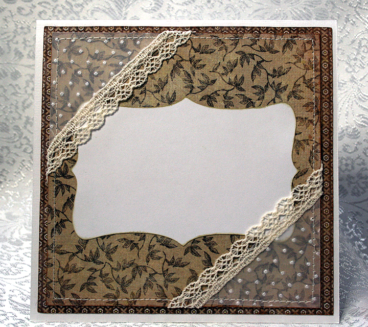
For the inside of the card, the white area is a shape cut using Art Philosophy.  The corners are a 2″ square of vellum, cut diagonally, embossed with the Swiss Dots folder, and trimmed with lace sewn across the top edges.  I then secured them to the card by stitching around the entire piece.

I originally planned on using the vellum corners on the front of the card, but when I laid everything out, I thought they hid too much of the paper on the front.  So they got moved inside, which worked out fine because I had no plans yet for the inside of the card.

  • Cricut cartridges:  Art Nouveau, Art Philosophy, Imagine Country Carnival
  • Cuttlebug embossing folders:  Forest Branches, Swiss Dots
  • Copics
  • Vellum, scraps of lace

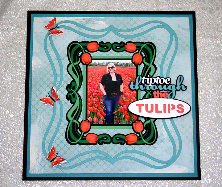
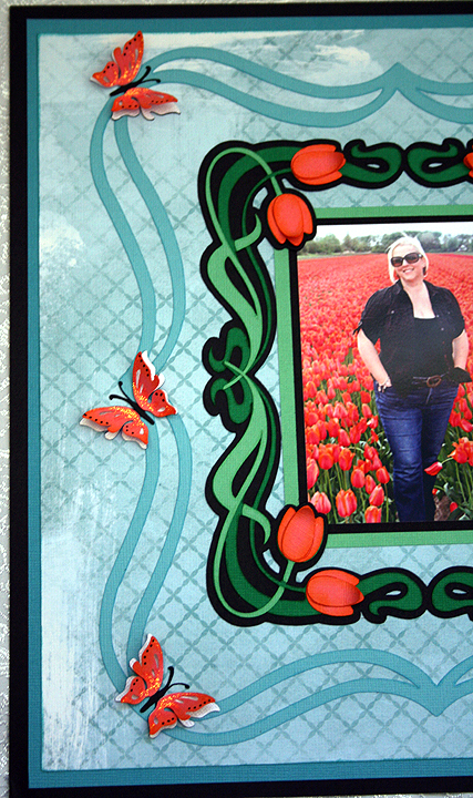
Tiptoe Through the Tulips Layout — Tulip Field in the Netherlands

I was inspired to make this layout after my dear daughter, Erin, posted a picture of herself standing in a tulip field in the Netherlands.  Erin and her hubby, Brett, were in the Netherlands the first week of May looking for a place to live as they will be moving there at the end of June.  They are currently living in Taiwan — have been there about 2 1/2 years.

Erin has been to the Netherlands several times before, but she has never been in the country when the tulips are blooming.  She thought they would be too late to see any this trip, but on their way to the airport in Amsterdam to leave, they found this field still in bloom.  Brett snapped the picture and Erin posted it on Facebook.  Once I saw the picture I knew I wanted to do something special with it.

Bitten by the Bug 2 has a frame challenge that began on May 7, right around the time I first saw the picture, so I designed my layout around that challenge.  We were to use a Cricut frame on any project.  The challenge ends today, so once again I am getting my project in just under the wire.

I have to first say that on this layout I finally used my Cricut Imagine.  It has been sitting in the box for some time.  I read some of the problems people were having with their Imagines and it took me quite a while to get up the courage to fire it up.  I discovered that the cartridge that came with my Imagine (Imagine More) was defective.  Luckily I had another cartridge I could use to get the machine running.  I called Provo Craft customer service and they are sending me a new cartridge.

I did manage to get it printing and cutting.  I am having some issues with the machine not cutting each time though.  Sometimes it just spits the mat out after printing.  I will play around with it some more and hopefully it behaves.

For this layout I printed the background paper on the Imagine.  I used a pattern from the Yummy cartridge and filled an 11″ square with the design.  I love that I can now print my own paper!

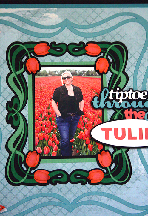
The solid color cardstock is mostly from Core’dinations, with a little Stampin Up thrown in the mixture.  For my swirly frame, I used the Cricut cartridge Fancy Frames.  I made the tulip frame in Design Studio by welding four corner shapes together from the Art Nouveau cartridge.  I welded just the shadow layer (black layer) only.  I cut the other layers separately so the tendrils would overlap on the center sides.  I also cut some extra tulip petals so I could layer them on the flowers and inked all the flower petals with some Tim Holtz Distress ink.  Here is a close-up of the frame.

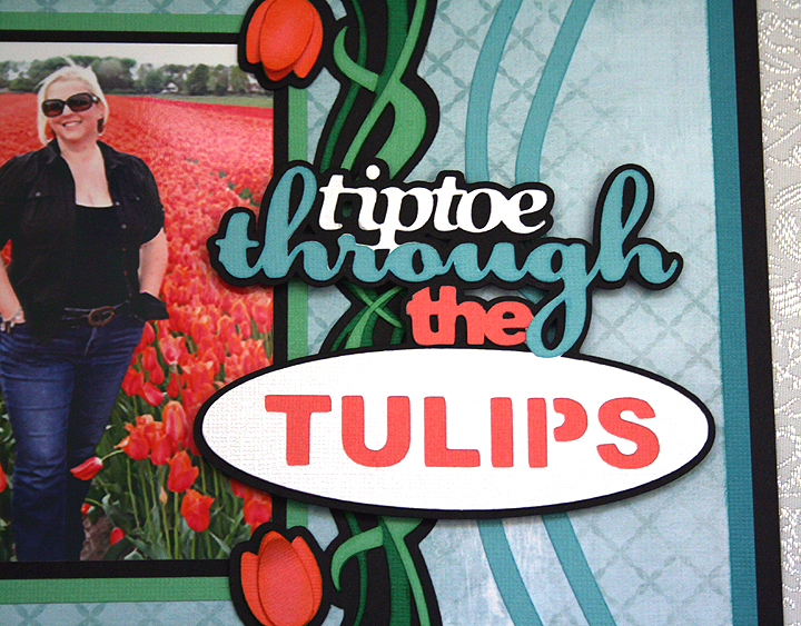
The title is cut from the Bloom Cricut Lite cartridge.  Erin posted on Facebook shortly after she arrived in the Netherlands that she was hoping to tiptoe through some tulips, so this was a perfect choice for the title.  I used pop-dots under the title.

And, finally, to balance out the left side of the layout I added three butterflies from the Indie Art cartridge.  I cut three different layers, and on the last layer I only glued down the inside portion of the wings so I could bend them up.  I added some Stickles to the wings.

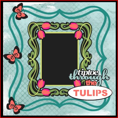
I have been playing around some in Cricut Craft Room and have to say that I am impressed by what it can do.  As with the Imagine, I have read some problems people have encountered with CCR, so I haven’t tried cutting with it yet.  I just didn’t have time to try it with this project, but I want to share what my project looked like laid out in CCR.  It is a great design aid because you can color your layers and see exactly what your project will look like.  For my background paper, I tried several different patterns before I decided on this one.  With the click of a button I could see what a different pattern would look like with my layout.  I think the final project looks pretty much like what I laid out in CCR.  I made a few changes as I started working on the layout, but this was my blueprint for my project.

  • Cricut cartridges:  Art Nouveau, Bloom, Fancy Frames, Indie Art
  • Cardstock:  Core’dinations, Stampin Up
  • Tim Holtz Distress Ink
  • Stickles