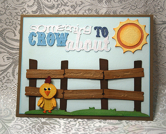
On this project, I combined challenges. I was making a card for the E-I-E-I-O challenge, hosted by Jenny. She wanted us to make a project using a barnyard animal. When I took a close look at the cut pieces, a light bulb went off — I thought this would also be a good project to do for Nadia’s challenge. She has an excellent tutorial on how to add perspective to flat die cuts. Be sure and check it out on Nadia’s blog. Her challenge is to make a project using some of the techniques she shows in her tutorial.
So, I would like to present to you the premiere of………………
EXTREME MAKEOVER: FDC EDITION
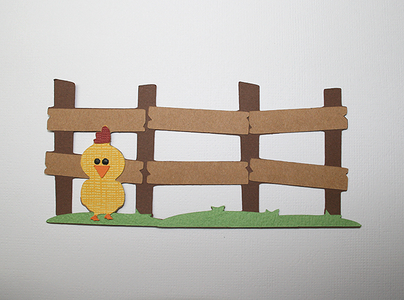
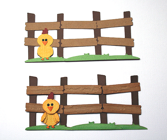
A flat die cut (FDC) is just that — flat. This case presented itself when it landed on my desk after coming off the Cricut mat. I looked at it and said to myself “this cut could definitely benefit from Nadia’s ideas.” Something I really enjoyed in Nadia’s tutorial was her before and after photos. So I took a photo of my die cut (from the County Fair cartridge), without any enhancement, as it went together after coming off the mat.
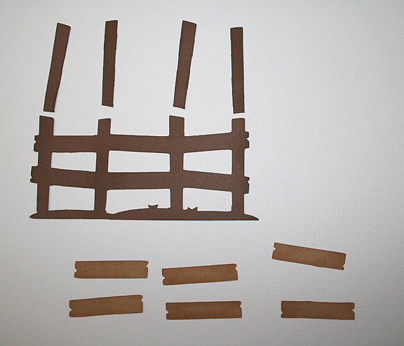
It’s cute, but it could be so much more. I began with the fence, which was cut at 2.25″. I added some grass to it by welding the shapes in Cricut Craft Room. The grass is also from County Fair, cut at 3″. I cut several of the same fence shapes so I could cut them apart and use only the pieces I wanted.
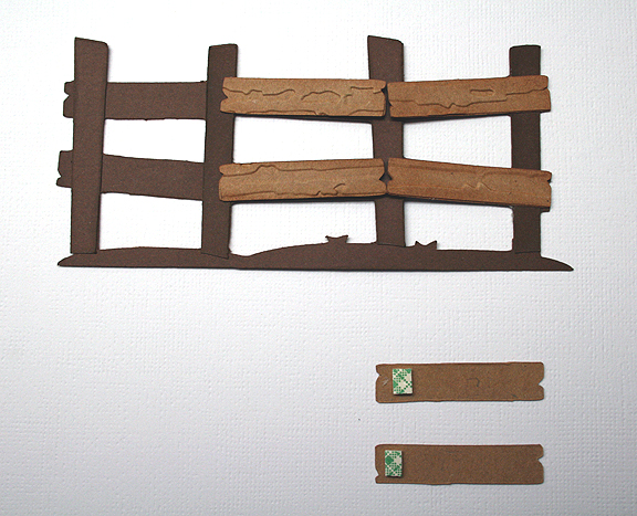
I took extras of the upright pieces and inked them. Two of them, the second from the left and the far right, I inked darker because I wanted them to look like they are farther away. I adhered them to the fence.
Then I began working on the cross pieces. I inked the edges and ran them through the Cuttlebug using the Distress Stripes folder. Because the paper was not real thick, I doubled the layers on these boards. I then began attaching them to the fence. I glued one end with liquid glue and put a piece of foam on the opposite end. Where the boards attached to the uprights that were farther away, I adhered that edge with the liquid glue. Where the boards are supposed to be closer to the viewer, I attached that end with the foam. I ended up with sort of a zigzag effect. When I finished gluing the boards on, I inked the edges of the grass and adhered the pieces to the fence.
Next up was the little chick.
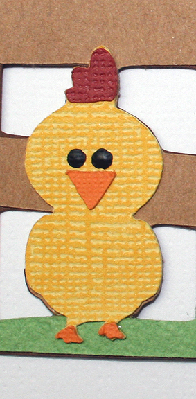
He is cute as is, but this little guy wanted some major work done. I began with several layers, as I knew I would be doing some nipping and tucking. He was very happy when he started getting inked. I cut a separate head from one of the layers and inked it.
He wanted a beak job done, but I recommended a little tuck instead. I creased his beak in the middle and folded it. Then I adhered it to his face and he ended up with some nice dimension.
The comb (his topknot) was next. I cut two slightly larger than the original piece and cut those into separate sections. I then adhered the three layers of the comb. This was a microscopic procedure, done under my lighted magnifying glass because the pieces were so small.
Now we came to what was perhaps the chick’s biggest issue — his wings. In the original cut, he has no wings. Just sort of an outline of wings. This little guy had more than wing envy, he had a wing obsession. He wanted me to do wing transplants, but in my opinion that would be too drastic. Without ruffling his feathers, I explained that wing transplants aren’t what they’re cracked up to be. I thought wing extensions would be a better solution, especially since the little guy is still a spring chicken.
I found some feathers from Paper Doll Dress Up and cut several of those. I inked the edges and then attached them to the chick, gluing only the top of each feather. The only procedure left to perform was attaching his new head. I glued the head even at the top and popped up the chin area (do chickens have chins?) with a pop dot.
As for his new look, the chick is very pleased. In fact, he happier than a rooster in a hen house. So let’s pull those curtains back and take a look at the results………..
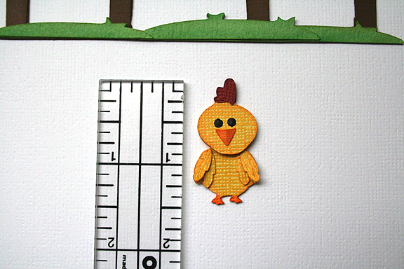
I photographed the chick alongside a ruler so you can see his size. Altering small cuts and have a big effect. He ended up being about three layers thick. Here’s a before and after photo of the entire cut piece.
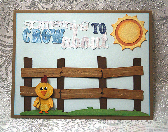
Since the chick now has something to crow about, I decided to use that as the sentiment on my card. Nadia explained in her tutorial about atmospheric perspective and how you can lose the effect you create in altering your cut by putting it on a background with a lot of detail. I decided to go with a plain background. I thought about embossing the background but decided I didn’t want that distracting from my fence and chick. I used a pale blue and inked the edges.
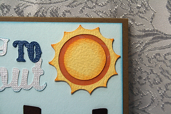
The sentiment is from Just Because Cards, cut at 5″. The sun is from Pooh and Friends, cut at 1.5″ inches. For the sun, I used another of Nadia’s ideas. The orange layer was very bright and I thought it was distracting. It seemed to draw my eye to that corner. So I cut a piece of vellum and adhered it over the orange. Although the orange still looks bright in the picture, it is actually more subdued.
I had a lot of fun with this project and I guess I should apologize for all the chicken puns. Thank you, Jenny, for your fun challenge!
- Cricut cartridges — County Fair, Just Because Cards, Paper Doll Dress Up, Pooh and Friends
- Ink
- Foam dots
- Vellum


Linda –
Now this is something to crow about! Love all of the dimension and texture you added to this fabulous card. I learned a lot from as well in addition to a nice chuckle. Great and fabulous work!
How fun and cute is this!! I love the dimension you gained with the embossing on the fence and the inking and layering you did on the chick! Those feathers are perfect! Everything about this is just too cute!! Great pic showing the chicken’s size! Wow– that guy is little!
Just awesome!